For entrepreneurs, business owners, and the creatively curious, mastering the language of colours is like holding a key to unlocking the hearts and minds of your audience. In this journey, we confidently stride into understanding the colours that are making waves this year, and, more importantly, why they resonate so deeply in this particular era.
Each year, design industries wait with bated breath for the revelation of the “Color of the Year,” serving as not only a trend forecast but also as a sociocultural barometer. Let’s delve into the basics of colour theory before we dissect the hues capturing our global mood.
The Basics of Colour Theory
Colour theory is a foundational pillar in the visual arts, underpinning the strategic use of colour in design, art, and branding. It encompasses the colour wheel, colour harmony, and the context in which colours are used.
The Color Wheel
Revolve your mind around the colour wheel, a tool that maps out colour relationships. The primary colours (red, blue, and yellow) stand as the wheel’s bold originators. Mix them to reveal secondary colours (green, orange, and purple), and stir in the primaries once more for the array of tertiary colours.
Harmony and Contrast
Fusion is key. Harmonious colours (those close to each other on the wheel) whisper conducive narratives, bringing forth feelings of calm and elegance. Contrasting colours, positioned across from one another, shout excitement and vitality.
Context and Culture
Context can make or break a colour’s message. A color might sing a song of peace in one culture, yet whisper the tales of mourning in another. Knowing the audience’s cultural backdrop is as vital as the hue selection itself.
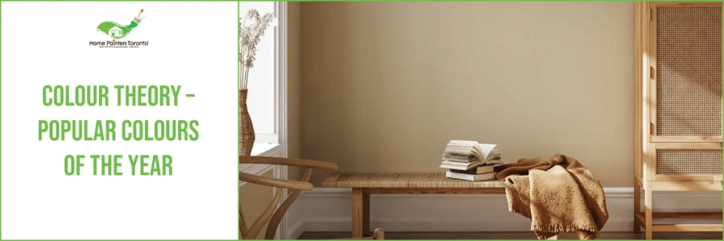
Popular Colours Of The Year
Every year, there are lists released that reveal the top or most popular colours of the year. These top picks come from paint manufacturers, colour experts and the top design hubs. It’s actually really exciting to see how things change from year to year and just how exactly these new popular colours are being used in different living spaces. What was trendy and in style last year might be considered passé this year!
Some of the top colours of the year 2023-2024:
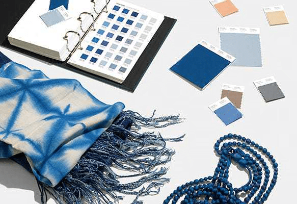
Pantone Classic Blue is a timeless and enduring deep blue shade that offers hints of teal. It’s suggestive of the sky at dusk and offers feelings of tranquillity and peace while still remaining strong and confident.
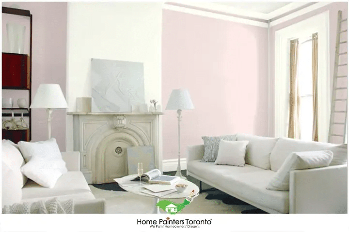
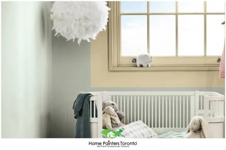
Benjamin Moore’s First Light is a beautiful soft pink that works as just a nice wash of light rosiness. It’s very light and airy, as the pink rests subtly and flatters any space with its simplicity and delicate nature
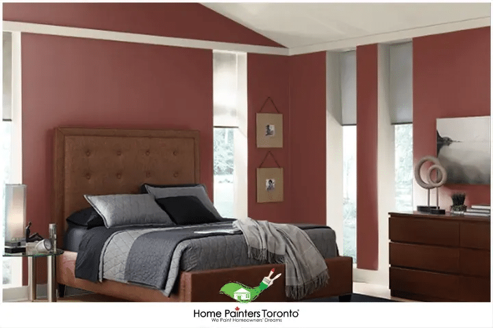
Behr’s Red Pepper is in the top trending colours of the season as it exists in that fine line between a deep red and a strong burgundy. It’s strong and makes a statement, but it’s still warm to the eyes.
Glidden’s Spring Thaw is a nice, light neutral gray that picks up hints of blue depending on the light and space. Individuals have used this as an all-over neutral room colour as well as on ceilings.
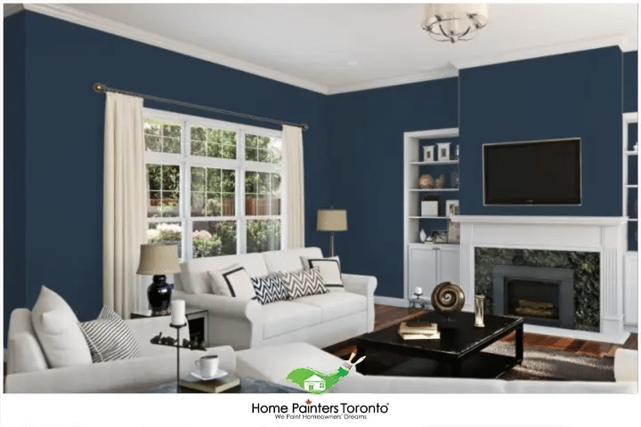
Sherwin Williams’ Naval is a rich navy blue that works to be bold and confident while still maintaining that sense of stillness and calm. This navy is empowering and gives a slight nod to the Art Deco influences of the early 1900’s.
Dulux’s Tranquil Dawn is a soft and serene cool-tone green that possesses the irreverence of nature and a lush landscape while still connecting to the human soul.
Kendall Charcoal is trending this season as deep and luxurious charcoals are all the rage. This one is dark and rich but still works as a versatile neutral. It could even work as an ideal trim colour for a cream or off-white room.
Harnessing Colour Theory for Your Paint Selections
Choosing paint colours for your spaces, be it an office redesign or a retail store opening, can often seem like a daunting task. Armed with an understanding of colour theory and the annual colour trends, you’re more capable than you think. Here’s a step-by-step guide to help you navigate this colourful landscape confidently.
Reflect on Your Space's Purpose
Before you start browsing paint swatches, take a moment to consider the purpose of your space. Are you aiming to invigorate your team in an office environment? Or create a calming space where customers can relax? The mood and function of the room strongly influence your colour choice.
Align Colors with Your Brand
A key element to consider while selecting paint colours is your brand identity. The colours should echo your brand’s values and sentiments. Revisit the parts of colour theory related to colour psychology to guide this step. Remember, every colour has a story; make sure it’s narrating your story.
Factor in Fixed and Furnishing Elements
Take into account the already established elements in the room – tile colour, wood finishes, furniture, or artwork. The new paint colour should not clash with these elements but should create a harmonious visual effect.
Experiment with the Color of the Year
Now, here’s where we bring in the trending colour of the year! Find clever ways to integrate it subtly if it jives with your colour scheme. It could be as an accent wall or in smaller decorative elements, a nod to the current trends and a visual connection to the zeitgeist.
Trust Your Instincts and Take a Test Drive
Once you’ve narrowed down your choices, bring home a small amount of each prospect colour. Paint swatches on the wall and observe the colours at various times of the day since light can vastly impact colour appearance. Trust your instincts – which colour makes you feel “at home”?
Consult a Professional if Needed
Lastly, always remember that it’s okay to seek professional guidance if the task becomes overwhelming. A professional colour consultant will have experience applying colour theory, considering lighting and shading nuances, and navigating the dizzying array of colour choices.
Color, in the end, is a powerful tool of communication. Choosing your paint colours wisely, backed by an understanding of colour theory, can create a space that resonates with your brand’s message and creates a positive impact. With “2024 Colour of the Year” in your tool belt and colour theory as your guide, there’s little standing in your way of creating a truly compelling space.
More interesting blogs related to
“Colour Theory – Popular Colours Of The Year”

Do these new popular colour picks have you totally jazzed? If the work involved in repairing or painting sounds like it involves too much time and energy to do yourself, call 416.494.9095 or email Brian@HomePaintersToronto.com for a FREE quote, or visit our website. And don’t forget to follow us on all our social channels below!