

Toronto families often call us when a parent starts missing steps or losing track of which door leads to the bathroom. House painting for aging in place uses contrast, low-glare finishes, low-odour paint and calm scheduling to make a home safer to move through. At Home Painters Toronto, we have painted 20,000+ homes across the GTA since 1991 and earned 1,200+ positive reviews from local homeowners. This guide covers which surfaces to contrast, which sheens to avoid, how to keep paint odour low, and how a crew can work quietly around a parent's routine. It also shows where a painter's job ends, and an occupational therapist's job begins, so families know exactly who to call for each part of the plan.
House painting for aging in place works best when doors, trim, switch plates and stair edges contrast with the walls beside them. Matte or low-sheen finishes cut glare, low-VOC paint keeps odour down, and one-room-at-a-time scheduling protects routines. A painter carries out the plan, but an occupational therapist should assess vision and memory needs.
What House Painting for Aging in Place Covers and What It Doesn't
House painting for aging in place covers the colour, sheen, product and scheduling choices that make a home easier to navigate. It does not replace a medical or occupational therapy assessment. Painters control what goes on the surface and when it goes on. We do not diagnose low vision, dementia or fall risk.
The best results come when the care team sets the goals, and the paint crew executes them. An occupational therapist might ask for a darker bathroom door frame or a marked top step. Our job is to deliver that plan precisely, with clean lines and matched sheens in every room. Families can start that conversation with our interior painting team before any colour is chosen.
Paint cannot fix a loose handrail, a raised threshold or a dim hallway. Those problems need a carpenter, an electrician or a lighting upgrade. Our interior carpentry and handyman crew repairs trim, railings and casings before painting starts. That way the new finish goes onto sound, solid surfaces.
A short planning meeting usually includes four people: the parent, one family coordinator, the care professional and the lead painter. The parent should stay in charge of colour choices wherever possible. Familiar colours often feel calmer than a sudden makeover. Small, targeted changes at doors, stairs and switches can do more than repainting every wall.
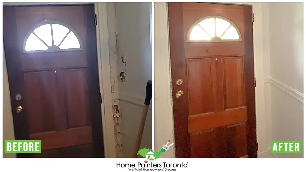
Contrast at doors, trim and stair edges helps mark the paths a parent uses most
Colour Contrast for Doors, Trim, Switch Plates and Stair Edges
The most useful contrast points in an aging-in-place home are door frames, baseboards, switch plates, handrails and stair edges. Each one marks an edge or a target a person needs to find. HealthLinkBC, the B.C. government's health information service, advises families to paint door frames in a contrasting colour and mark stair edges with high-contrast paint or tape. The Alzheimer Society of Canada's dementia-friendly spaces tip sheet makes similar points about contrast at doors and seating edges. Both sources treat contrast as a way to separate surfaces that would otherwise blend together.
| Area | Contrast Idea | Why It Helps |
|---|---|---|
| Door frames and casings | Dark casing on a light wall, or the reverse | Shows where an opening starts and ends |
| Bathroom door | A casing colour no other door uses | Helps a person find the washroom at night |
| Baseboards | Darker than the wall, close to the floor tone | Marks where the wall meets the floor |
| Switch plates and outlets | Plates that contrast with the wall colour | Makes controls easier to spot and reach |
| Stair nosings | Contrasting stripe on each tread edge | Shows exactly where each step ends |
| Handrails | Rail colour different from the wall behind it | Makes the rail easier to find and grip |
| Front door and house number | Strong door colour with a number that contrasts its background | Helps visitors, drivers and paramedics find the home |
The front entry deserves the same attention as any hallway. A door in a deep, clear colour stands out against brick or siding from the street. House numbers should sit on a plain background that is much lighter or darker than the numbers themselves. Our front door refinishing service can restore or recolour the entry without replacing the door.
Using LRV to Plan Senior-Friendly Paint Colours
Light Reflectance Value (LRV) tells a painter how light or dark a colour really reads. Benjamin Moore publishes an LRV for each colour on a scale from 0, absolute black, to 100, pure white. The UK accessibility standard BS 8300 sets a gap of at least 30 LRV points between adjacent surfaces as its contrast benchmark. Canada has no residential rule on this, so we treat that 30-point gap as a practical planning target.
Hue alone can fool the eye. A sage green and a dusty blue can look different on a paint chip but share almost the same LRV. To a person with reduced contrast sensitivity, those two colours can merge into one surface. We check LRVs on paper before ordering paint, and families can browse our colour inspiration page to start a shortlist.
Stair Edge and Handrail Contrast
Stair edges need the clearest contrast in the house because a misjudged step carries the most risk. A painted stripe on the front edge of each tread shows the eye exactly where the step ends. On stained wood stairs, a crew can mask a band along the nosing. That band gets a durable floor enamel in a contrasting tone. Our staircase painting and staining team can blend that stripe with the existing finish so the stairs still look finished.
Handrails should contrast with the wall behind them so a parent can find the rail without feeling for it. A dark rail on a light wall works well. Spindles can stay a lighter colour so the rail itself reads as the main line. The same contrast rule applies to grab bars in the bathroom.
Why Glossy Paint Causes Glare in Ontario Homes
Glossy paint causes glare because a smooth, high-sheen film reflects light like a mirror. Ontario's low winter sun makes that worse. The National Research Council of Canada's sun calculator puts Toronto's noon sun only about 23 degrees above the horizon at the winter solstice. Low-angle light reaches deep into rooms and strikes walls at a shallow angle. On semi-gloss walls, that light bounces back as bright hot spots.
Older eyes often take longer to recover from glare. A bright patch on a hallway wall can hide the edge of a step. The NRC's sunrise and sunset tables also show under nine hours of Toronto daylight around December 21. That means more hours under lamps and ceiling fixtures, and point light sources make sharp reflections on shiny paint.
The Master Painters Institute (MPI) defines each sheen by gloss units measured at a 60-degree angle. Lower numbers reflect less light back at the viewer. The table below shows how each MPI level fits an aging-in-place plan.
| Sheen | MPI Gloss Level (60° Reading) | Glare Risk | Best Use in an Aging-in-Place Home |
|---|---|---|---|
| Flat or matte | G1: 0–5 units | Lowest | Ceilings and bedroom walls |
| Eggshell | G3: 10–25 units | Low | Living rooms, hallways and bedrooms |
| Satin | G4: 20–35 units | Moderate | Trim, doors and high-touch areas |
| Semi-gloss | G5: 35–70 units | High | Small accents only, never large walls |
| Gloss | G6: 70–85 units | Highest | Avoid on walls in most homes |
Where a Low-Sheen Finish Still Makes Sense
A pure matte finish is not the right call everywhere. Flat paint marks more easily and handles scrubbing less well than higher sheens. Kitchens, bathrooms and the wall beside a staircase see hand contact and moisture every day. In those spots, we suggest a scrubbable matte or an eggshell, which keeps glare low and still takes a wipe. Doors and trim often get a satin, since walkers and canes knock against them daily.
Low-Odour Paint and Ventilation in an Occupied Home
Low-odour, low-VOC water-based paint is the standard choice when an older adult stays home during painting. Good ventilation matters just as much as the product. Health Canada lists paint as a common indoor source of VOCs and recommends increasing ventilation during and after use. Federal VOC limits for architectural coatings, set by Environment and Climate Change Canada, cap flat interior paint at 100 grams per litre. Premium lines such as Benjamin Moore Regal Select are sold as low-VOC products.
Low-VOC does not mean no smell, and it does not replace fresh air. Our crews open windows when outdoor air is good, run exhaust fans and keep the work zone's door closed. Health Canada also suggests checking the Air Quality Health Index before opening windows on smoky days. A parent with asthma or COPD should ask their doctor about timing.
Most families can stay home during interior work. Our guide on whether you can stay in the house during painting covers sleeping arrangements, pets and timing in more detail. For older adults, we add one more step. A quiet room stays unpainted until the final day so there is always a calm, odour-free place to rest.

Low-VOC paint and steady ventilation keep odour low for older adults staying home
How Our Crews Schedule a Calm, Low-Disruption Painting Project
A calm aging-in-place painting project runs one or two rooms at a time and keeps one safe room untouched. It also uses the same crew daily and works around meals, naps and medication times. The steps below are how we stage that work.
- Walk through with the family. We note routines, mobility aids and the rooms used most, then confirm the colour plan from the family or care team.
- Set up a safe room. One bedroom or sitting room stays clear of drop cloths, ladders and odour until the last day.
- Paint in short stages. Each zone is finished and cleaned before the next one starts, so no walkway stays blocked overnight.
- Keep paths clear. Ladders, cords and drop cloths come off every route the parent uses, and furniture goes back where it was.
- Keep one point of contact. The same lead painter introduces the crew on day one and answers questions every day.
- Walk the finished home together. We check each contrast point against the plan in daylight and lamplight before packing up.
Trust matters when a crew spends days inside a parent's home. Home Painters Toronto is WSIB compliant and fully insured with $5M in general liability coverage. Every crew member passes a criminal background check. Read more about why families choose Home Painters Toronto and see what past clients say in our client reviews.
When High Contrast Backfires for People Living With Dementia
High contrast backfires when it lands on the floor. A person living with dementia may read a dark band, threshold or rug as a hole or a step. They may stop walking or try to step over it. This is the mistake we see most often in well-meaning colour plans. Families hear that contrast helps, then stain one room's floor much darker or paint a bold border at a doorway.
The UK Alzheimer's Society advises avoiding flooring that is shiny or close in colour to the walls. Its guidance also favours keeping floor colour steady from room to room. The goal is contrast between the floor and the walls, not sudden changes across the floor itself. A threshold strip that matches both floors is usually safer than a contrasting one.
Busy patterns cause similar trouble. Strong stripes, speckled finishes and heavy wallpaper prints can look like movement or objects. Plain, solid colours on walls are easier to read. Our wallpaper removal crew can strip old patterned paper and prepare the walls for a flat, even finish.
Dementia-Friendly Home Painting: Doors to Highlight and Doors to Blend
Dementia-friendly home painting uses contrast to draw attention to the doors a person should use and lets other doors fade into the wall. The Alzheimer Society of New Brunswick used this idea in its own resource centre. Its neutral wall colour highlights some features and camouflages others. In a home, the bathroom and bedroom doors might get a strong casing colour. A furnace room or storage closet might be painted the same colour as the wall around it, frame and all. This choice affects safety and wayfinding, so it should come from the care team and not the paint crew alone.
What Aging-in-Place Painting Costs in Toronto
Aging-in-place painting in Toronto usually costs $400 to $900 + HST per living room and $700 to $1,200 + HST for a trim, door and baseboard package. Those figures come from Home Painters Toronto's published price ranges. Most of the contrast work happens on trim and doors, so that line often matters more than wall painting. The table below shows where each range fits.
| Scope | Typical Range (CAD + HST) | Aging-in-Place Notes |
|---|---|---|
| Living or dining room | $400–$900 | Matte walls with contrasting casings |
| Bedroom | $400–$800 | Often the safe room, painted last |
| Bathroom | $250–$500 | Scrubbable low-sheen walls and a contrasting door |
| Trims, doors and baseboards | $700–$1,200 | Where most contrast work happens |
| Ceilings | $1,000–$1,300 | Flat finish to limit glare from fixtures |
| Small exterior job (front door, trim, porch) | $2,000–$4,000 | Entry colour and house-number contrast |
Contrast work takes more careful cutting-in than plain wall painting, because a dark casing beside a light wall shows every wobble. Room size, drywall condition, and furniture moving also shift the price. Our interior painting calculator gives a quick starting estimate before a site visit. Interior painting carries our lifetime warranty, and exterior painting carries a 3-year warranty.
Senior-Friendly Painting FAQs
The best colours for seniors with low vision come in pairs with a big light-dark difference. A light wall with a dark door casing is a good example. Lightness matters more than hue, so check the LRV of each colour. A gap of 30 points or more, the BS 8300 benchmark, is a sensible target. Plain colours also read more clearly than busy patterns.
Matte is the lowest-glare choice for most walls in an elderly parent's home. Eggshell works well in hallways and living areas that need more washability. Save satin for trim and doors, and keep semi-gloss off large walls because it reflects lamp and window light.
Yes, a bathroom casing in a colour no other door uses can help a person living with dementia find it. Pair it with good lighting and a clear sign if the care team recommends one. Keep the floor colour the same across the threshold so the doorway does not look like a step.
Paint one or two rooms at a time and keep a quiet, safe room untouched until the end. Use low-VOC paint, ventilate each zone, and clear every walkway at the end of each day. Ask the painting company for one lead painter who stays on the job from start to finish.
No, walls and trim should usually contrast in an older adult's home, because matching colours hide where a doorway or corner begins. The exception is a door the care team wants to blend in, such as a utility closet. In that case, the door, casing and wall all get the same colour.
Low-VOC paint releases fewer volatile organic compounds, which lowers odour and irritation for older adults. Health Canada notes that people with asthma or chronic lung conditions can be more sensitive to VOCs. Ventilation still matters, so keep fresh air moving during and after painting.
Planning House Painting for Aging in Place
Planning house painting for aging in place starts with the care team's goals and ends with a precise crew. Contrast belongs on door frames, baseboards, stair edges and handrails. Glare control comes from matte and eggshell finishes, and low odour comes from low-VOC products and steady ventilation. A calm schedule protects the routines that keep a parent steady.
Home Painters Toronto is a family-run company that has served Toronto and the GTA since 1991. Our painting project gallery shows the clean lines and even finishes this kind of work depends on. We can review your parents' colour plan with you and stage the work around daily life.
This article is general information about paint colour, sheen and scheduling choices. It is not medical, occupational therapy or care advice, so please speak with your parent's doctor or occupational therapist about their specific vision, memory or mobility needs.

Ready to review your parents' colour plan? We offer fast, free quotes and warranty-backed work from a crew that is WSIB-compliant and fully insured.
Contact Home Painters Toronto Today!