

A home painting colour consultation in Toronto is a guided session where a painting professional tests colours in your actual rooms before any wall gets rolled. Most homeowners book one after buying several sample pots, painting swatches on every wall, and still feeling unsure which grey is the right grey. The session replaces guesswork with a clear process of lighting checks, undertone analysis, large sample testing, and a written palette tied to specific products and sheens. At Home Painters Toronto, a family-run painting company and HomeStars Best of Award 2026 winner with 1,200+ positive reviews, our interior specialists offer free colour consultations to homeowners across the GTA. Here is exactly what happens during a professional session, why each step matters in Toronto light, and what you should expect to walk away with.
A professional colour consultation is an in-home session where a specialist reviews your goals and checks each room's light. The specialist then finds the undertones in your fixed finishes and tests large samples on your walls. You leave with a room-by-room palette that names the exact colour, product line, and sheen for every surface.
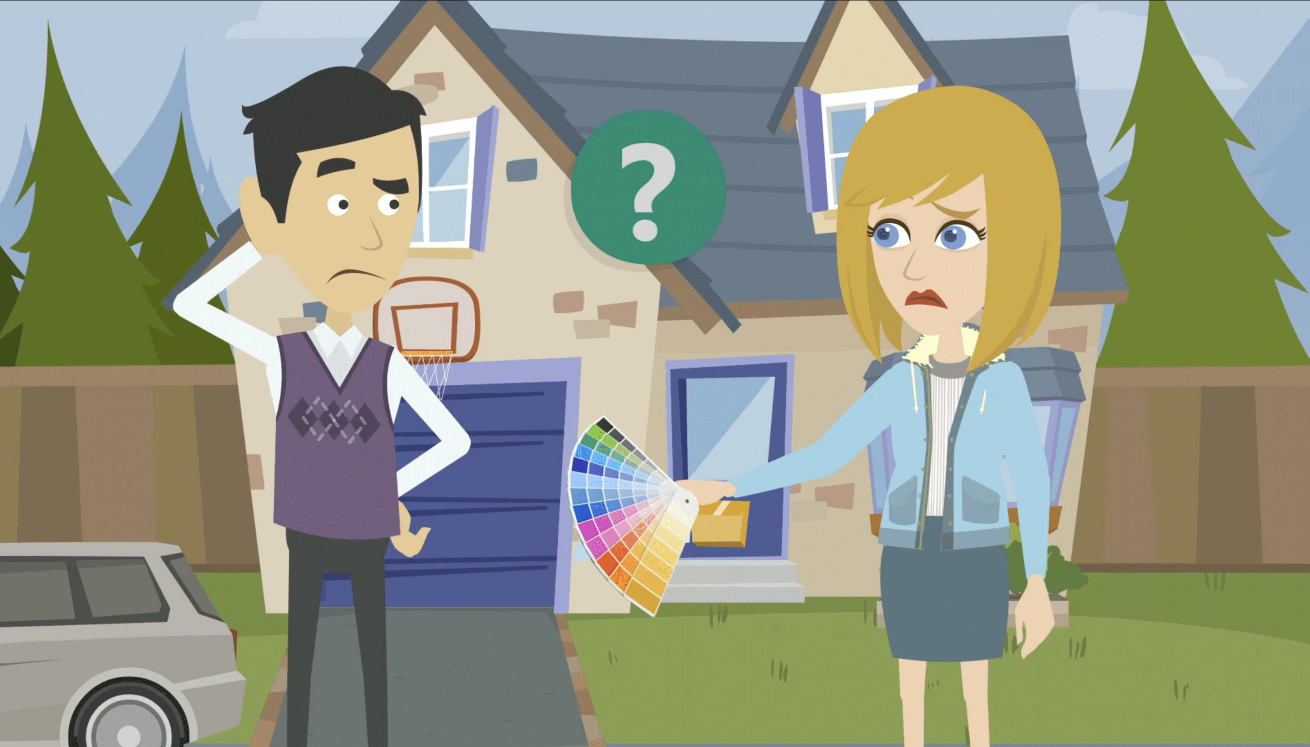
Large sample boards get tested on your actual walls, in your actual light
What a Home Painting Colour Consultation Actually Involves
A home painting colour consultation involves five stages: a goals discussion, a lighting assessment, undertone analysis, on-wall sample testing, and a written final palette. Each stage narrows your options in a logical order. A room that starts with dozens of possible whites usually ends with one clear answer. The whole process happens in your home, under your light, beside your own floors and furniture.
- Discovery and goals: The consultant asks how you use each room, what mood you want, and which colours you already dislike. Resale plans matter here, since preparing your home for sale calls for a different palette than a forever home.
- Lighting and exposure check: The consultant notes which way each window faces and how much direct sun enters. They also check the bulbs in your main fixtures.
- Fixed-element and undertone review: Flooring, countertops, brick, and tile rarely change. The consultant compares short-listed colours against these surfaces to expose hidden undertones.
- Large sample testing: The final candidates go on large primed boards placed on different walls. You view them in morning, afternoon, and evening light before you decide.
- Final palette delivery: You receive a written list of colours by room. It includes product line, sheen, and colour codes for walls, trim, ceilings, and doors.
The Discovery Stage of a Home Painting Colour Consultation
The discovery stage of a home painting colour consultation is where the consultant learns how your household actually lives in each space. A home office used all day needs different treatment than a bedroom used mostly after dark. Questions cover kids, pets, foot traffic, and cleaning habits, because these shape sheen choice as much as colour. Buyers painting a new house before move-in often want a whole-home plan in one visit.
Many homeowners bring inspiration photos from social media or our colour inspiration gallery. Those images help the consultant spot patterns in your taste. A steady pull toward warm whites or earthy greens tells them where to start. It also rules out whole colour families early, which keeps the session focused.
Why Lighting Changes How a Colour Reads in a Toronto Home
Lighting changes how a colour reads because paint only reflects the light that hits it. The same can of paint can look warm beige in a south-facing Leaside living room and flat grey in a north-facing basement. Toronto adds a seasonal twist to this. Winter brings shorter days and a lower sun, so north-facing rooms can feel cool and dim for months. A good consultant plans for the darkest season, not the sunny afternoon when you picked the chip.
| Window Exposure | How Natural Light Behaves | Typical Consultant Adjustment |
|---|---|---|
| North | Cool, indirect, and steady all day | Lean toward warmer undertones and lighter colours to offset the blue cast |
| South | Warm, strong, and bright for most of the day | Handles cooler or deeper colours well; pale shades can look washed out |
| East | Warm and bright in the morning, cooler by afternoon | Test samples at both times; balanced neutrals work well |
| West | Soft in the morning, intense orange glow late in the day | Avoid colours that turn too hot at sunset; judge samples in evening light |
Exposure is only half of the lighting picture. Trees, porches, and neighbouring homes also filter what reaches your walls. A south-facing room on a narrow Toronto lot can behave like a north-facing one if the house next door blocks the sun. That is why consultants judge the room in person and do not rely on a compass alone.
How Bulb Colour Temperature Shifts Paint Colour
Bulb colour temperature shifts paint colour because warm bulbs add yellow and cool bulbs add blue to every wall they light. Natural Resources Canada reports that most home LED bulbs fall between 2000 K and 6500 K. The same source notes that bulbs from 5000 K to 6500 K best mimic daylight. A warm bulb at the low end can turn a crisp white creamy. A daylight bulb can push a warm grey toward blue. Sometimes the right fix is a bulb swap, not a new colour.
What Undertone Analysis Actually Means
Undertone analysis means finding the subtle hue beneath a colour's main shade, like the green inside a greige. Undertones are hard to see on a small chip. They show up once the colour covers a full wall or sits next to a contrasting surface. A consultant finds them by comparing samples against pure white paper and against each other. That side-by-side view exposes what the chip alone hides.
| Colour Family | Common Hidden Undertones | Where the Undertone Shows Up |
|---|---|---|
| Whites | Yellow, blue, grey, or pink | Next to bright white trim or painted cabinets |
| Greys | Blue, green, or violet | North-facing rooms and near cool porcelain tile |
| Greige | Green, violet, or taupe | Beside warm oak floors or natural stone |
| Beige | Pink, yellow, or peach | Under warm bulbs and near red brick |
| Greens | Yellow, blue, or grey | Near natural wood and windows facing trees |
Why Fixed Elements Decide the Undertone
Fixed elements decide the undertone because floors, countertops, and brick cost far more to change than paint. A granite counter with pink flecks will fight a grey wall with a green undertone. Honey oak floors from the 1990s can make a cool grey look muddy. The consultant builds the palette around these finishes first. Paint is the flexible layer, so it adapts to everything else in the room.
Light Reflectance Value: The Number on the Back of the Chip
Light Reflectance Value, or LRV, measures how much light a paint colour reflects. It matters more than the colour name. Sherwin-Williams prints an LRV on every colour chip, on a scale from 0 (absorbs all light) to 100 (reflects all light). Most homeowners never look at it. Professional consultants check it early. A colour with a low LRV will read far darker across four walls than it does on a small card.
| LRV Band (HPT Working Guide) | How the Colour Behaves | Where We Often Use It |
|---|---|---|
| 70 and up | Bright and reflective; bounces light around the room | North-facing rooms, basements, and ceilings |
| 55 to 69 | Light to mid-tone; colour stays visible | Main living areas with average daylight |
| 35 to 54 | Mid-tone with real presence | Bright south or west rooms and dining rooms |
| Below 35 | Deep and moody; absorbs light | Accent walls, doors, cabinetry, and powder rooms |
These bands are a working guide our consultants use on Toronto jobs, not a strict rule. A basement with one small window almost always needs a higher LRV than the homeowner expects. Sheen also plays a part in how bright a colour feels. An eggshell or satin finish reflects more light than a flat finish. That extra reflection makes the same colour read slightly brighter.
Why Small Chips and Screen Previews Mislead Homeowners
Small chips and screen previews mislead homeowners because neither shows a full wall under your own light. A chip is a tiny printed patch viewed under store lighting. A phone or laptop screen creates colour with its own backlight, which paint cannot do. Both remove the two things that shape colour most: the size of the surface and the light falling on it.
- Area effect: Colours usually look lighter and more intense across a large wall than on a small chip. A soft sage can become a strong green once it covers a full living room.
- Metamerism: Two colours can match under one light source and look different under another. A paint matched to a sofa in a bright showroom may drift once it sits under your home's bulbs.
- Surrounding colour: The existing wall colour around a sample changes how the eye reads it. Testing a pale grey on a bright yellow wall gives a false result, which is why consultants use primed sample boards.
- Screen calibration: Every monitor displays colour a little differently. Online room visualizers help with a rough direction, but they are not a reliable final check.
This is the biggest gap in most online colour advice. The fix is simple but disciplined. Test large samples on neutral boards, move them around the room, and judge them over a full day. Colour decisions made this way hold up once the second coat goes on.
In-Person vs. Virtual Colour Consultations
In-person consultations are more accurate for undertone and lighting decisions. Virtual consultations are faster and suit simple projects or early planning. The difference comes down to what the consultant can actually see. Cameras adjust colour automatically, so photos rarely show a room's true light. A live visit removes that filter.
| Factor | In-Person Consultation | Virtual Consultation |
|---|---|---|
| Lighting assessment | Seen live from different angles and times | Based on photos, which cameras often colour-correct |
| Undertone matching | Samples held against real floors and counters | Limited by screen and camera accuracy |
| Sample testing | Large boards placed on your actual walls | Homeowner places samples after the call |
| Speed to book | Needs a site visit | Can often happen sooner |
| Best for | Whole-home repaints, tricky light, open-concept layouts | Single rooms, simple refreshes, early planning |
For most whole-home projects, in-person is the better choice. Open-concept main floors especially need a live look, since one colour must work under several light sources at once. Virtual sessions still earn their place. They suit condo owners, busy families, and anyone narrowing options before a site visit.
How to Prepare for Your Session
Preparing for your session means gathering a few photos, notes, and questions before the consultant arrives. Good preparation keeps the visit focused on decisions. It also gives the consultant a head start on your taste and your room conditions.
- Take daytime and evening photos of each room, with the lights both on and off.
- List the fixed finishes staying in place, such as floors, counters, tile, and brick.
- Collect a handful of inspiration images that match the mood you want.
- Note the colours you already dislike, since ruling colours out speeds up the process.
- Check the Kelvin rating printed on the bulbs in your main fixtures.
- Decide which rooms are in scope so the palette covers every connected space.

A Recent Colour Consultation in Leslieville
At a recent colour consultation in Leslieville, we fixed a north-facing living room where every grey looked cold and blue. The house was a semi-detached brick home with original plaster walls and newer white oak floors. The owners had already tested four greys. Each one turned steel blue by mid-afternoon.
We checked the fixtures first and found cool daylight bulbs in the ceiling lights. Those bulbs pushed every sample further toward blue. Our consultant pulled three warmer greige options and tested them on large primed boards over two days. The winner was Benjamin Moore Classic Gray (OC-23), which stayed soft and warm against the oak floors.
We specified it in Benjamin Moore Regal Select Interior in Eggshell for the walls. A brighter white on the trim added crisp contrast. The owners also switched their ceiling bulbs to a warmer rating, which kept the palette consistent after dark. Before painting, our crew took surface temperature readings on the exterior-facing walls in late fall. The coldest wall read 16°C, which sits above the 10°C minimum listed on Benjamin Moore's technical data sheet for Regal Select.
That temperature check matters on older Toronto brick homes. Exterior walls can run much colder than the room air, which affects how paint levels and cures. The finished room now reads calm and warm in every season. The owners stopped second-guessing their colour choice the day the first coat went on.
What You Walk Away With After a Colour Consultation
After a colour consultation, you walk away with a written, room-by-room palette naming each colour, product line, and sheen. This document removes guesswork on painting day. It also gives your estimator a precise scope to price. Here is what a complete palette should include.
- Colour names and codes for walls, ceilings, trim, doors, and accent features.
- Product line picks matched to each room's traffic and moisture, such as a scrubbable finish for hallways and a moisture-resistant product for bathrooms.
- Sheen recommendations by surface, for example eggshell walls, flat ceilings, and semi-gloss trim.
- A flow plan showing how colours connect between open or adjoining rooms.
- Notes on any bulb changes or lighting tweaks that support the palette.
- A clear scope that can include kitchen cabinet painting or condominium and apartment painting if they are part of the plan.
Once the palette is set, the next step is pricing the painting work itself. HPT publishes the interior ranges below in CAD plus HST. Your final estimate depends on room size, wall condition, and the number of coats needed.
| Interior Area | Typical Range (CAD + HST) |
|---|---|
| Living or dining room | $400–$900 |
| Bedroom | $400–$800 |
| Bathroom | $250–$500 |
| Trims, doors, and baseboards | $700–$1,200 |
| Ceilings | $1,000–$1,300 |
For a quick ballpark, try our interior painting calculator. Our interior painting in Toronto comes with a lifetime warranty on interior painting. Every interior residential painting crew we send is WSIB compliant and fully insured. The palette you choose gets applied with warranty-backed work from prep to final coat.
Home Painting Colour Consultation FAQs
Yes, a colour consultation is worth it for most repaints because it prevents repainting a room in the wrong shade. Extra sample pots and repeat labour add up quickly. A consultant also catches undertone clashes with floors and counters before they become permanent. At HPT, the consultation is free, so the only investment is a short visit.
Most in-home colour consultations fit into a single visit, and the length depends on how many rooms are in scope. A single bedroom moves quickly. An open-concept main floor with connected hallways takes longer because every colour must flow into the next. Sample testing then continues for a day or two while you view the boards in different light.
At Home Painters Toronto, our interior painting specialists offer free colour consultations to homeowners planning a project. Policies vary between companies, so ask before you book elsewhere. Some firms charge a flat fee and credit it toward the job. Others only offer colour help once a contract is signed.
Yes, a colour consultant can build a palette around existing floors, cabinets, tile, and countertops. This is one of the main reasons to book one. The consultant holds samples directly against these surfaces to check undertones. If your cabinets are also getting refreshed, the palette can cover them too. That way, walls, trim, and cabinetry get chosen as one system.
Paint looks different on the wall because a full wall reflects far more light than a small chip. Your home's light also differs from store lighting. Large areas usually make colours look lighter and more intense. Bulb colour temperature and window direction shift the tone further. Testing large samples in your own rooms is the only reliable check.
Yes, exterior colour consultations follow the same process but focus on fixed features like roofing, brick, stone, and windows. Outdoor daylight is far stronger than indoor light, so exterior colours often read lighter than the chip. Our team helps pick tones for exterior house painting and exterior brick staining. For both, colour must suit the street as well as the house. Samples get judged from the curb, not just up close.
Getting the Most From Your Home Painting Colour Consultation
The best home painting colour consultation combines lighting checks, undertone analysis, LRV review, and large sample testing in your own rooms. Skip any of those steps and the colour on the wall may not match the one you pictured. Home Painters Toronto has served Toronto and the GTA since 1991 and has painted 20,000+ homes across the region. Our founder, Brian Young, brings four decades of painting industry experience, and our client reviews show that experience on real projects. You can also read why homeowners choose Home Painters Toronto.
Ready to settle on a palette and get your project on the calendar? Book your free colour consultation with our WSIB-compliant, fully insured team. Count on fast, free quotes and warranty-backed work across Toronto and the GTA.

Ready to settle on a palette and get your project on the calendar? Book your free colour consultation with our WSIB-compliant, fully insured team.
Contact Home Painters Toronto