

Toronto homes are full of surfaces that never get painted, from the orange-red clay brick of a Leaside semi to the grey limestone sills on a Rosedale Georgian. When you repaint trim, soffits, siding, or a front door, the new colour has to live beside those fixed materials for years. Matching paint to brick and trim is the step most repaints get wrong, because a chip that looks perfect indoors can turn pink, green, or chalky once it sits next to real masonry in daylight. At Home Painters Toronto, a family-run company serving Toronto and the GTA since 1991, our crews solve this problem on almost every exterior job, and it shows in our 1,200+ positive reviews and our HomeStars Best of Award 2026. This guide explains how professional painters read undertones, test samples, and custom-tint colour so the finished house looks planned from the curb.
Home painting companies match new paint to existing brick, trim, and stone by reading the masonry's undertone, testing large painted samples directly against the real surface in morning and afternoon light, comparing light reflectance values, and custom-tinting when stock colours miss. The homeowner approves the final colour on the house before production painting starts.
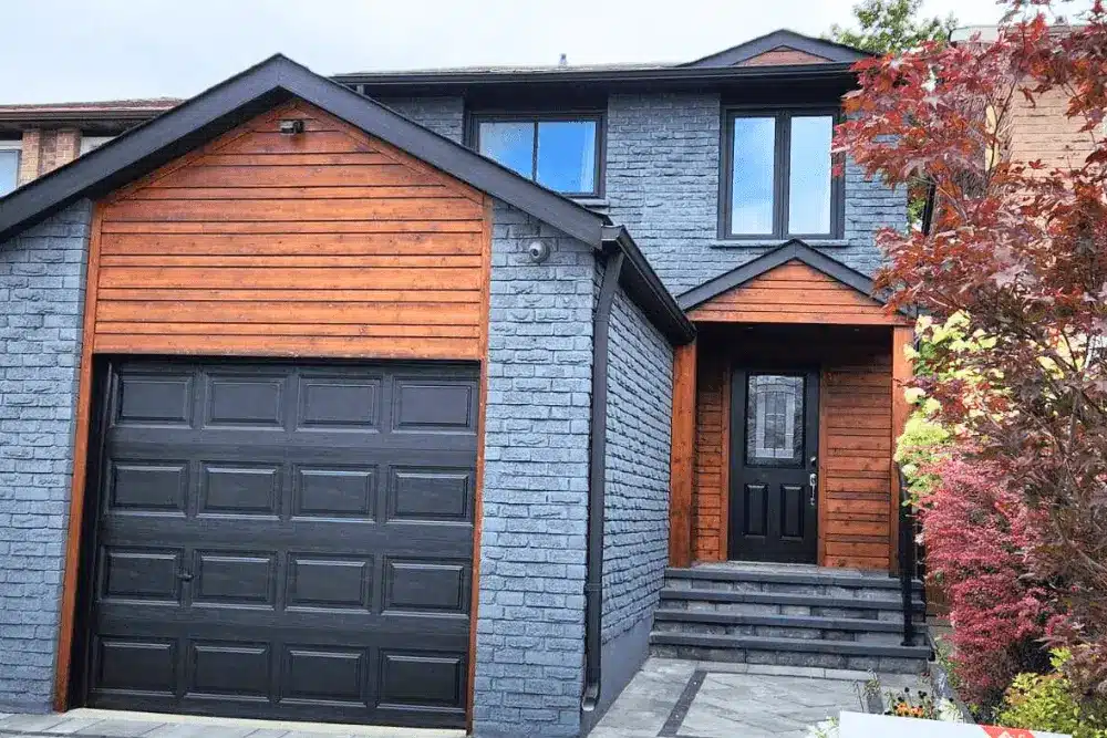
Why Matching Paint to Unpainted Brick and Stone Is a Technical Challenge
Matching paint to unpainted brick and stone is a technical challenge because masonry has a fixed, multi-toned colour that can't be changed, so every new paint colour must be chosen to fit it. A single brick wall is never one colour. Each unit carries flashing from the kiln, and the mortar joints add a second colour across the whole face. Stone adds veins, iron spots, and weathering that shift from course to course.
Sheen makes the gap wider. Brick and stone are dead flat, while exterior paint always carries some gloss. Benjamin Moore's technical data sheet lists Aura Exterior Low Lustre at 9 to 15 gloss units at a 60-degree angle, so even a low-sheen trim paint reflects light that the brick beside it absorbs. That reflection can make a well-chosen colour look a shade lighter than planned.
Toronto's housing stock raises the difficulty. Many pre-war homes in Riverdale, Leslieville, and the Annex use soft clay brick that ranges from salmon to deep plum on one elevation. Postwar bungalows in Scarborough and North York often pair buff brick with pink or grey stone veneer. Each mix pushes the right exterior painting colour in a different direction, and no single "safe" white works for all of them.
How Professionals Read Undertones in Brick and Stone
Professionals read undertones in brick and stone by holding neutral white and grey reference cards against the masonry in daylight, which exposes the hidden yellow, red, pink, blue, or green base under the main colour. The reference card acts like a control sample. Next to pure white, a "red" brick often reveals itself as orange-based or violet-based. That one reading decides whether trim should lean warm or cool.
We read at least three spots on each elevation. Sun-faded bricks on a south wall can read two steps warmer than shaded bricks on the north side. Stone gets read at its darkest vein and its lightest field, since trim often looks best when it borrows from one of those extremes.
| Masonry Type | Common Undertone | Paint Direction That Works | Paint Direction That Clashes |
|---|---|---|---|
| Orange-red clay brick | Yellow-orange | Creamy whites, warm greys, deep olive or black-green | Blue-whites, icy cool greys |
| Deep red or plum brick | Red-violet | Warm charcoal, soft putty, muted navy | Yellow-beige, orange-based tans |
| Buff or tan brick | Yellow | Warm taupe, bronze, dark brown trim | Pure white, pink-beige |
| Grey or pewter brick | Blue or green | Soft white, cool charcoal, slate blue | Yellow creams |
| Limestone sills and lintels | Warm grey to yellow | Warm off-whites, greige, black | Bright optical white |
| Mixed fieldstone | Several at once | Trim pulled from the darkest stone | Any colour matched to one single stone |
Why Mortar Colour Changes the Undertone Reading
Mortar colour changes the undertone reading because the joints frame every brick, so grey Portland cement mortar cools the whole wall while buff or lime-based mortar warms it. Two houses with identical brick can need different trim colours for this reason alone. Repointed patches cause a second problem. New mortar is often lighter than the original, which creates a blotchy base that no paint colour can hide. We flag these areas early, and our brick and mortar repair crew can tone new joints to blend with the old ones before colour selection begins.
Why Paint Looks Different Against Brick Than on a Swatch
Paint looks different against brick than on a swatch because of three effects: simultaneous contrast from the surrounding masonry, the changing colour of daylight, and the tiny size of the chip. Most homeowners blame the paint store when this happens. The real cause is how the eye reads colour in context.
Simultaneous contrast is the biggest factor. A warm red wall pushes the colour beside it toward its opposite, so a neutral grey trim can read slightly green next to orange-red brick. Large areas also read lighter and more saturated than a small chip held in the hand. A soft greige chip can look almost white once it covers a full fascia board.
Daylight shifts through the day as well. Morning light on an east wall is cooler, and late afternoon light on a west wall is warmer and more orange. A colour that works at 10 a.m. may clash at 5 p.m. Two paints can also match under one light and split apart under another, an effect colour scientists call metamerism. Browsing a colour inspiration gallery is a good way to narrow a direction, but only an on-site test confirms a match.
Light Reflectance Value and Masonry Contrast
Light reflectance value (LRV) measures how much light a colour reflects on a scale from 0 for black to 100 for white, according to Benjamin Moore. Comparing the LRV of a trim colour with the darkness of the brick tells a painter how much contrast the finished house will show. A very high LRV white against dark plum brick can glare, while a mid-range cream softens the frame.
LRV also matters for metal and plastic trim. Benjamin Moore's Aura Exterior data sheet warns against painting vinyl siding any colour with an LRV under 55 unless the colour is on its approved vinyl palette, because darker colours absorb heat and can warp the siding. That rule changes the options when a brick home has vinyl or aluminum siding painting in the scope.
The Step-by-Step Professional Colour-Matching Process
The professional colour-matching process runs in six steps: site assessment, undertone reading, fan deck shortlisting, painted sample boards, a two-light review, and written sign-off before production painting. Each step removes one type of guesswork.
- Site assessment: we photograph every elevation, note which surfaces stay unpainted, and record the orientation of each wall.
- Undertone reading: we hold neutral reference cards against the brick, mortar, and stone and note the base tone of each.
- Fan deck shortlist: we pull three to five candidate colours per surface, checking each one's published LRV.
- Painted sample boards: we paint two coats of each candidate on large boards in the actual exterior product and sheen.
- Two-light review: we view the boards against the masonry in morning and late afternoon light, and from the street.
- Written sign-off: the homeowner approves the final colours, product, and sheen in writing before any wall gets painted.
Matching Paint to Brick and Trim With On-Site Sample Boards
On-site sample boards are the most reliable way to match paint to brick and trim, because they show the real colour, in the real sheen, beside the real masonry. We paint boards in the exact product the job will use, since an interior sample pot can dry to a slightly different colour and gloss. Each board gets moved from the brick field to the window frame to the door surround. Homeowners often change their pick at this stage, and that is the whole point of the step.
Film build matters too. Benjamin Moore's Aura Exterior technical data sheet lists a recommended wet film of 4.6 to 6.4 mils, which dries to 2.1 to 2.9 mils. A thin sample coat can look lighter and patchier than the finished wall, so our boards use the same film thickness as production work. That consistency is part of how our exterior residential painting crews keep the approved colour and the final colour identical.

Custom Tinting When Stock Colours Miss the Mark
Custom tinting is the fix when no stock fan deck colour sits correctly beside the masonry, so the paint store adjusts the colourant formula until the new colour bridges the gap. Most adjustments are small. A cream may need a touch less yellow to stop fighting pink brick, or a charcoal may need a hint of brown to pick up the warm tones in a sandstone lintel.
Deep custom colours need extra planning. Benjamin Moore notes that certain custom colours require a deep-colour base primer tinted to a special formula to reach full hide. Skipping that primer can leave a door or fascia looking uneven after two coats. We confirm the primer system with the retailer before the order is placed.
We never chip a homeowner's brick to get a sample. A loose brick from the garage, a spare piece of stone from a past project, or a clean section of a sill gives the store enough surface to read.
Spectrophotometer Readings vs. the Human Eye
A spectrophotometer reading gives a fast starting formula, but the human eye makes the final call because the device averages colour and ignores texture. Point a spectro at a mottled brick, and it returns one flat colour that exists nowhere on the wall. Rough stone scatters light in ways a smooth paint film never will. We use the reading to land in the right family, then refine by eye with painted boards on site.
Common Colour Mismatches on GTA Homes
The most common colour mismatches on GTA homes are cool whites against warm red brick, beige trim that fights pink-toned brick, and trim colours matched to a single stone instead of the whole wall. Each one has a clear cause and a clear fix.
| Mismatch | What Happens | Professional Fix |
|---|---|---|
| Blue-white trim on orange-red brick | Trim reads cold and stark; brick looks dirty | Warm off-white or soft cream with a yellow base |
| Yellow-beige trim on plum brick | Trim looks jaundiced; brick looks purple | Warm grey, putty, or muted charcoal |
| Bright white caulk lines on dark brick | Every joint around windows becomes a visible stripe | Colour-matched sealant tinted to the trim or brick |
| Orange-toned door stain on red brick | Door and brick compete; neither reads as the focal point | Deeper walnut stain or a painted door in a contrasting hue |
| Trim matched to one stone in fieldstone | Trim looks like a mistake beside the other stones | Pull trim from the darkest recurring stone tone |
| Glossy trim beside flat limestone | Trim flashes in sunlight and looks cheap | Drop to low lustre or satin on large trim surfaces |
Caulking is the mismatch most homeowners never notice until it's done. Our exterior caulking work uses sealant colours chosen with the trim, so window perimeters read as clean lines and not white outlines. Front doors deserve the same care, and our front door restaining and refinishing service tests stain tones against the brick before the full door is coated.
How Long a Colour Match Holds Up in Toronto Weather
A well-chosen colour match holds up for years on a Toronto home, but brick and paint age at different speeds, so the match drifts slowly over time. Brick colour is fired into the clay and barely changes. Paint pigments fade under sunlight, and the south and west elevations fade first.
Toronto sun is stronger than many homeowners expect. Environment and Climate Change Canada reports that southern Ontario records the country's highest UV Index values, reaching 11 and on rare occasions 12. That exposure is why we favour premium acrylic exterior coatings with strong fade resistance for trim that sits next to unpainted brick.
| Surface | How It Ages in Toronto | Effect on the Colour Match |
|---|---|---|
| Clay brick | Colour stays stable; surface darkens slightly with dirt | Trim looks lighter over time unless the brick is cleaned |
| Limestone and sandstone | Weathers and can darken in wet areas | Warm trim holds its match better than stark white |
| South and west trim paint | Fades fastest from UV exposure | May need a refresh coat before north and east walls |
| Brick stain | Penetrates masonry and resists peeling | Holds colour evenly across the whole wall |
Our exterior painting carries a 3-year warranty, and our brick staining carries a 15-year warranty. For homeowners who want the brick itself to shift toward the trim, exterior brick staining changes the masonry colour without forming a film. Our guide on how long brick stain lasts covers what to expect in GTA freeze-thaw conditions.
Our Recent Colour-Matching Project in Leaside
At a recent exterior repaint on a 1940s semi-detached home in Leaside, our crew matched new trim, soffit, and door colours to orange-red clay brick with grey Portland mortar and limestone window sills. The homeowners had picked a crisp blue-white from a chip at home. On our sample boards, that white turned stark and pushed the brick toward orange.
We tested three warmer whites against the brick at 9 a.m. and 4 p.m. The homeowners chose Benjamin Moore White Dove OC-17 in Aura Exterior Low Lustre for the fascia and soffits. For the front door, we used Benjamin Moore Kendall Charcoal HC-166 in Aura Exterior Semi-Gloss, which picked up the grey in the mortar and anchored the entrance.
Before priming, our moisture meter read 11 percent on the wood fascia, and the surface temperature read 9 degrees Celsius. Both sat inside safe limits, since the Aura data sheet sets a minimum application temperature of 1.7 degrees Celsius. Our wet film gauge confirmed 5 mils per coat, within Benjamin Moore's recommended range. Two rotted fascia sections were replaced by our soffit and fascia carpenters first, so the new colour went onto sound wood.
The finished house looks like the trim was designed around the brick, because it was. Our crew on that job was WSIB compliant and fully insured, and the homeowners received warranty-backed work under our 3-year exterior warranty. More results like this appear in our painting projects portfolio.
Matching Paint to Brick and Stone FAQs
Warm off-whites, soft creams, and warm charcoals usually suit red brick best in Toronto. The right choice depends on whether your brick leans orange or violet. Orange-based brick pairs well with creamy whites, while violet-based brick looks better with warm greys. Always confirm the choice with a painted sample board on the house.
Your sample looks pink because the red brick is shifting how your eye reads the colour beside it. This effect, called simultaneous contrast, is strongest with beige and greige colours that already carry a red base. Moving to a colour with a yellow or green base usually cancels the pink cast.
Yes, painters can custom-tint paint to coordinate with stone. A spectrophotometer reading of a clean stone sample gives the paint store a starting formula. The painter then refines it with sample boards viewed against the actual stone in daylight.
Your front door should almost always contrast with your brick. A door that matches the brick disappears into the wall. Deep charcoals, navy, black-green, and rich wood stains give the entrance a clear focal point on most GTA brick homes.
Repainting trim on a brick house in Toronto typically falls in the small exterior range of $2,000 to $4,000 plus HST, based on Home Painters Toronto's published pricing. Larger scopes that add siding, soffits, and doors usually move into the $4,000 to $8,000 plus HST medium range. Carpentry repairs and custom-tinted colours can affect the final quote.
Staining your brick is better when no trim colour can make peace with the existing masonry. Brick stain changes the masonry colour while letting it breathe, and our small to medium brick staining jobs run $4,000 to $6,000 plus HST. Standard latex brick painting can trap moisture, so we recommend breathable mineral-based coatings when paint is the goal.
Getting a Cohesive Look Across Painted and Unpainted Materials
A cohesive look across painted and unpainted materials comes from treating the brick and stone as the fixed palette and building every paint colour around them. Undertone readings, large sample boards, LRV checks, and custom tinting all serve that one goal. Skipping any of them is how a house ends up with trim that fights its own walls.
Founder Brian Young has worked in the painting industry since 1987, and our team has painted 20,000+ homes across Toronto and the GTA. That volume means we have likely matched colour to brick very much like yours. You can read what homeowners say about our process in our client reviews.

Ready to see real colour samples against your own brick and stone? We offer fast, free quotes and warranty-backed work on every exterior project across Toronto and the GTA.
Contact Home Painters Toronto