

A house painting visualizer is the first stop for many Toronto homeowners who want to preview a new colour before buying paint. You upload a photo, tap a wall, and the app repaints a room or the front of your house in seconds. That preview is useful, but it is not the colour that will dry on your drywall, plaster, brick, stucco or aluminum siding. As part of our house painting guide, this article explains where visualizer apps help, where they mislead, and how real samples close the gap. It draws on what our crews at Home Painters Toronto see on real jobs every week, and our work is backed by more than 1,200 positive reviews on HomeStars, Google and Houzz.
Visualizer apps are accurate enough to shortlist paint colours but not to pick the final one. Screen settings, photo exposure and room lighting all shift how a colour appears, and paint makers say so in their own disclaimers. Use the app to narrow the field to three colours, then judge large painted samples in morning and evening light.
House Painting Visualizer vs Real Samples: Which Is More Accurate?
Real paint samples are more accurate than any house painting visualizer. A sample shows the actual pigment, sheen and texture under your home's own light. A visualizer only shows a digital estimate of that colour on a screen. Both tools still have a job to do. The table below shows where each one fits in a colour decision.
| Tool | Example | Best For | Main Limit |
|---|---|---|---|
| Visualizer app | Benjamin Moore Colour Portfolio app, Sherwin-Williams Colour Expert app | Cutting hundreds of colours down to a short list | Screen and camera distort the colour |
| Colour-matching device | Benjamin Moore ColorReader | Matching fabric, tile or an existing wall to a paint colour | Reads a colour but does not show it in your room |
| Colour chip | Sherwin-Williams 2 x 3 inch chips | Comparing undertones side by side | Too small to judge a full wall |
| Peel-and-stick sample | Sherwin-Williams 8 x 8 inch sheets | Moving one colour from room to room | No true sheen or wall texture |
| Brushed sample board | Two coats of the real product on a primed board | Final decision on walls, trim or siding | Needs a day to prepare and dry |
Benjamin Moore reports that its ColorReader devices match colours with over 90% accuracy when paired with the Colour Portfolio app. That figure covers reading a physical surface, not showing a colour on a phone. The same Benjamin Moore page notes that on-screen colours can vary from the actual paint. Treat every app preview as a draft, never as the final answer.
Visualizers still earn their place early in a project. They are fast, free and good at a few specific jobs:
- Ruling out colours you dislike within seconds
- Testing door, trim and accent wall combinations
- Giving everyone in the household a shared starting point
- Saving exact colour names and codes to pass to your painter
Where they fall short is undertone, sheen and how a colour behaves in your specific rooms. Those three details decide whether you love a colour or repaint it. Only paint on a real surface can show them.

Why Visualizer Apps Often Miss the Real Colour
Visualizer apps miss the real colour because a screen gives off light, while paint only reflects the light that falls on it. That one difference changes brightness, contrast and undertone. Sherwin-Williams states on its Paint Color Visualizer page that actual colour may vary from the on-screen version. The company advises checking a physical chip or painted sample before buying. When the paint makers add that warning to their own tools, homeowners should take it seriously.
Why a Paint Colour Visualizer Can't Calibrate Your Screen
A paint colour visualizer has no control over the screen it runs on. Phones, tablets and laptops ship with different colour profiles, brightness levels and night-time warm filters. The same greige can look pink on one device and green on another. Photo exposure adds a second error, because a phone camera brightens dark rooms and corrects white balance on its own.
We see the result on estimates every season. A homeowner shows us a soft grey on a phone, and the brushed sample reads two shades darker on the wall. Nothing is wrong with the paint. The screen simply told a brighter story.
Sheen, Texture and Film Depth Never Show on a Phone
Sheen changes colour, and no app can show it accurately. A flat finish absorbs light and reads slightly deeper. Satin and semi-gloss bounce light back and look lighter at an angle. Texture matters too, since orange-peel drywall, stucco and rough brick scatter light differently from the smooth wall in an app's sample scene.
Two full coats also build film depth that a thin digital layer cannot copy. Our guide on how many coats of paint a house needs explains why one coat rarely shows the true colour. A single coat over an old colour lets the base tone bleed through. The finished wall then looks different from both the app and the chip.
How Toronto Daylight and LED Bulbs Change Paint Colour
Toronto light changes paint colour through the day, because the colour temperature of daylight and indoor bulbs shifts the undertones you see. Natural Resources Canada's ENERGY STAR lighting fact sheet classifies bulbs at 3,000 K or lower as warm and yellowish. It classifies bulbs at 4,000 K or higher as cool and bluish. A typical incandescent bulb sits near 3,000 K on the same scale.
| Light Source | Colour Temperature | Typical Effect on Paint |
|---|---|---|
| Warm white LED or incandescent | 3,000 K or lower (NRCan) | Pushes whites toward cream and warms greys and beiges |
| Cool white LED | 4,000 K or higher (NRCan) | Pulls greys toward blue and can make whites look stark |
| North-facing daylight | Changes with sky and season | Cool, even light that deepens greys, blues and greens |
| South-facing daylight | Changes with sky and season | Strong, warm light that can wash out pale colours |
A visualizer preview ignores all of this unless you photograph the room under each light. Even then, the camera adjusts the image to look neutral. Swapping warm bulbs for cool ones after painting can turn a creamy white noticeably grey. If new light fixtures are coming, install them before the final colour decision.
North-Facing Rooms Under a Grey Toronto Sky
North-facing rooms in Toronto get cool, indirect light for most of the year. That light deepens greys and blues and can make a warm white look flat. South-facing rooms get stronger, warmer sun that flatters cool colours. In winter, low sun and snow glare can bounce extra light into ground-floor rooms.
Light Reflectance Value, or LRV, helps with dim rooms. Benjamin Moore lists an LRV for its colours on a scale from 0 for black to 100 for pure white. A colour with a higher LRV reflects more light back into the room. An app may display that number, but it cannot show how the colour feels on a grey January afternoon.
Exterior Visualizer Previews vs Brick, Stone and Roofing
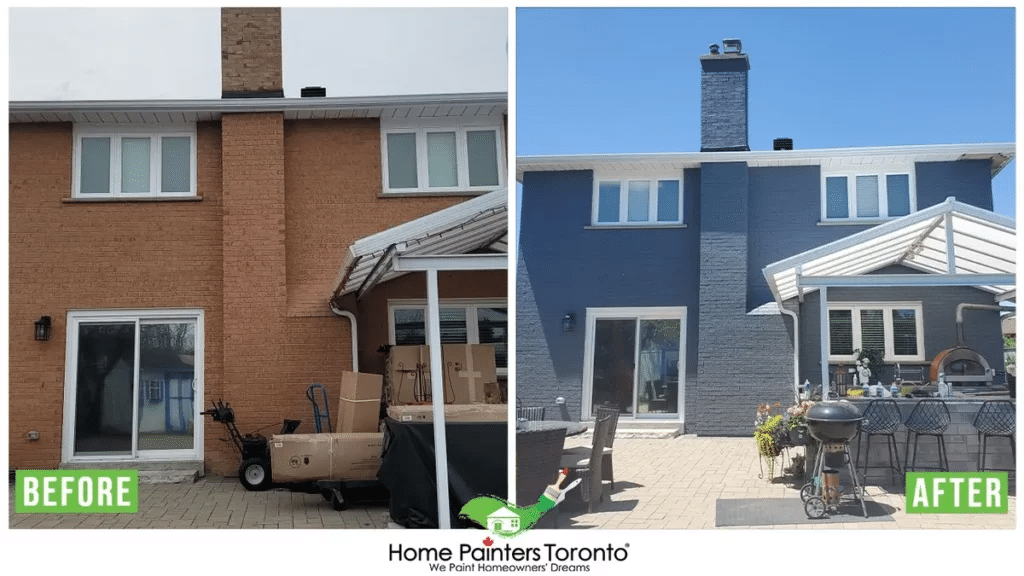
Exterior visualizer previews are less reliable than interior ones, because fixed materials like brick, stone and shingles control how the new colour reads. Toronto homes mix red and orange clay brick, buff brick, stone sills and asphalt roofs. A phone photo often flattens those fixed materials into one muddy tone. The new trim colour then looks balanced on screen and clashes in daylight.
Our article on matching paint to brick, trim and stone covers the undertone checks we use on site. Distance matters as well. Colours read lighter from the street than on a sample at arm's length. A mid-tone often works better than a very pale one. Before you commit to dark exterior paint colours, view the samples against the brick in full sun and in shade.
Masonry adds another twist. Exterior brick staining changes the brick itself, so a visualizer handles it poorly. Stain soaks into the masonry and does not form a surface film. The final tone depends on how porous each brick is. A test patch on an inconspicuous wall shows the real result.
Aluminum and vinyl siding add one more variable. Factory finishes have a sheen and texture that a photo cannot capture, and a new coating changes both. Ask to see a sample panel before you approve aluminum siding painting or any larger exterior painting in Toronto project.
The Real Cost of Choosing a Colour From a Screen
Choosing a colour from a screen alone can cost a full repaint. Our published range for one living or dining room is $400 to $900 plus HST. A few sample boards cost very little next to that. The table below shows our published ranges for the work a wrong colour can trigger. These are ranges, not quotes, and your house painting estimate will reflect your home's size and condition.
| Colour Mistake | Work to Correct It | Typical Range (CAD + HST) |
|---|---|---|
| Bedroom colour reads too dark | Repaint one bedroom | $400 to $800 |
| Living or dining room undertone clashes | Repaint one living or dining room | $400 to $900 |
| Trim colour fights the new walls | Repaint trims, doors and baseboards | $700 to $1,200 |
| Small exterior scheme fails | Repaint a small exterior | $2,000 to $4,000 |
| Medium exterior scheme fails | Repaint a medium exterior | $4,000 to $8,000 |
A redo also costs time. A colour fix means a second round of protection, prep and drying inside the home. Exterior corrections have to wait for suitable weather, which can push a fix into the next season. Two or three brushed samples prevent most of these redo jobs.
The free app is not the expensive part of a colour decision. The expensive part is skipping the step that comes after it. A short sampling round protects the larger investment in labour and premium paint.
How to Turn a Visualizer Shortlist Into a Final Colour
A visualizer shortlist becomes a final colour through five steps: narrow, sample, check the light, compare finishes and wait a day. Each step removes one source of error that a screen cannot. Your painter should handle the sample boards, so the test uses the same product and sheen as the job. The steps below describe the decision, not the painting.
- Shortlist three colours in the app. Use the visualizer to rule colours out, not to pick a winner. Three finalists keep the sample stage quick.
- Sample at full size. We brush sample boards about 2 feet by 2 feet with two coats of the real product. Peel-and-stick sheets work well for quick checks from room to room.
- Check morning, afternoon and evening light. Look at each sample in daylight with the lamps off, then at night under your own bulbs. Note which colour holds its undertone in both.
- Hold samples against fixed finishes. Place each board beside trim, flooring, countertops, brick or roofing. Those fixed materials decide more than the chip does.
- Wait 24 hours before deciding. A colour that still feels right the next evening is usually the one to book.
Ask a few questions before samples go up. The answers tell you whether the colour you approve is the colour you will get:
- Will samples use the same product and sheen as the job?
- How large will the sample boards be?
- Will the approved colour name and code appear in the written quote?
- Who signs off on the colour before painting starts?
For ideas before you open an app, browse our interior colour inspiration page. If you are planning interior painting across several rooms, run one sampling round for the whole floor. That way the colours flow from room to room.
House Painting Visualizer FAQs
Paint colour visualizer apps are accurate enough to compare options but not to make a final choice. Your screen settings, the photo's exposure, and your room's light all shift the colour you see. Sherwin-Williams and Benjamin Moore both warn that on-screen colour can differ from the real paint. Confirm any shortlist with a physical sample.
Paint looks different on a phone because the screen gives off light while the wall only reflects it. Phones also brighten photos and adjust white balance automatically. Sheen and wall texture never show up on a screen. The painted wall is always the true reference.
The best exterior visualizer comes from the paint brand you plan to use. Its colour library matches the product your painter will buy. Benjamin Moore's Color Portfolio app and the Sherwin-Williams visualizer tools both let you upload a photo of your house. An overcast-day photo keeps brick and roof colours closer to life. Confirm the shortlist with sample boards held against the brick.
A photo can get you close to a paint colour, but it rarely gives an exact match. Lighting and camera processing change the colour values in the image. A colour-reading device placed on the real surface, such as Benjamin Moore's ColorReader, gives a much closer match. A paint store can also scan a physical chip of the existing paint.
A paint sample should be large enough to judge from across the room, and our crews use boards about 2 feet by 2 feet. Small chips are fine for comparing undertones side by side. Sherwin-Williams' 8 x 8 inch peel-and-stick samples are handy for moving between rooms. For exteriors, view each sample from the street as well as up close.
Professional painters use visualizer apps to help homeowners narrow choices, not to approve final colours. At Home Painters Toronto, we treat the app as a starting point during the estimate. Final colours are confirmed on brushed samples and written into the quote by name and code. That record protects both the homeowner and the crew.
Using a House Painting Visualizer the Right Way
The right way to use a house painting visualizer is as a filter for your shortlist, followed by real samples for the final choice. Screens, cameras and Toronto light all bend colour in ways an app cannot predict. Large brushed samples, checked at different times of day, show the colour you will actually live with. That two-step approach costs little and avoids an expensive repaint.

Bring your visualizer shortlist to your estimate, and we will test it on your walls with real paint. Get fast, free quotes and warranty-backed work on every project.
Contact Home Painters Toronto