

How To Brighten Up A Dark Room With Paint
Brightening up a dark room with paint is one of the fastest and most cost effective interior transformations available to Toronto homeowners, because the right colour and finish combination can make a north facing room feel dramatically lighter without any structural changes. Home Painters Toronto, the HomeStars Best of Award 2026 winner with over 1,200 positive reviews and 37 years serving the GTA, has transformed dark rooms across homes in North York, Etobicoke, Leaside, and Riverdale using colour and sheen strategies that go well beyond simply choosing a lighter white. Paint can do wonders when refining the mood and atmosphere of a room, and the right colour choice turns a cold, sombre space into something vibrant and welcoming. This guide covers the science behind it and the specific strategies that work in Toronto homes.
Paint can do wonders when refining the mood and atmosphere of a room. The right paint colours can breathe new life into a dim space, turning it from cold and sombre into vibrant and welcoming. Most people prefer brighter rooms because natural brightness lifts mood and makes a space feel more generous and open. Whether it be bright art pieces or carefully selected interior paint colours, more homeowners are focusing on how light works in their spaces.

The contrast in sheen between eggshell walls and semi gloss trim creates a crisp, light-reflecting boundary that makes windows feel brighter — the single most underused technique for transforming a dark Toronto room.
Why Dark Rooms Are So Common in Toronto Homes
Toronto's housing stock creates specific dark room conditions that warmer climates do not produce at the same frequency. Homes in established neighbourhoods like The Annex, Leaside, East York, and North York are often semidetached or built close together on narrow lots, which limits side window light penetration. North facing rooms in these homes receive little to no direct sunlight at any time of year. In winter, when Toronto sees only 3 to 4 hours of meaningful daylight in December and January, even south facing rooms feel dim without the right colour choices amplifying available light.
Older homes also have smaller window openings than modern construction, which compounds the problem. A room that might feel adequately lit in summer can become uncomfortably dark by November. Paint colour and finish selection is the most accessible tool for addressing this condition, and it works more effectively than most homeowners expect when the right approach is applied.
Understanding the Basics of Colour for Brightening Dark Rooms
Lighter colours make a room feel brighter and larger because they reflect light rather than absorb it. Darker hues absorb light and make spaces feel smaller and cosier. The key to brightening a room with paint is choosing a colour that reflects as much available light as possible back into the space.
Light Reflectance Value (LRV) is the technical measure of how much light a colour reflects, expressed as a percentage from 0 (absolute black) to 100 (pure white). Colours with an LRV above 70 are considered light reflecting and work well in dark rooms. Most professional paint brands, including Benjamin Moore and Sherwin Williams, publish LRV data on their colour chip packaging and product pages, which makes it easy to compare options before committing.
How to Brighten Up a Dark Room with Paint: The Professional Approach
Shade selection for a dark room begins with choosing light colours: whites, creams, light greys, and pastels all perform well as the primary wall colour in low light spaces. The undertone within that light colour matters as much as the lightness itself.
Cool undertones (blue and green) tend to recede visually, creating the perception of more space and reflecting the grey blue quality of northern light accurately. Warm undertones (red, yellow, and orange) project toward the viewer and create a more intimate, cosy feeling. For a true brightening effect in a north facing Toronto room, cool to-neutral undertones produce the most impactful result. For a south facing room where warmth is desired rather than brightness, warm whites and cream tones perform better.
Paint finish affects how much light a surface reflects as much as the colour does. High gloss paints reflect the most light but show wall imperfections under any raking light, which makes them unsuitable for most wall surfaces. Semi gloss and satin finishes provide a soft reflective glow and are significantly more practical for walls and trim. Eggshell finish is the most widely used sheen for Toronto interior walls because it reflects slightly more light than flat paint while hiding minor surface imperfections.
The professional recommendation for a dark room is eggshell or satin on walls in a light colour, combined with semi gloss on all trim, window casings, and door frames. The contrast in sheen between the walls and the trim creates a crisp, bright boundary that draws the eye and makes the room feel more dimensional. That combination of wall and trim finish produces more perceived brightness than wall colour alone.
The ceiling is the fifth wall of any room and has a significant impact on the perceived brightness and height of the space. Painting the ceiling white or a very slightly lighter shade of the wall colour increases the perceived ceiling height and contributes to a brighter overall room. A ceiling painted in a colour significantly different from the walls, or in a shade darker than the walls, lowers the perceived height and creates a closed in feeling that compounds the dark room problem.
For the darkest rooms in a Toronto home, a ceiling painted in Benjamin Moore Ceiling White or a comparable flat white ceiling paint provides the most reflective overhead surface possible. Flat finish is the correct sheen for ceilings because it prevents the glare and roller mark visibility that semi gloss or satin produces on a horizontal overhead surface viewed in all lighting conditions.
A little contrast within a bright room creates visual depth that makes the space feel considered and finished rather than flat. Deeper shades used selectively on trim, a single accent wall, or in built in shelving units add character without reversing the brightening effect achieved by the primary wall colour. The key is restraint: one accent element in a slightly richer tone is effective; multiple dark elements undermine the lightening work done by the main wall colour.
Best Paint Colours for Dark Rooms in Toronto Homes
Choosing the right colour for a dark room involves more than picking the lightest shade on the chip card. The most effective colours for brightening Toronto's challenging light conditions share specific properties: high LRV, cool to-neutral undertones, and compatibility with both the warm and cool light shifts that happen in Toronto rooms throughout the year. Both Benjamin Moore's full colour range and Sherwin Williams' colour collections include dedicated sections for light reflecting and neutral colours that work well in low light environments.
| Colour Family | Best Shades for Dark Toronto Rooms | Why It Works | Best Room Application |
|---|---|---|---|
| Warm whites | Benjamin Moore Chantilly Lace OC 65; White Dove OC 17; Simply White OC 17; Sherwin Williams Alabaster SW 7008 | Highest LRV values; reflects maximum available light; warm enough not to read cold in low light | North facing rooms, hallways, small bedrooms with limited windows |
| Cool whites | Benjamin Moore Ice Mist OC 67; Decorator's White OC 149 | True cool undertone reads as crisp and airy; pairs well with grey trim in contemporary spaces | Bathrooms and kitchens where cool clarity is the priority over warmth |
| Pale yellow | Benjamin Moore Pale Yellow 2024-70; Sherwin Williams Ivory Lace SW 7012 | Warm light reflective tone; mimics the effect of sunlight even in dim rooms; lifts mood | Living rooms and kitchens on east or south facing walls; darker bedrooms that feel heavy |
| Warm greige | Benjamin Moore Pale Oak OC 20; Revere Pewter HC 172; Sherwin Williams Accessible Beige SW 7036 | Warm neutral that reflects light while adding warmth; works in any orientation | Any room; particularly effective in open concept spaces connecting darker and lighter areas |
| Pale lavender or soft blue | Benjamin Moore Gossamer Blue 2123-40; Pale Vista 2029-60 | Cool undertone amplifies natural grey blue daylight quality; airy and spacious | North facing rooms where the blue light quality is embraced rather than fought |
| Soft green | Benjamin Moore Pale Avocado 2146-40; Sherwin Williams Rainwashed SW 6211 | Earthy and light reflecting; works as a neutral in many Toronto home styles | Dining rooms and living rooms with limited natural light; brings a natural vitality to dim spaces |
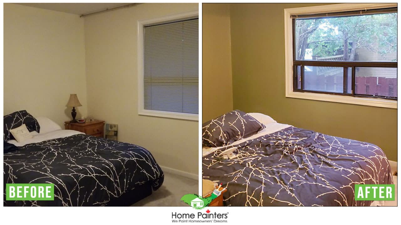
Not every dark room needs lightening — chocolate brown with cream trim and light accents creates an intentionally cozy atmosphere that many Toronto homeowners prefer through the long winter months.
A Counterintuitive Approach: When Warm Dark Colours Work in Toronto Rooms
Not every dark room needs to be lightened. Some rooms benefit more from leaning into the coziness that limited natural light creates. Chocolate brown and warm terracotta tones can transform a dim room into an intentionally intimate and inviting space when the goal is atmosphere rather than brightness.
Chocolate brown with light accents, such as cream trim, warm toned textiles, and pale area rugs, creates a rich, grounded environment that many Toronto homeowners find more comfortable in the long winter months than an artificially brightened space. The key is ensuring the accents are sufficiently light to prevent the room from feeling heavy, and that warm toned lighting reinforces the cosy atmosphere after dark.
Warm orange tones in shades of pumpkin, terracotta, and apricot communicate warmth and togetherness in a room. These colours work best in dining rooms and family rooms where the evening gathering atmosphere benefits from a colour that glows warmly under incandescent or warm LED lighting. They are not the right choice for a room where brightness is the primary goal, but they are exactly right for creating a welcoming winter room in a Toronto home.
Lavender is one of the most welcoming colours for a room that lacks natural light because it reads as neither warm nor cool in a way that feels sophisticated and calming. Mixed with deeper blues and purples as accent colours, pale lavender creates a playful and elegant environment that works in living rooms, bedrooms, and any room where natural light is limited.
Sunny yellow walls in pale, warm tones combat low light rooms effectively because they simulate the visual effect of natural light. Pale yellow as the dominant colour works especially well in a room with an all white trim and ceiling, where the yellow walls feel like sunlight is already present regardless of the actual outdoor conditions. Warm wood tones in furniture complement pale yellow particularly well.
Pink in pale tones is a bright and effective choice for rooms where natural light does not appear reliably. Warmer shades of blush and rose provide enough visual brightness to improve the feel of a dim room significantly without the aggressive energy of saturated colours. In Toronto homes where north facing rooms are often used as home offices or creative spaces, pale pink creates an energising but not overwhelming environment.
Green in bright lime and sage tones adds energy and vibrancy to low light spaces. Lime green in particular functions as an energiser colour that lifts the mood of a room independent of how much natural light is present. Pairing a bright green wall with white trim and natural wood accents produces a result that feels fresh and contemporary. For additional colour inspiration tailored to specific room lighting conditions, our guide on interior paint colour trends covers the most popular options across Toronto's diverse home styles.
Brightening Dark Kitchens and Living Rooms in Toronto
Dark living rooms in Toronto often suffer from limited side lighting in semidetached homes where one or both side walls are shared with a neighbouring property. Warm shades like a pale primrose yellow or a cream with golden undertones amplify the warmth of any available light and make the room feel sunlit even on overcast days. Painting the inside of the window frame and the window reveals in a crisp white reflects significantly more light into the room compared to leaving those surfaces in a darker existing colour.
Kitchens that feel too dark benefit most from cool paint colours like warm greens and pale blue greens, which communicate freshness and cleanliness while reflecting light efficiently. In a kitchen where directional task lighting is already present above work surfaces, a light coloured wall bounces that light around the room more effectively than a dark one. The combination of pale walls and good task lighting produces the brightest kitchen result.
How to Brighten Up a Dark Room with Paint: Room-by-Room Guide for Toronto Homes
| Room | Toronto Specific Problem | Best Colour Approach | Finish Recommendation |
|---|---|---|---|
| North facing bedroom | Receives no direct sunlight; feels dim and cold year round | Cool white with neutral or very slightly blue undertone; Benjamin Moore Ice Mist OC 67 or Chantilly Lace OC 65 | Eggshell on walls; semi gloss white trim; flat white ceiling |
| North facing living room | Grey light all day; feels claustrophobic in winter | Warm white or pale greige; Benjamin Moore White Dove OC 17 or Pale Oak OC 20 | Eggshell on walls; semi gloss trim; consider lighter version of wall colour on ceiling |
| Dark hallway | No exterior windows; may only borrow light from adjacent rooms | Crisp white or very light greige; keep consistent throughout to extend borrowed light | Semi gloss or satin on walls (more durable in traffic area); white ceiling |
| East facing room | Good morning light; dim by early afternoon | Warm yellow or peachy cream that amplifies morning light and retains warmth as it dims | Eggshell on walls; semi gloss trim |
| Basement with small windows | Limited or no natural light; artificial light only | Pure white or very light cool grey; LRV above 80 recommended; avoid any warm tones that feel yellow under LED lighting | Eggshell on walls and ceiling; semi gloss trim |
| Kitchen with north or east exposure | Feels clinical or dim; cooking prep requires good light | Warm white or pale sage green; semi gloss on walls for washability and light reflection | Semi gloss on all surfaces including walls; white ceiling mandatory |
How to Add Lightness to Dark Bedrooms and Hallways
Dark bedrooms in Toronto homes most commonly result from north or east orientation, small original windows in older housing stock, or overshadowing from adjacent buildings on narrow lots. The most effective brightening combination for a bedroom is a warm white or very pale greige on the walls, a white or near white ceiling, and crisp white semi gloss on all trim including window casings, baseboards, and door frames. The light coloured trim draws the eye to the windows and makes whatever light enters feel amplified.
Hallways benefit from a unified light colour that flows continuously from the entry through to any connecting rooms. Breaking the hallway into different colours or using a significantly darker colour in the hallway than in the rooms it connects creates visual barriers that make the space feel smaller and darker. A single warm white or light greige carried through all hallway surfaces, including the ceiling, produces the most open and light filled result.
Mirrors placed opposite windows amplify the brightening effect of light paint colours by reflecting natural light back into the room. This is not a paint technique, but it works in combination with the right wall colour to produce a result that no amount of paint alone can achieve in a truly dark room. The combination of high LRV wall paint, white trim and ceiling, and a mirror opposite the primary light source represents the full professional toolkit for a dark room transformation.
Light Reflectance Value and Finish Guide for Brightening Dark Rooms
This reference table helps Toronto homeowners select the correct combination of colour LRV and paint finish for maximum brightening effect in rooms with limited natural light.
| Surface | Recommended LRV Range | Best Finish | Why |
|---|---|---|---|
| Walls (dark room) | 70 to 90 LRV | Eggshell | Reflects light without showing imperfections; washable; best balance of brightening and practicality |
| Ceiling | 85 to 100 LRV | Flat / Matte | Maximum light reflection overhead; flat finish prevents glare and shows no roller marks on horizontal surface |
| Trim and door casings | 85 to 100 LRV (white) | Semi gloss | Crisp boundary between wall and trim; reflects light at edges where wall meets ceiling and floor |
| Interior door faces | 85 to 100 LRV (white) | Semi gloss | Doors reflect light into adjacent spaces when open; high sheen amplifies this effect |
| Hallways (no windows) | 75 to 95 LRV | Satin or eggshell | Higher traffic requires more durable finish than standard eggshell; satin is washable and reflective |
| Kitchen walls (low light) | 70 to 90 LRV | Semi gloss | Washable; reflects task lighting back into the room; semi gloss mandatory in food preparation areas |
Cost of Interior Painting to Brighten Dark Rooms in Toronto in 2026
Repainting dark rooms is one of the most cost effective interior improvements a Toronto homeowner can make. Home Painters Toronto is WSIB compliant, fully insured to $5 million general liability, and all interior painting is backed by a lifetime warranty. All prices below are in CAD and exclude HST.
| Scope | Estimated Cost (CAD) | Notes |
|---|---|---|
| Single room wall repaint (living or dining) | $400 – $900 | Includes prep, prime if needed, and two topcoats on walls only |
| Single room including ceiling and trim | $700 – $1,400 | Full room including all surfaces; recommended for maximum brightening effect |
| Full main floor repaint (connected rooms) | $1,500 – $3,500 | Living, dining, hallway as unified scope; most impactful for open concept Toronto homes |
| Bedroom repaint (walls, ceiling, trim) | $600 – $1,200 | Full treatment for maximum light transformation in a single bedroom |
| Hallway and stairwell | $700 – $1,200 | Includes two storey height; unified light colour recommended throughout |
| Full home interior repaint | $3,000 – $7,000 | All floors; all rooms; complete light transformation from dark to bright throughout |
For a full breakdown of interior painting costs, see our interior painting cost guide.
Real Project: Brightening a North-Facing Living Room in East York
East York 1952 Semidetached: Taupe to Chantilly Lace, White Trim Contrast, and a Room That No Longer Feels Cave-Like
A homeowner in East York contacted Home Painters Toronto to address the main floor living and dining room of their 1952 semidetached home. The room faced north and the shared wall on the east side reduced side window light to a single south facing window at the rear. The existing paint was a medium taupe that had appeared acceptable in the original staging photos but felt oppressively dark in daily use, particularly through the winter months.
Our team recommended Benjamin Moore Chantilly Lace OC 65 on all walls in an Eggshell finish, Benjamin Moore Ceiling White in a Flat finish on the ceiling, and Benjamin Moore Advance in a Semi Gloss finish on all trim, baseboard, door casings, and window frames in a crisp white. The trim treatment specifically was the recommendation the homeowner had not considered: the existing trim was in the same taupe as the walls, which eliminated the visual contrast that makes windows and doorways feel bright and open.
The completed project transformed the room from a space the homeowner described as cave like in winter to one their family spent significantly more time in throughout the day. The white trim against white walls sounds subtle, but the sheen differential between eggshell walls and semi gloss trim created exactly the crisp boundary that makes windows feel like sources of light. Total project cost was within the standard two room range. The homeowner requested the same treatment in the north facing primary bedroom at the follow up estimate.
Home Painters Toronto is WSIB compliant, fully insured to $5 million general liability, and all interior painting is backed by a lifetime warranty. For completed projects, visit our Toronto painting projects page. Same day free estimates are available seven days a week across the GTA.
Brightening Your Toronto Home: Professional Interior Painting That Works
Paint colour and finish selection is the most accessible and cost effective tool for transforming a dark room into a bright, welcoming space. The combination of a high LRV wall colour, the right finish for each surface, white trim and ceiling, and thoughtful accent colour placement produces results that exceed most homeowners' expectations.
Frequently Asked Questions About Brightening Dark Rooms with Paint
Warm whites and cool whites with high LRV values are the most effective colours for brightening dark rooms in Toronto homes. Benjamin Moore Chantilly Lace OC 65 (true white, LRV 92), White Dove OC 17 (warm white, LRV 85), and Pale Oak OC 20 (warm greige, LRV 69) are among the most consistently recommended by our team for Toronto rooms with limited natural light. For north facing rooms specifically, a cool white or very pale blue grey amplifies the blue grey quality of northern daylight more naturally than a warm tone.
Paint finish has a significant effect on how bright a room feels, independent of the colour chosen. Eggshell and satin finishes reflect more light than flat or matte finishes on walls. Semi gloss on trim and door casings creates crisp, reflective boundaries around windows that make light sources feel brighter. The combination of eggshell walls plus semi gloss trim is the professional standard for maximising the brightening effect of any colour in a dark Toronto room.
Ceilings should almost always be painted white or near white when brightening a dark room. A white flat ceiling reflects maximum overhead light back into the space and increases the perceived ceiling height. Using the same colour on the ceiling as on the walls, or a ceiling colour darker than the walls, reduces perceived height and amplifies the dark room feeling. Benjamin Moore Ceiling White in Flat finish is the most widely used ceiling product on Toronto brightening projects.
Dark colours can work in a low light Toronto room when the goal is atmosphere and cosiness rather than brightness. Leaning into the dark quality of a north facing room with a warm chocolate brown, deep sage green, or rich navy creates an intentionally intimate space that many homeowners find more comfortable in winter than an artificially brightened room. The key is pairing dark walls with light accents, warm lighting, and surfaces that reflect available light (light floor, white ceiling) to prevent the room from feeling oppressive.
Repainting a single dark room in Toronto including walls, ceiling, and trim costs between $600 and $1,400 depending on the size of the room and the scope of surface preparation required. A full main floor repaint of connected living and dining rooms runs $1,500 to $3,500. These ranges include preparation, primer where needed, and two topcoats. All quotes from Home Painters Toronto are free and provided the same day.
LRV stands for Light Reflectance Value. It measures what percentage of light a colour reflects, expressed on a scale of 0 (absolute black, reflects nothing) to 100 (pure white, reflects everything). For dark rooms, colours with LRV values above 70 produce the most noticeable brightening effect. Most paint manufacturers publish LRV values on colour chip cards and product data sheets. When selecting a paint colour for a low light Toronto room, checking the LRV is a more reliable indicator of brightening potential than simply judging how a chip looks in the paint store under artificial light.
More Helpful Blogs Related to How To Brighten Up A Dark Room With Paint
Ready to Brighten Up a Dark Room in Your Toronto Home?
Home Painters Toronto is the HomeStars Best of Award 2026 winner with a lifetime warranty on all interior painting. Call 416-494-9095 or email [email protected] for a FREE same-day estimate.