When thinking about interior paint colours, it’s a good idea to start by researching basic colour schemes. When you know the colour schemes, coordinating paint colours will be easier. Another way to pick paint colours is by using the colour wheel. Remember in primary school when we learned about the colour wheel: red, yellow, and blue? Combining these colours will give you secondary choices (orange, purple, etc). That information comes in handy when picking the right colour for your room.
In addition, going through the colour wheel will allow you to decide which tone you want your room to be: cool, complementary, warm, shaded, or vibrant. Giving your room a certain vibe is what homeowners look for. Had a bad day? You would want to use cool or warm shades to make you more relaxed. Are you a moody type of person? Maybe you would use darker tones to resemble that aspect of your personality. Knowing coordinating paint colours will help you for a very long time.
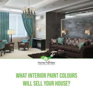
The Importance of Coordinating Paint Colours
Colour coordination is the cornerstone of any successful interior design project. It affects the overall visual appeal of a space and can also influence the atmosphere and mood. You can create a seamless and harmonious flow throughout your home by carefully selecting and coordinating paint colours.
Here are some reasons why coordinating paint colours for the interior is essential:
Aesthetics: A well-coordinated colour scheme can elevate your space by making it look more polished and put-together.
Mood: Different colours evoke different emotions. By coordinating the colours in a room, you can create a mood that complements the purpose of the space.
Flow: Coordinating paint colours for walls can help establish a sense of continuity and flow from one room to another.
Tips for Coordinating Paint Colours
To achieve a well-coordinated colour scheme, keep these tips in mind:
Start with a base colour: Choose a primary colour that will be the foundation of your colour scheme. This will typically be the dominant colour used throughout the space. Pick a versatile hue that can be easily paired with other colours.
Pick complementary colours: Complementary colours are found on opposite sides of the colour wheel, creating a pleasing contrast. For example, blue and orange are complementary colours. Pairing complementary colours adds visual interest and creates balance in your space.
Keep it simple: Limit your colour palette to 3-5 colours to avoid overwhelming the space. This will ensure a more cohesive and harmonious look.
Consider room size: A small room may feel cramped with dark colours, while a large room might seem cavernous with light, repetitive hues. Choose colours that work with the scale of your space.
Experiment with colours: Don’t be afraid to think outside the box and try unconventional colour combinations. Mixing attractive hues can add depth and personality to your space.
Paint Colours
Coordinating paint colours significantly affect your home depending on the schemes you use. For example, let’s say you want your living emerald green. You will need to see the effect it will have on not only the appearance of your home but the mood of the room. Knowing what each colour represents will help you best and limit your options.
Warm and Cool Colours
Warm Colours
Red: energy, power, passion. Stimulates appetite, so it’s a standard colour for dining rooms.
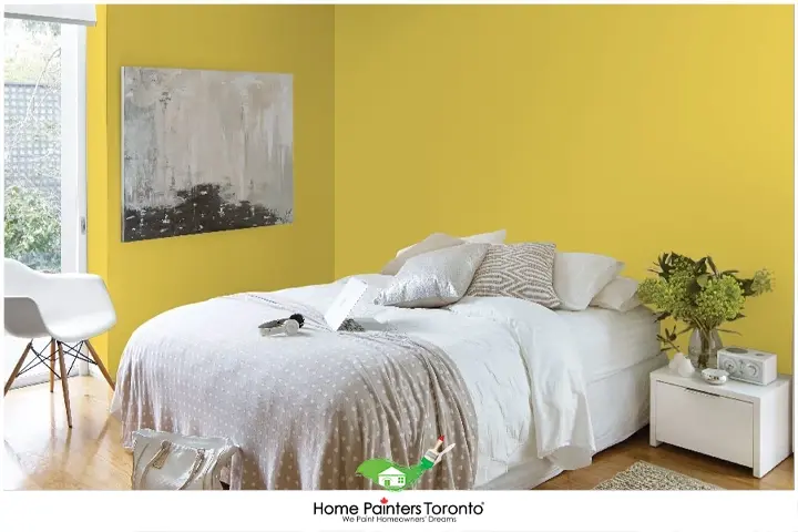
Yellow: happy, uplifting colour. It could be a bit distracting because of its brightness.
Orange: A bit less aggressive than red. Creates warmth and joy in a space. They are often used as an accent colour because it can be too bright.
Cool Colours
Blue: a very peaceful colour. Makes a space refreshing and bright. Can add a bit of moderness too.
Violet: It is a mixture between the calm blue brings and the energy red exudes. Used often in bedrooms as a sign of serenity.
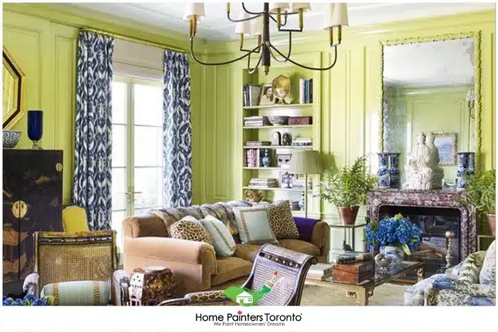
Green: Represents renewal and growth. One of nature’s prominent colours and can blend perfectly in any room.
Warm and Cool Colours
It’s pretty safe to say that the lighter the shade, the more energy and positivity it gives.
Yellow is the colour of the sun and the epitome of vibrancy! The moment you lay eyes on a yellow wall, you instantly feel good. In addition, being in a yellow room causes people to become more active in their day-to-day tasks and are more conscious of their surroundings. So, if you are feeling a little lazy and out of sorts, a yellow wall can change that instantly.
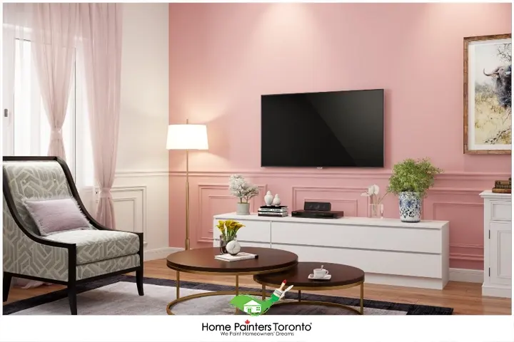
Also, pink wall paint is a shade that balances energies because it is soothing. In addition, using pink in any room promotes sensitivity and peacefulness. Lastly, green is a very calming and quiet colour, just like nature! It attracts harmonious vibes, which reduces anxiety.
Light Colours Are Very Popular
It’s pretty safe to say that the lighter the shade, the more energy and positivity it gives.
Yellow is the colour of the sun and the epitome of vibrancy! You instantly feel good when you lay your eyes on a yellow wall. In addition, being in a yellow room causes people to become more active in their day-to-day tasks and are more conscious of their surroundings. So, if you feel lazy and out of sorts, a yellow wall can instantly change that.
Also,pink wall paintis a shade that balances energies because it is soothing. In addition, using pink in any room promotes sensitivity and peacefulness. Lastly, green is a very calming and quiet colour, just like nature! It attracts harmonious vibes, which reduces anxiety.
Mixing Coordinating Paint Colours
Do you want magic to occur? Then you should mix the paint and look at the hue’s complimentary first.
For example, if you choose to blend a complementary colour into the primary colour of a subject, your space will look dynamic as ever. There are many colours on the colour wheel that you can mix around and manipulate to satisfy you and your ideas.
Professional painters suggest doing a trial with the colours you want to use (test mixing). This will allow you to see all the swatches and how complementary paints affect one another. It’s important to remember that even if you don’t have a set idea or colour that you want, the answer to your problem is most likely on the colour wheel.
Popular Colour Combinations
Here are some popular colour combinations that you can try in your space:
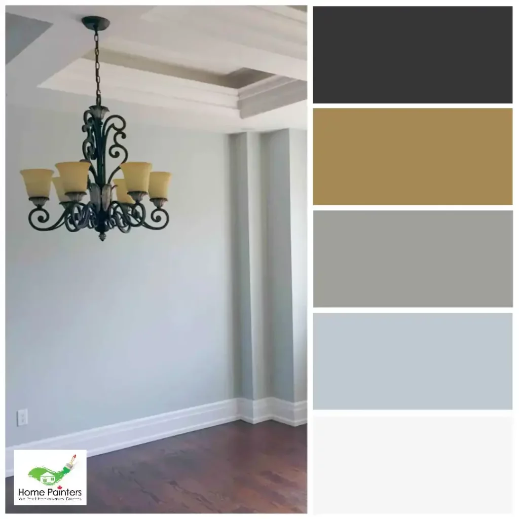
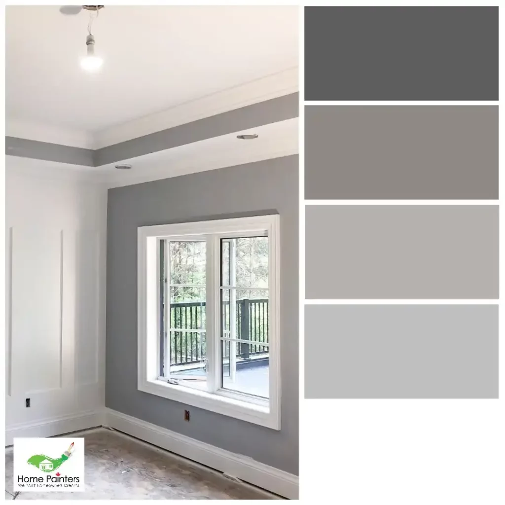
Monochromatic: A monochromatic colour scheme involves using different shades and tones of a single colour. This creates a clean and cohesive look, ideal for minimalist or modern spaces. For example, you can use light grey as your base colour and pair it with darker grey accents for depth.
Analogous: Analogous colours are adjacent on the colour wheel, such as red, orange, and yellow. These colours share a common hue and create a harmonious colour scheme. Try combining warm or cool hues for a cohesive look.
Triadic: A triadic colour scheme involves using three colours that are evenly spaced around the colour wheel, such as blue, red, and yellow. This creates a balanced and vibrant colour scheme that works well in creative or energetic spaces.
Neutral with a pop of colour: Start with a neutral colour scheme (such as shades of grey or beige) and add a pop of colour for visual interest. This versatile approach can be easily updated by changing the accent colour.
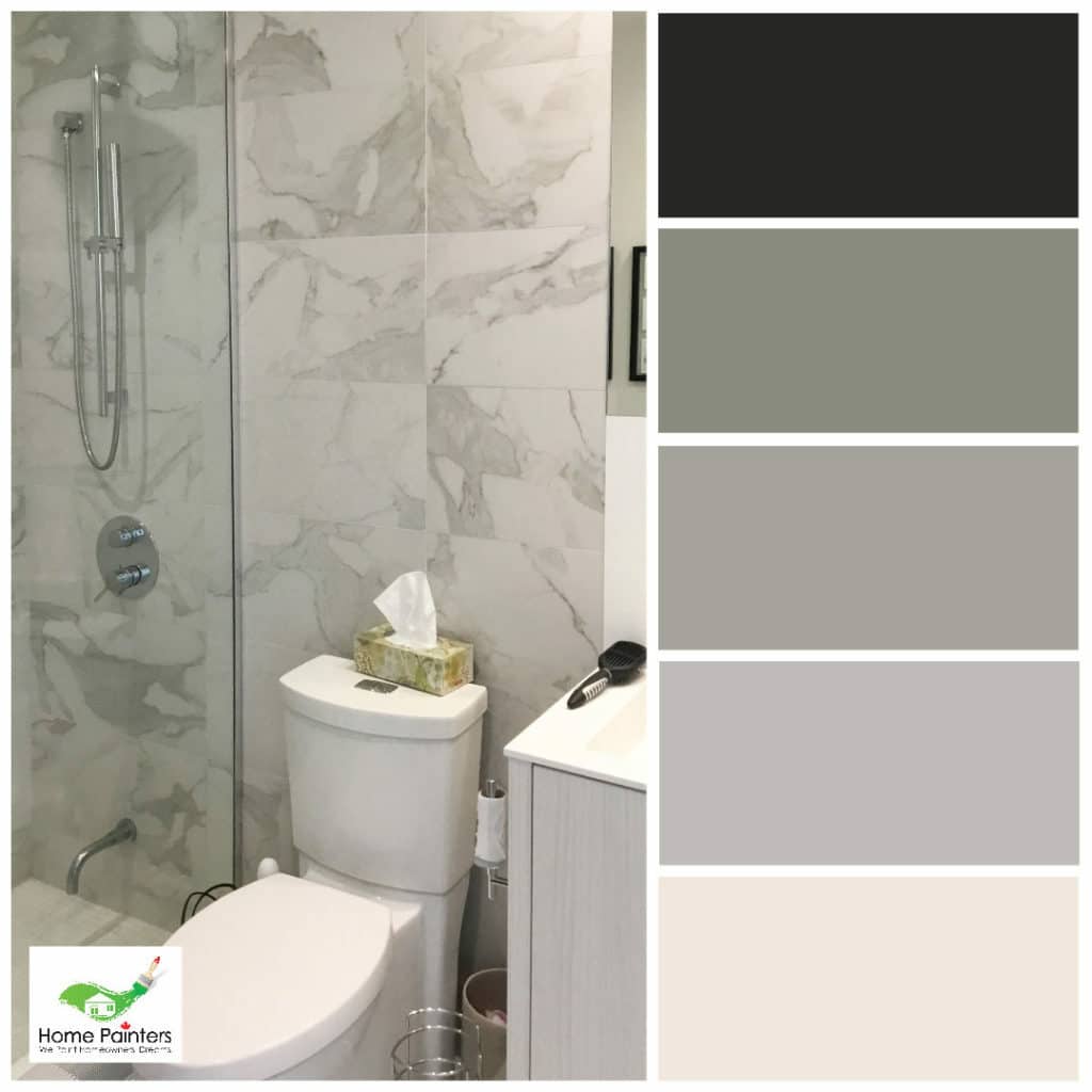
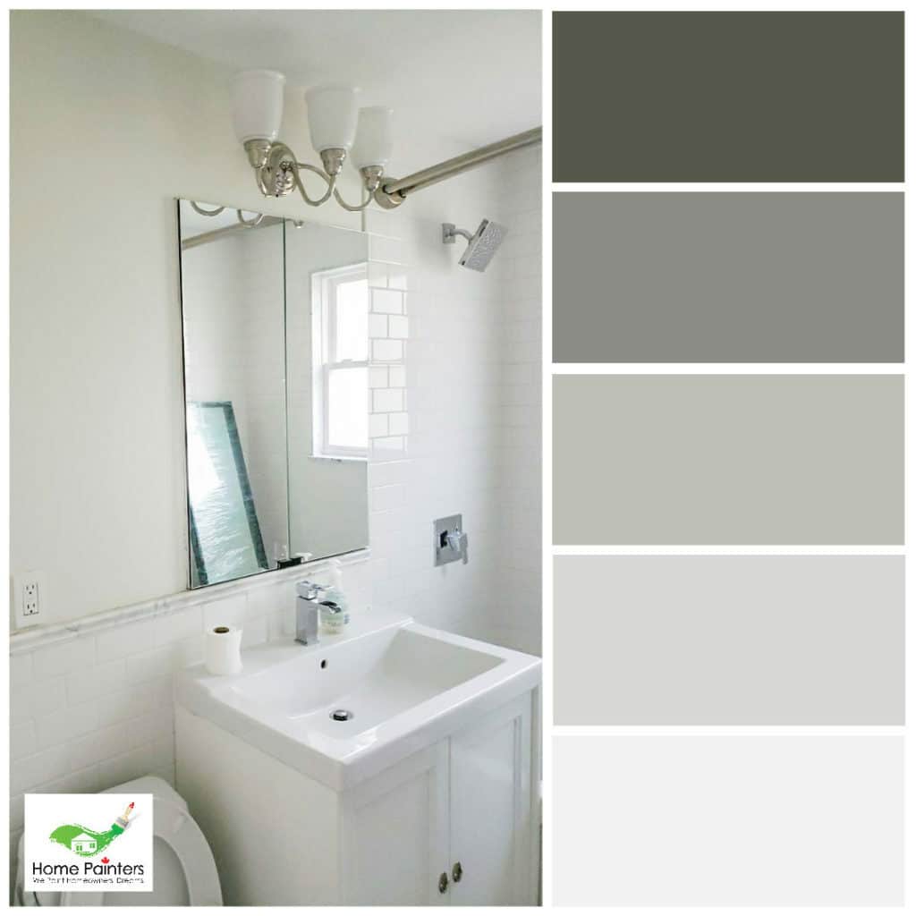
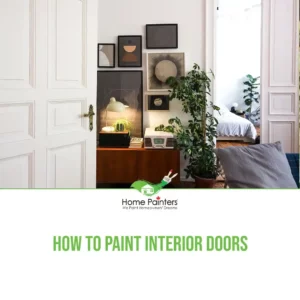
Working on Your Bathroom!
The right type of paint for a bathroom would be water-based latex paint.
Although oil paint is more durable, you need to clean it with mineral spirits and that causes VOCs (volatile organic compounds) to develop. In addition, oil paint can develop yellow, especially in dark rooms.
Latex paint is better suited for bathrooms because it doesn’t allow water to penetrate, and that’s important when showering or using the sink. Also, you can scrub away stains easier using latex paint than oil-based paint. In its totality, latex paint is easier to use and dries quicker, two things people love to hear.
In conclusion, coordinating paint colours is an essential aspect of interior design and can significantly impact a space’s overall appearance and mood. When selecting, consider your base colour, complementary colours, simplicity, and room size. Don’t be afraid to experiment with various colour combinations to create a unique and visually captivating space.
If you’re thinking of doing some home interior painting but don’t want to do the work yourself, let our interior painters help! Even if you are undecided, professional house painters can help you with any problems or questions. If the work involved sounds like it involves too much time and energy to do yourself, call 416.494.9095 or email Brian@HomePaintersToronto.com for a FREE quote. And don’t forget to follow us on all our social channels below!