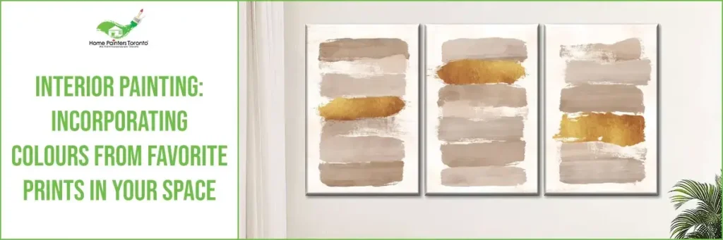
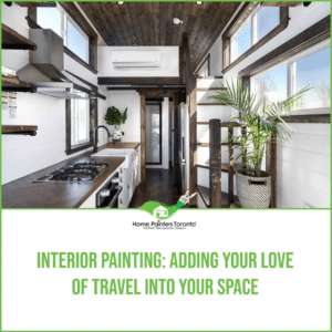
One of the coolest parts about interior painting and design is that inspiration can come from anywhere. You could catch a sunset one day that you just can’t seem to get out of your mind. The next thing you know, you’re buying a print with the most beautiful oranges and yellows in it!
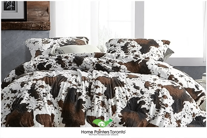
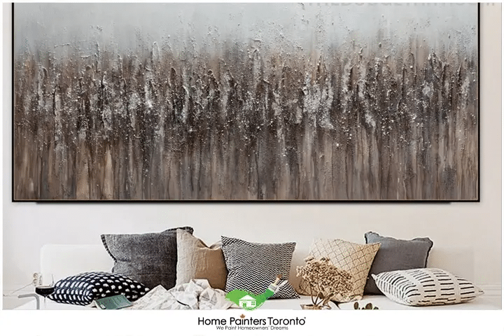
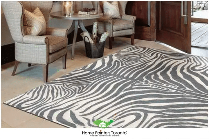
A really nice design tip to think about when you’re looking to rework a room in your home is to think about some of the prints you naturally gravitate toward. This doesn’t have to just include art prints on the wall, either! We’re talking about prints in fabrics, like bedding. Or maybe it’s a printed rug that you recently brought home and want to pull some colours out of. For some, it’s that piece of art up on their wall that they just can’t stop staring at.
The point is that all of these prints can really make an impact on a space, especially if you’re looking to pull some great colours out of them. Let’s dig into some pro design tips for interior painting and incorporating colours from your favourite prints!
Interior Painting: Incorporating Colours From Favorite Prints In Your Space
One of the coolest parts about interior painting and design is that inspiration can come from anywhere. You could catch a sunset one day that you just can’t seem to get out of your mind. The next thing you know, you’re buying a print with the most beautiful oranges and yellows in it!
A really nice design tip to think about when you’re looking to rework a room in your home is to think about some of the prints you naturally gravitate toward. This doesn’t have to just include art prints on the wall, either! We’re talking about prints in fabrics, like bedding. Or maybe it’s a printed rug that you recently brought home and want to pull some colours out of. For some, it’s that piece of art up on their wall that they just can’t stop staring at.
The point is that all of these prints can really make an impact on a space, especially if you’re looking to pull some great colours out of them. Let’s dig into some pro design tips for interior painting and incorporating colours from your favourite prints!
Interior Painting – Where Do You Start?
The question here can be: How do you even decide you want to incorporate a print colour into your interior painting? And if it’s a really brilliant and vibrant print, how do you choose the right colour? The first thing to remember is to have fun! Whatever you choose, you can always play with it, if it’s not quite what you want.
You need to think about what initially drew you towards this print in the first place. If it’s a piece of art that you want to feature, what drew you in? Maybe it was the overall colour combination happening. Perhaps it was the mood it evoked in you. Or maybe you had a space to fill and this did the job perfectly. Whatever the reason, let that gut feeling bring you back to those early feelings of excitement. That way, you can have that excitement lead the way with your interior painting choices!
Design Tips: Choosing Your Colours
This may be the hard part for some, while others may have an easier time knowing exactly what they want. It’s all part of the process! The thing to think about here is, whether the print is bedding, artwork or even a rug, what main colour is going to fit best in your space?
Some may be willing to go a bit bold, but you really have to stop and consider how this print will work to tie things together. If the print features many colours, you might steer towards picking one of the print’s accent colours. It won’t be the main colour featured in the print, but it’s one that blends nicely with it or complements the tone.
If you go that route, you’re likely to not get overwhelmed down the line and wonder why you wanted to use this print as your room inspiration. If you still can’t quite decide, it’s usually time to get your colour palette started! Colour palettes can truly make your life and decisions way easier when it comes to interior painting decisions.
Interior Painting Design Tip: Pick Your Colour Palette
Creating a colour palette for your room, especially when you’re working to bring in colours from a print, can be a huge aid. It can just help the mind make sense of the actual colours and how they translate to the painting world.
You can think about taking your print to an actual paint store and grabbing the swatches yourself. When you see all of the colours in the print laid out for you in paint swatches, everything will start to make more sense. Even if you’re only bringing in one of the paint colours, this can be really helpful. You’ll really be able to see the colours as they are and make your final paint colour decision for your interior painting!
The Psychology of Colours in Your Space
Embarking on the journey to select the appropriate colour palette for your space is a vibrant venture. It’s like holding a mirror to your brand’s soul. The paint colours you choose can quite literally paint your mood and set the stage for every interaction within your space. Let’s navigate together through the moods and atmospheres that different hues command. This will give you an idea of how to coordinate paint colours throughout the house:
Radiant and Energizing:
Bright colours, like sunny yellows or bold reds, infuse energy into a room. They’re like a caffeine boost for the eyes, perfect for spaces that thrive on creativity and action.
Calm and Contemplative:
The serene siblings of blue and soft green hues are akin to a breath of fresh air. They lower stress levels, making them exemplary for places where peace and focus are of the essence.
Warm and Welcoming:
Earthen tones, such as terra cotta oranges or creamy beiges, wrap a room in warmth. They quietly whisper ‘welcome’ to anyone entering, making great companions for reception areas or meeting rooms, aiming for a comforting vibe.
Royal and Sophisticated:
Deep purples and muted golds carry an air of nobility and sophistication. They bring depth to strategic spaces where decisions are made and partnerships are formed.
Fresh and Renewing:
Hues reflecting nature’s palette—think fresh greens and sky blues—promote renewal and growth. They’re a visual symbol of your brand’s dynamic and rejuvenating spirit.
Neutral and Versatile:
Shades of grey or classic navy offer a backdrop of neutrality and flexibility, providing a canvas that lets other colours take center stage or speak confidently on their own in a modern, chic tone.
Bold and Dramatic:
For those spaces that scream to make a statement, exotic colours like charcoal black or fiery red can amplify a bold brand personality.
Soft and Soothing:
Gentle pastels lend a nurturing and gentle touch to an environment. They’re ideal where tranquillity and gentleness are paramount.
Interior Painting: Getting Started & Don’t Forget The Accessories!
This is where the actual interior painting can start to happen! You can always turn to interior house painters to do the job. You’re ready to go into the space once you’ve picked out your colours and you have your inspirational print. The big question is, have you picked out the perfect spot to put it on display? If it’s a piece of artwork, do you have a wall in mind? Might we suggest a wall that gets the best light? If this print was the backbone that worked to bring the whole space together, you really want to show it off. Maybe the print feature is a rug. Be sure to have it in the center of the room or in an area that just makes the most sense. If your print is bedding or some kind of fabric, don’t be afraid to have it on full show!
And when you’re picking out other accessories for the room, like lamps, sconces and pillows, don’t be afraid to get that colour palette out. You might not think it could help you decide on design factors such as metals, but it can! It can help you really get a sense of what is going to work and blend seamlessly.
Don’t forget to check out our Pinterest page for all sorts of interior painting inspiration!
Most Interesting Blogs Related to
“Crown Moulding Installation: The Easy Way”

If you’re having trouble picking out the right interior painting colours for your space or are just unsure of what direction to go in, it might be time to call in some professional painters. Our painting teams at Home Painters Toronto have over 36 years experience in the field. Allow our expert house painters to do all the work for you! Call 416.494.9095 or email [email protected] for a FREE quote. And don’t forget to follow us on all our social channels below!