
INTERIOR HOUSE PAINTING SERVICES
SERVING TORONTO AND THE GTA FOR OVER 37 YEARS


elated homeowners!

Family owned for 37 years
positive raving reviews
Award Winning Services


Home Painters Toronto believes in bringing our loyal clients interior painters who will bring experience and quality painting work to every single job we take on.
Our professional house painters will ensure that you’re 100% satisfied with your interior painting project every time.
the top interior residential painters in the GTA
Let Our Interior House Painters Handle All the Work For You!
Do you have a painting project you want done, but you don’t have the time to do the quality painting work that’s involved? Or maybe you’re just looking for a one-stop-shop when it comes to interior painting services that also offers handyman and carpenter services.
Home interior painting runs the entire gamut as well. With everything from painting services for your living room spaces and bedrooms to painting kitchen cabinets and wallpaper removal service and drywall painting for new homeowners. Every home deserves quality painting and only the best professional house painters in Toronto to do the job efficiently with 100% satisfaction every time.
ANSWERS TO FREQUENTLY ASKED QUESTIONS ABOUT INTERIOR HOUSE PAINTING
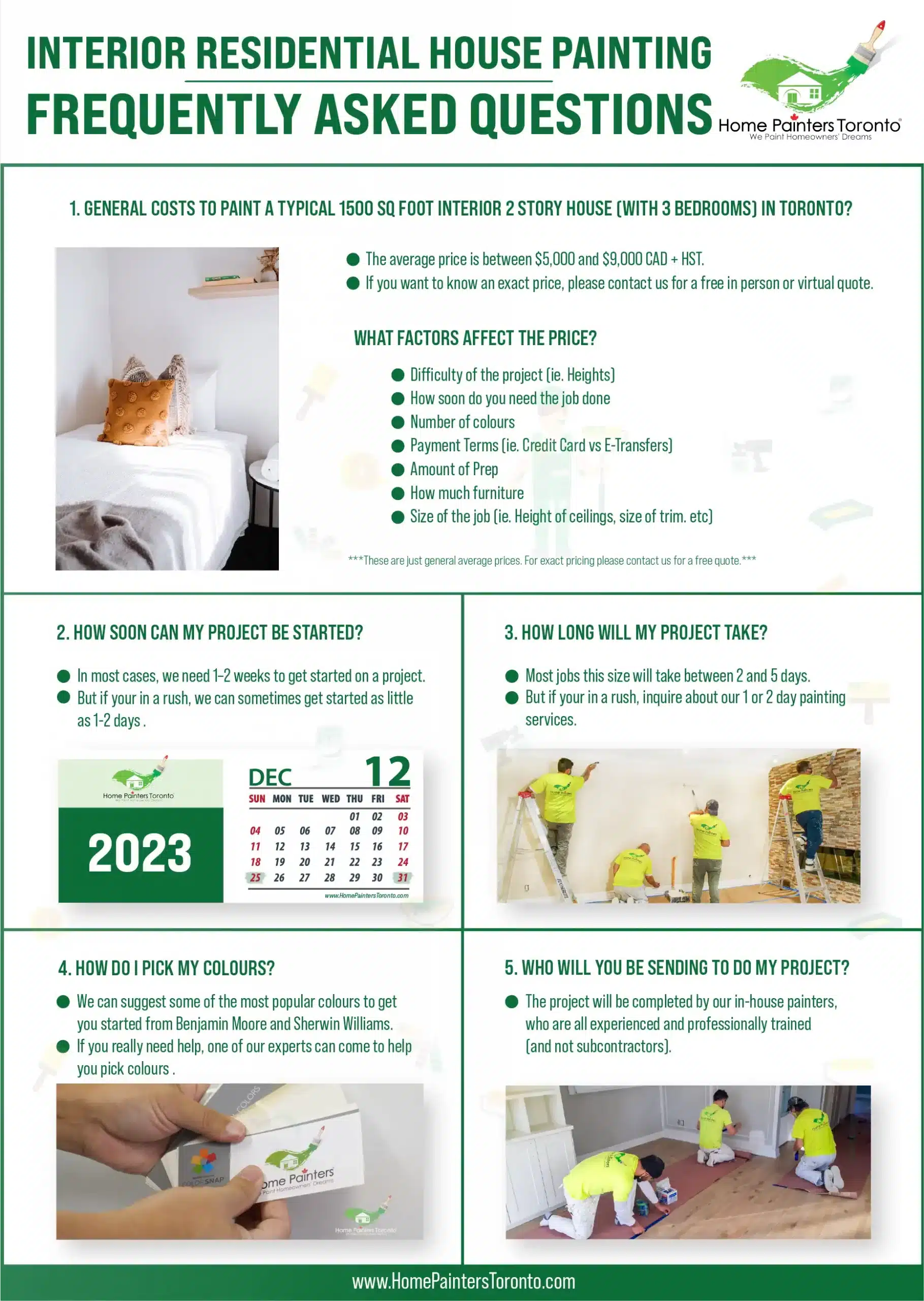
Important to notice, although we will provide different costs, interior painting at Home Painters starts at $1,495 + HST. So what can you do if you have a smaller project? Well, consider bundling other painting, carpentry or handyman services to grow your project and get a better price.
Approximate costs for interior painting ‘per square foot’
- Cost of interior painting ‘walls’ per sq ft: $2 to $3 + HST
Approximate prices for interior house painting
- Small to medium houses: $2,000 to $5,000 + HST
- Medium to large houses: $5,000 to $8,000 + HST
- Large to XL houses: $8,000 to $15,000+ + HST
Yes, we include up to 5 colours of paint, also all the materials to protect and prepare the walls as well as labour are included.
Usually yes, painters can do it for you but that will add on the hours of your project and it will increase your overall estimate. But!, if there’s any oversized furniture that you cannot move on your own, it’s normally ok to ask them to give you a hand to move it a bit to allow them to paint.
Approximate completion times for interior house painting
- Small to medium houses: 2 to 5 business days
- Medium to large houses: 4 to 8 business days
- Large to XL houses: 5 to 10 business days
Most jobs will take 2 and 5 days. But if your in a rush, inquire about our 1 or 2 day painting services.
We can suggest some of the most popular colours to get you started from Benjamin Moore and Sherwin Williams. If you really need help, one of our experts can come to help you pick colours.
The project will be completed by our in-house painters, who are all experienced and professionally trained (and not subcontractors).
interior house painting: why should I consider it?
Interior house painting is one of the easiest ways to make a big change for your space, especially after we’ve spent so much time in our homes this year! If you’re considering starting a new interior painting project, there are so many variables involved in the cost of painting a house. You have to think about the conditions of the rooms you’re painting if any previous work needs to be done and, the type of paint and the colours you want to use. In addition to that, the quality and precision of the service can affect the cost of your interior painting.
There’s also the thought of whether or not you’re going to want to hire professional painters to do the job. A lot of people stop and consider — is it worth paying someone to paint your house?. It really depends on the painting company you hire and what you’re looking for, but the answer is usually yes, it can save you a lot of work and headaches plus if you hire a quality painting company, they normally guarantee your satisfaction 100%. As you can see, there is a lot to be discussed here when it comes to the average cost to paint a house in 2025 whether you hire house painters or not. So, let’s dig right in and get started!
Do you have a painting project you want done, but you don’t have the time to do the quality painting work that’s involved? Or maybe you’re just looking for a one-stop-shop when it comes to interior painting services that also offers handyman and carpenter services.
Home interior painting runs the entire gamut as well. With everything from painting services for your living room spaces and bedrooms to painting kitchen cabinets and wallpaper removal service and drywall painting for new homeowners. Every home deserves quality painting and only the best professional interior house painters to do the job efficiently with 100% satisfaction every time.
8 Reasons Why You Should Hire An Interior Painting Company
1. You Have The Budget To Incorporate Interior Painters Costs
It’s always best to think about all the little details when it comes to taking on an interior painting project. If you’ve spent some time thinking and planning ahead, it’s likely you can work out the interior painters costs into your budget. Plus, a lot of reputable painting companies offer special pricing during their slower winter months!
2. If You’re Having Trouble Picking A Colour For Interior Painting, A Painting Company Can Help Make Suggestions
Sometimes we know we want to do a new home interior painting project and where, but we’re not exactly sure what interior wall paint or colour to go with. Reputable interior home painters quite often offer free colour consultations and suggestions in terms of what direction you might be wanting to head in for your painting project.
3. If You Have Too Busy Of A Schedule To Do Interior Painting Yourself
If you have a busy work and family life, you can’t always find the time for those painting projects yourself. By hiring painting contractors, you’re taking all of that undue stress off your shoulders and allowing experienced pro painters to take on that interior painting work load.

4. The Expertise And Knowledge Of Painting Contractors
When you bring interior house painters into your home for a painting project, you can almost always be guaranteed superior quality painting work every time.
Pro painters know what they’re doing in terms of making your home interior painting projects look professionally executed, clean and fresh.

5. Your Local Painters Can Take Care Of All The Prep Work And Labour
The thing about home interior painting is that there can be quite a lot of work to get to the end result. If you hire a qualified and experienced painting company to come in and do the interior painting work for you, that includes all the prep work (caulking, filling, sanding and priming) and labour involved. Sounds pretty great, right?

6. Insurance And WSIB
Professional painting contractors most often work to protect their interior home painters as well as the clients’ homes that they go into for their painting projects. In case there are any accidents, it’s always best to hire a painting company who works to protect their interior house painters and clients as much as possible.

7. Interior Painters Have The Time To Dedicate To Quality Painting
When you hire a professional painting company to come in and do the interior painting work for you, you’re not only paying for the labour, but for quality painting that is smooth, fresh, clean with expert precision that only professional local painters can provide.

8. Interior Painting Warranties & Touch-Ups
When you hire a professional painting company it ensures that any touch-ups or flaws in the interior painting that need tending to will be fixed by the interior painters themselves. Plus, you’re likely to come across some really great interior painting warranties when you hire local interior painters who want to ensure quality painting work that will last you for years to come!
Customer Feedbacks
Jason From Etobicoke
Dan From Toronto
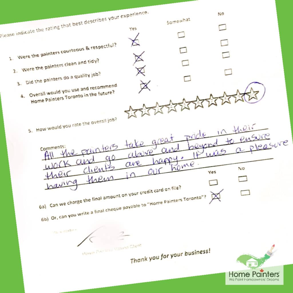
All the painters take great pride in their work and go above and beyond to ensure their clients are happy. It was a pleasure having them in our home.
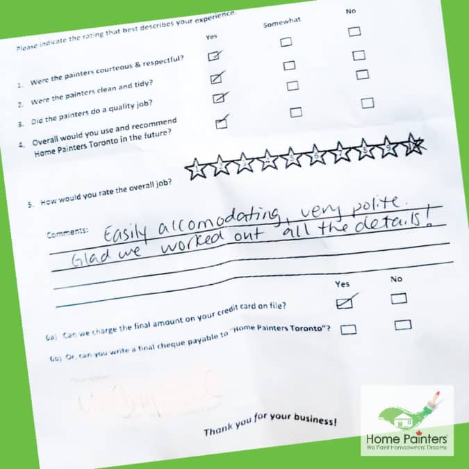
Easily accomodating, very polite. Glad we worked out all the details!
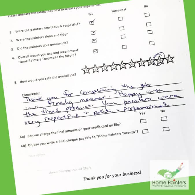
Thank you for completing the job in a timely manner. Happy with the final product. Your painters were very respectful + polite & professional.
ENSURE YOU PICK THE RIGHT INTERIOR PaintING company!
A lot of homeowners regret going with a cheap and inexperienced contractor or not checking how reliable the company is and how much expertise they have in the matter. Unfortunately, many times they embark on the interior painting without a formal contract to make sure they’re getting the job right.
With Home Painters Toronto, we’ll leave all the specifications for your interior paint project on paper so you can rest assured your job will fulfill the standards we both set up.
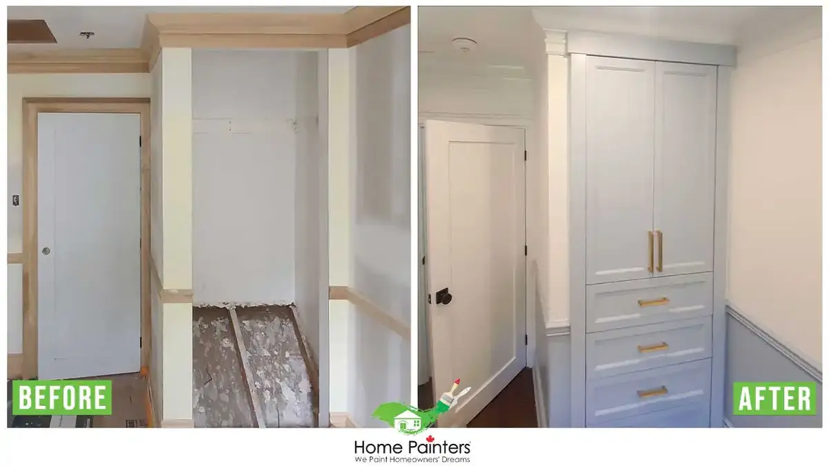
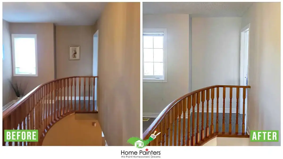
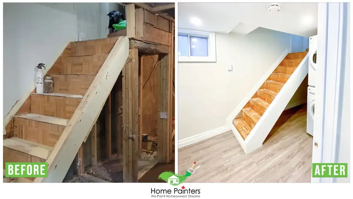
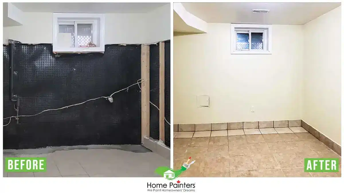
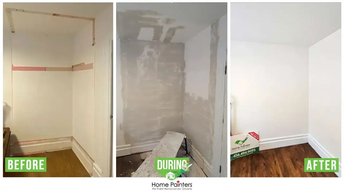
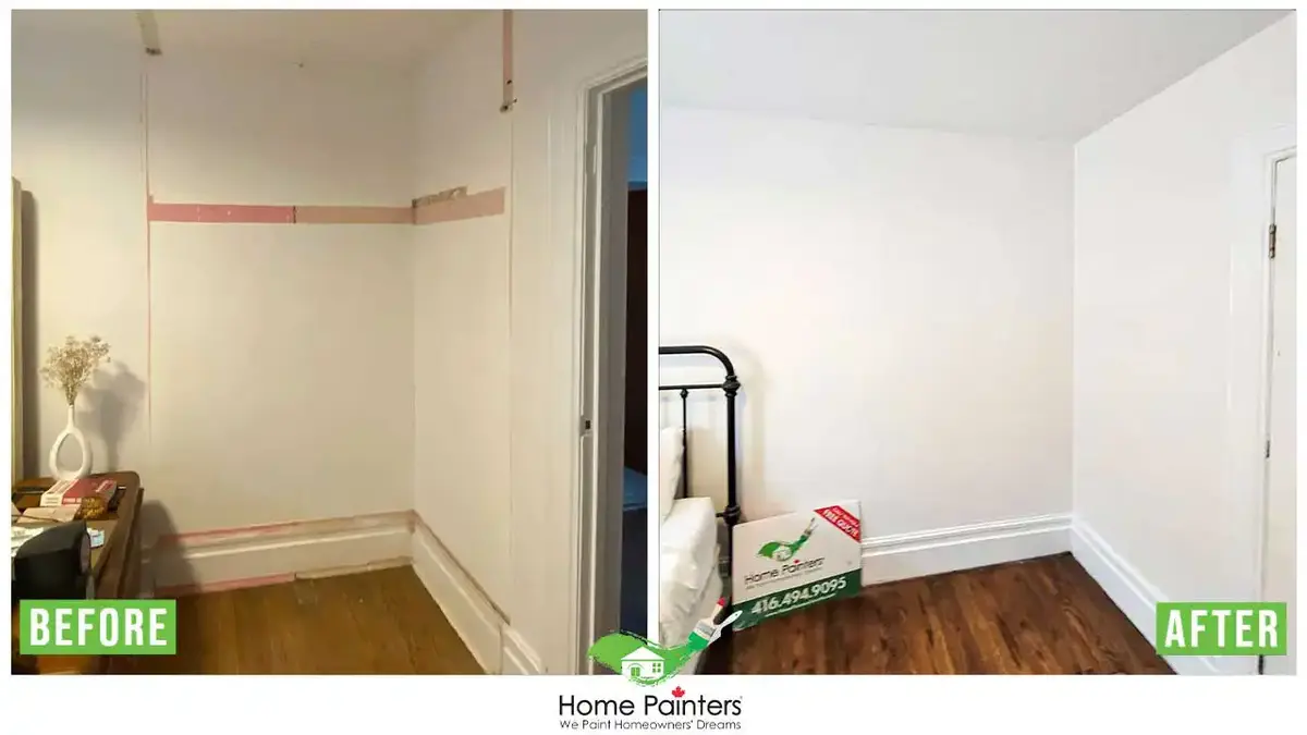
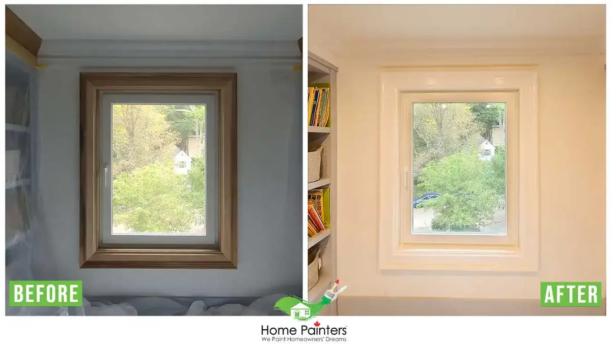
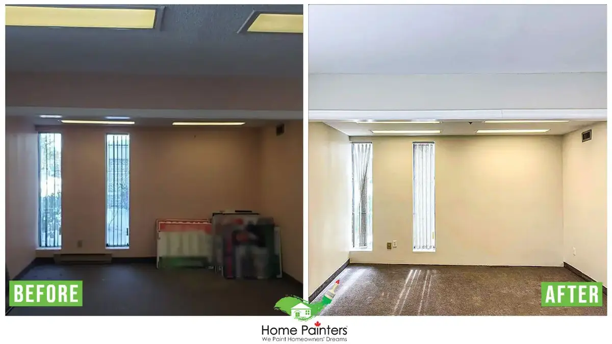
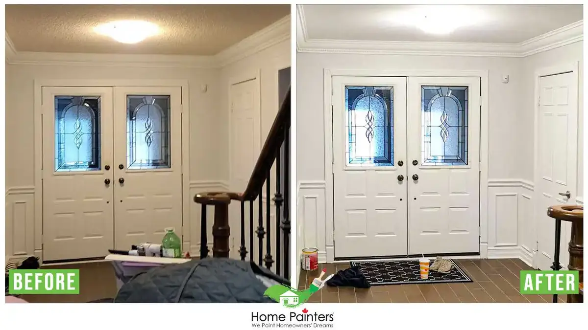
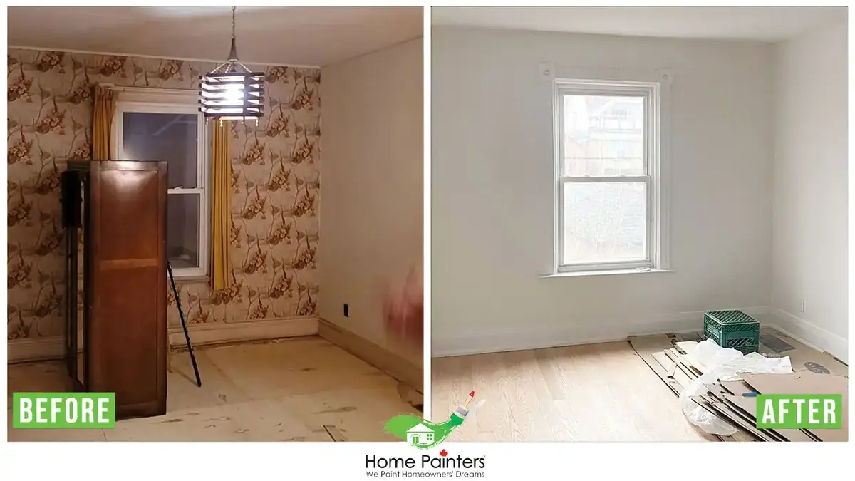
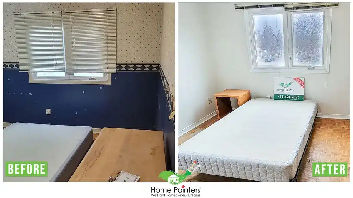
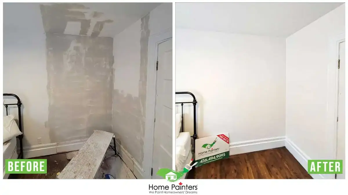
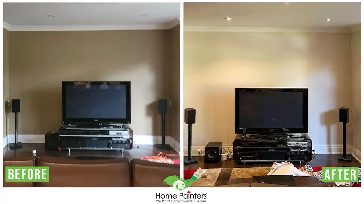
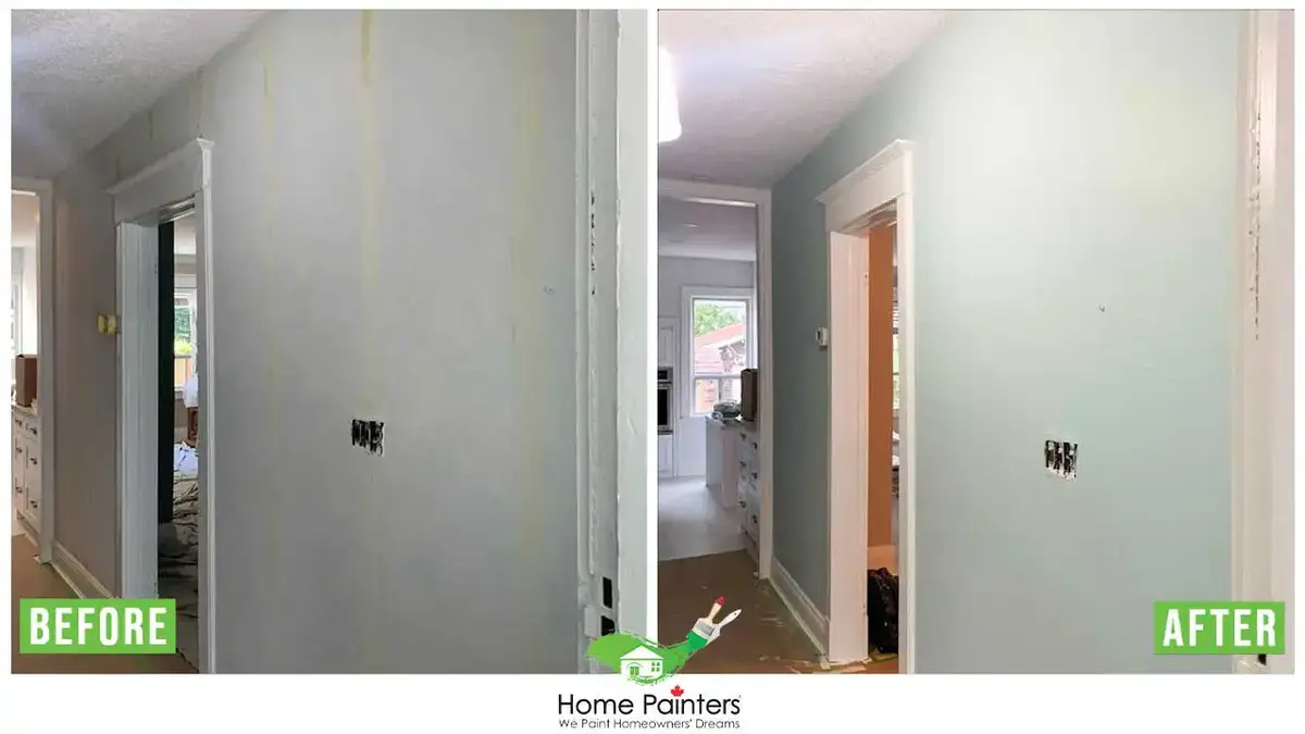
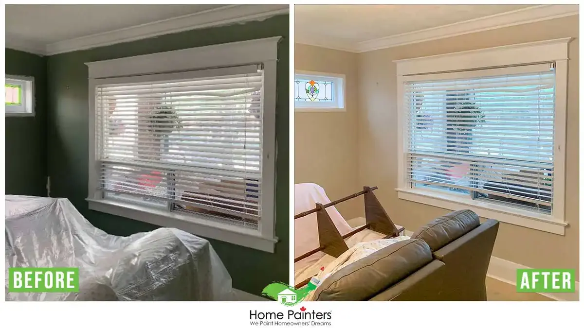
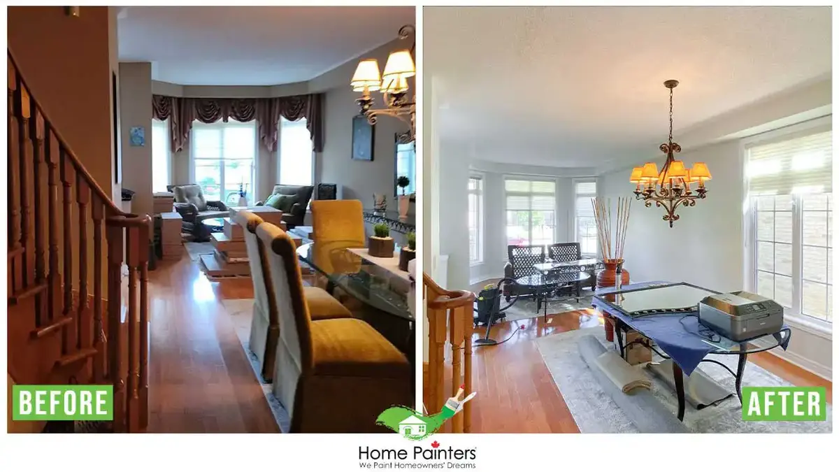
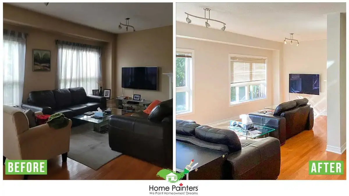
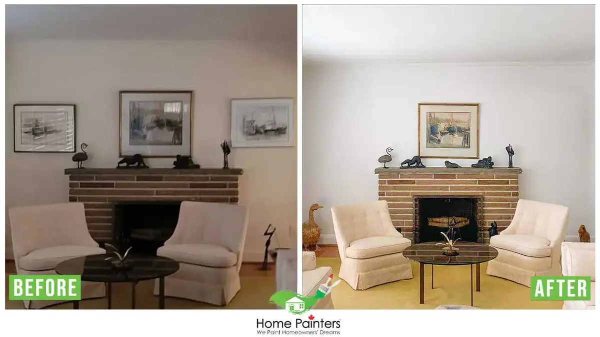
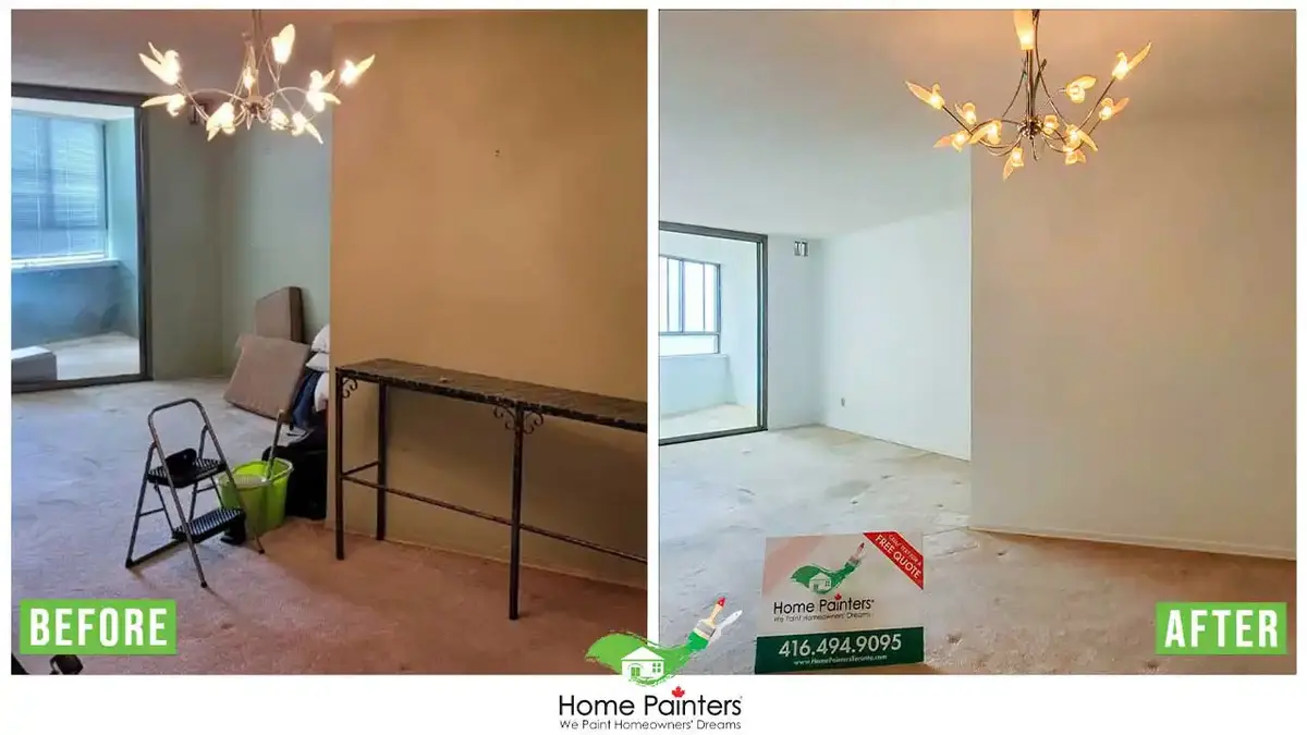
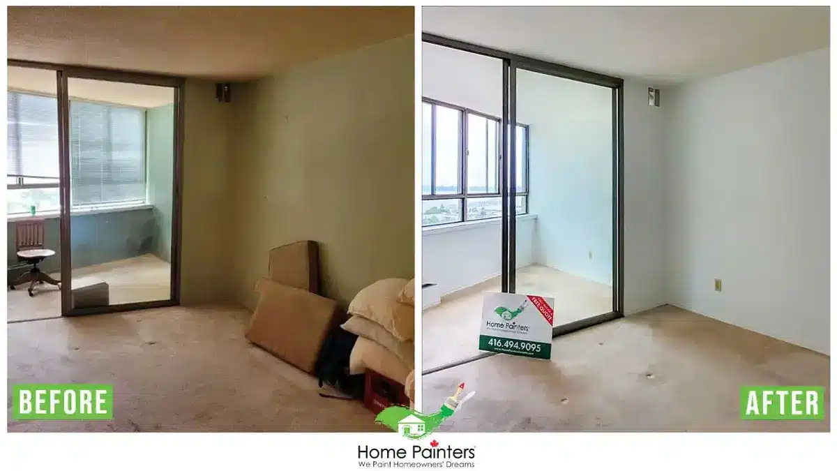
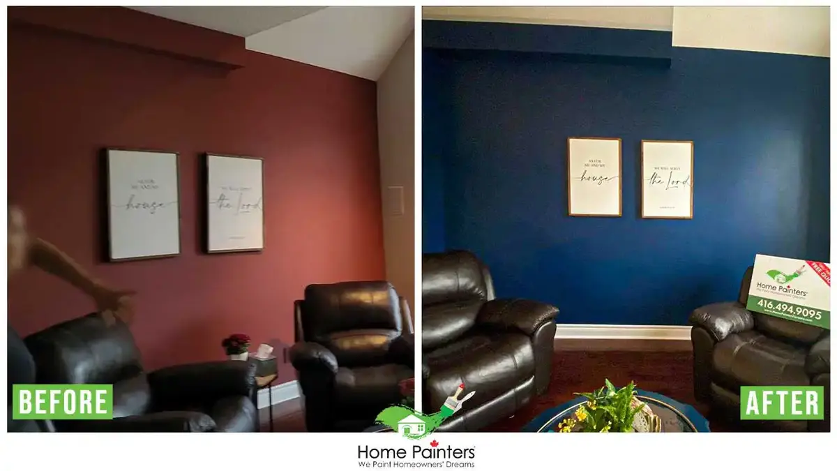
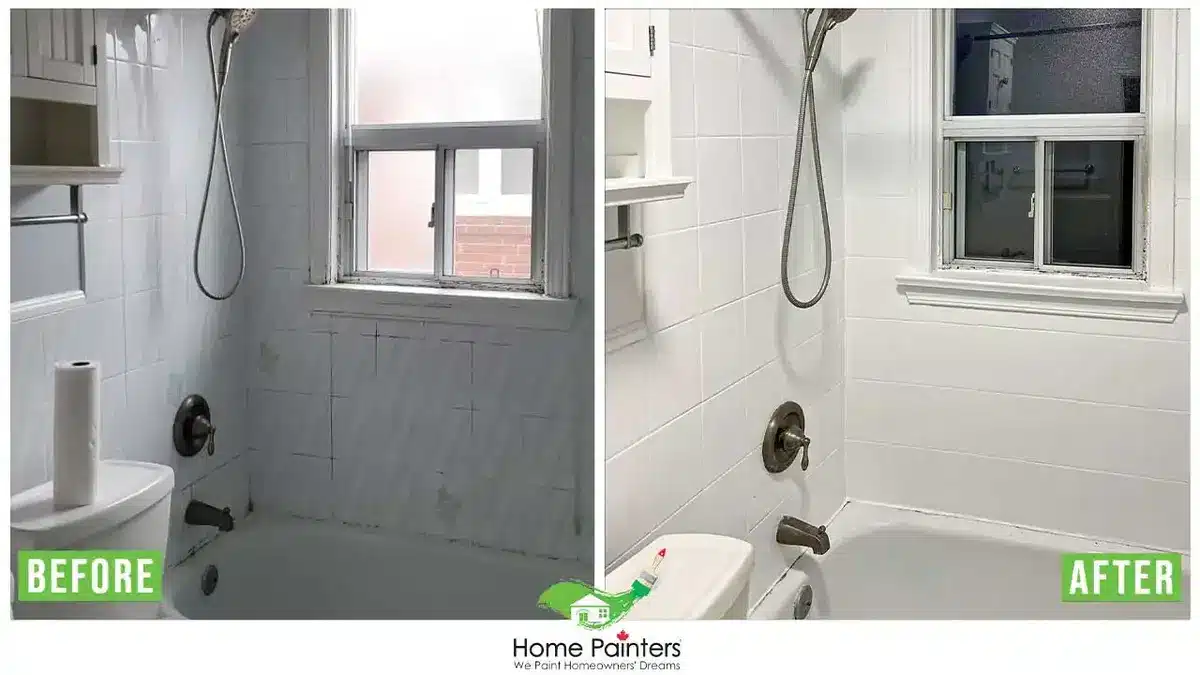
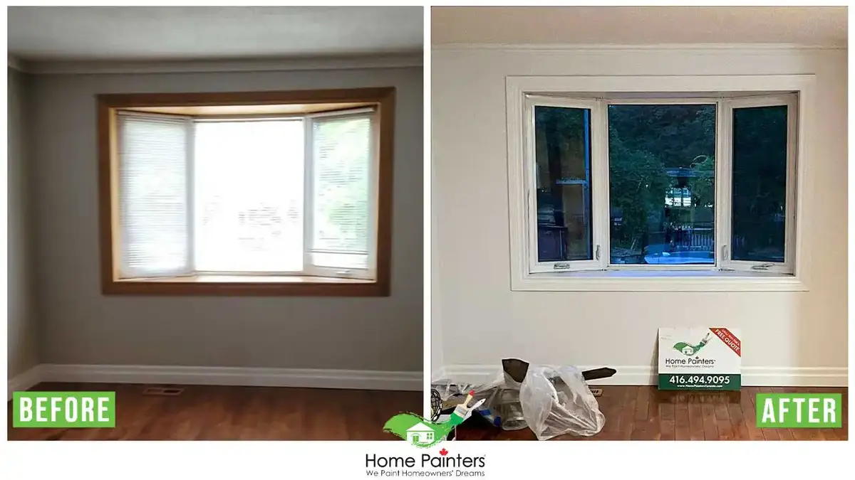
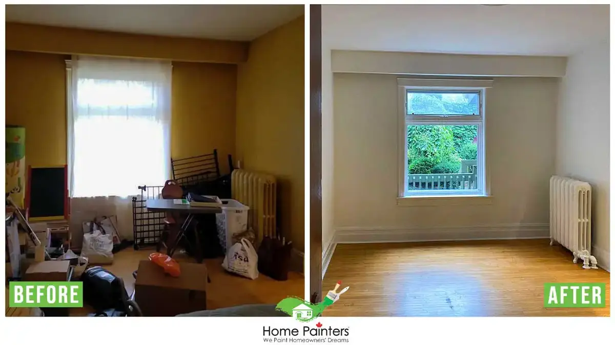
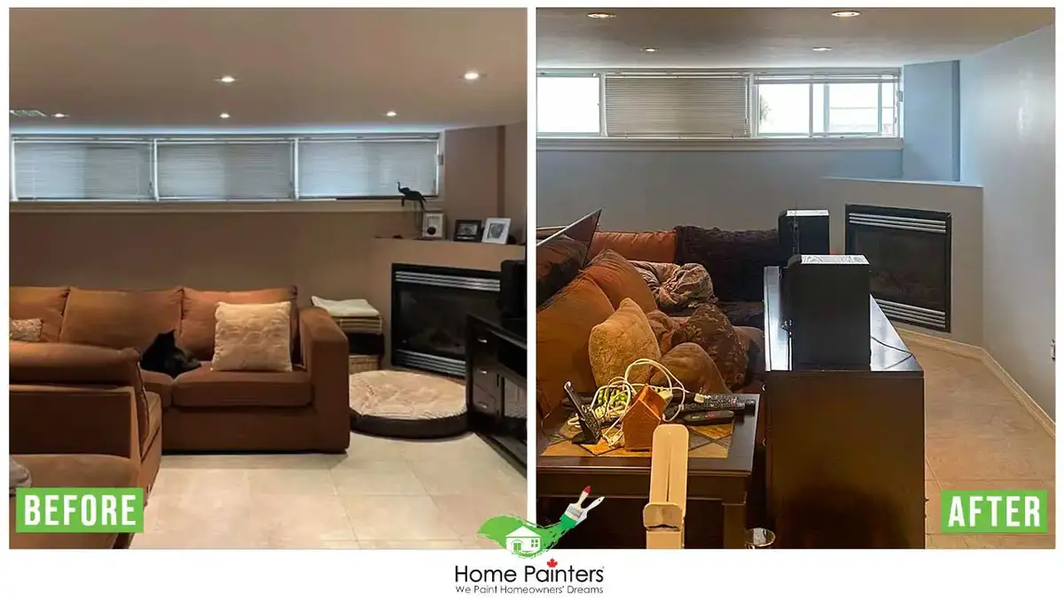
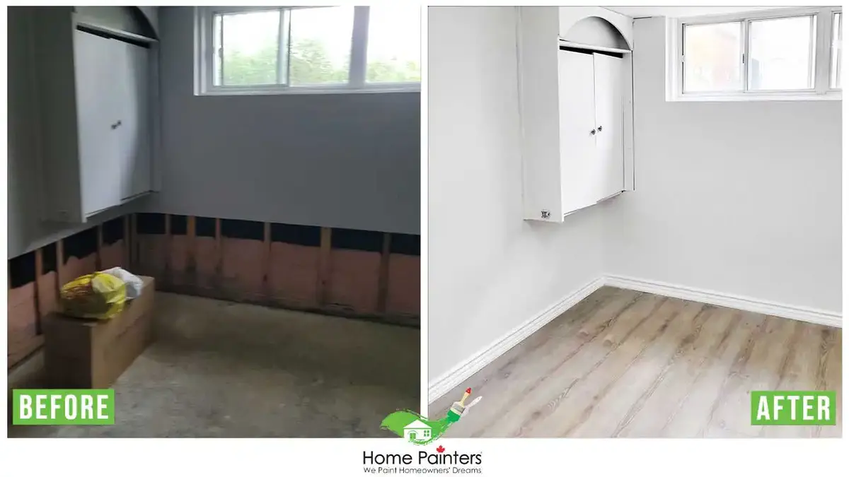
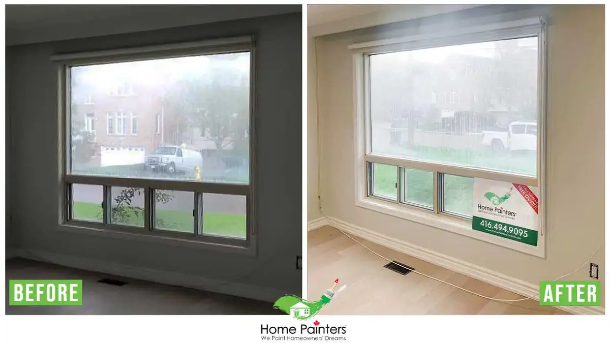
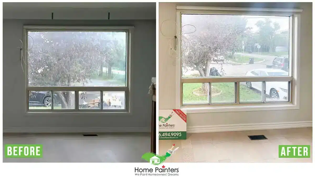
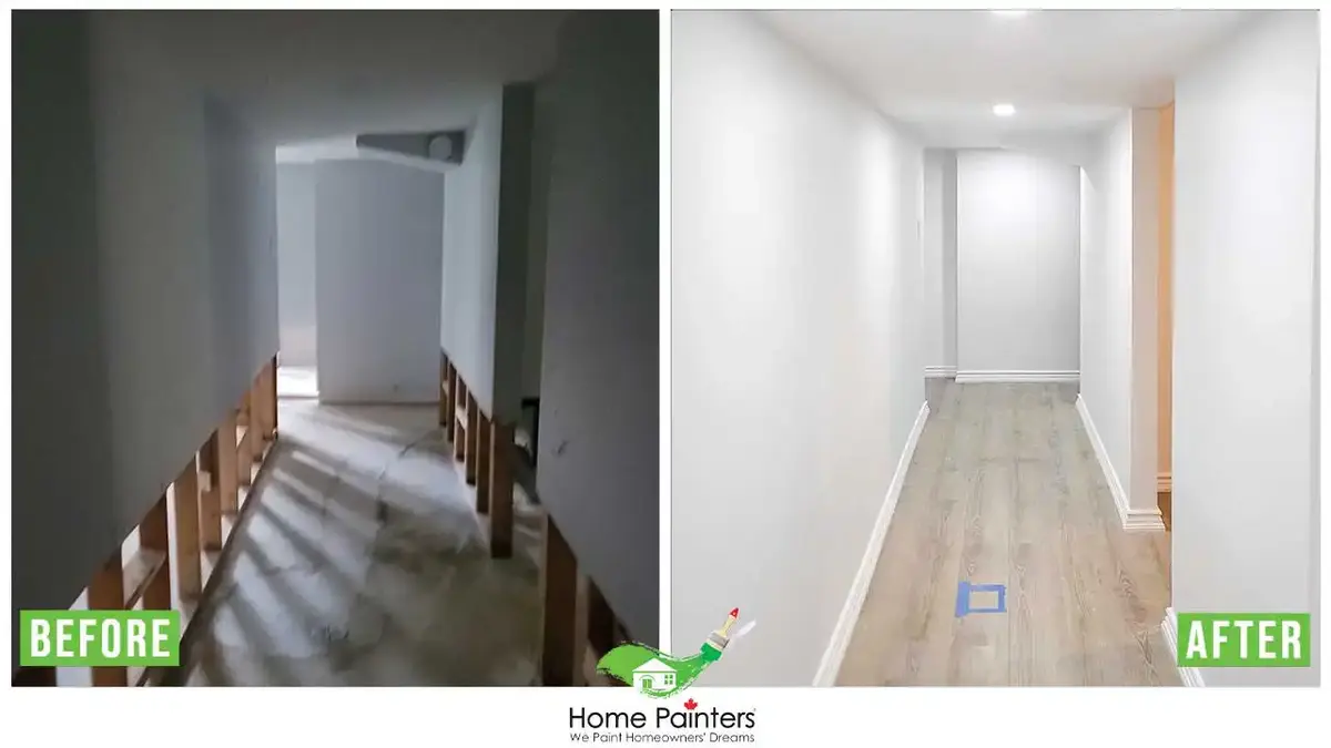
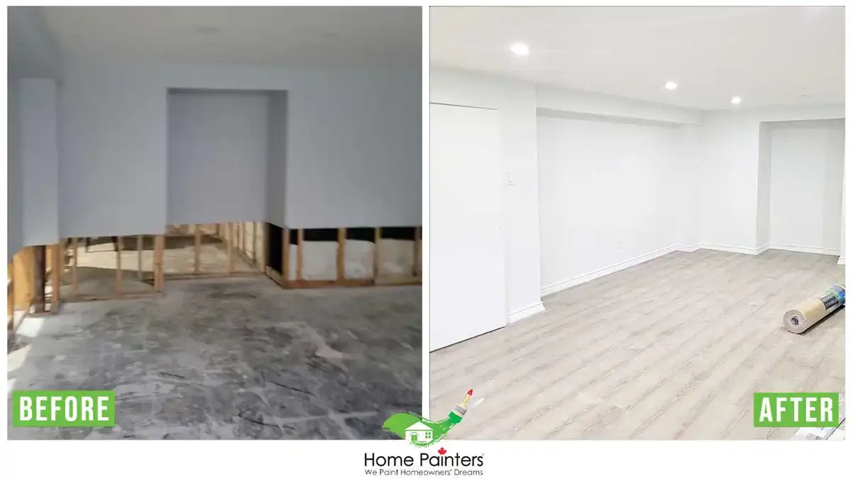
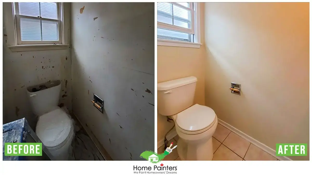
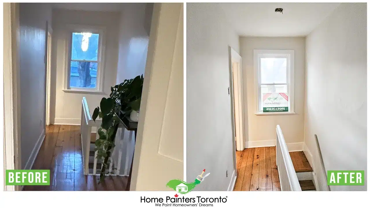
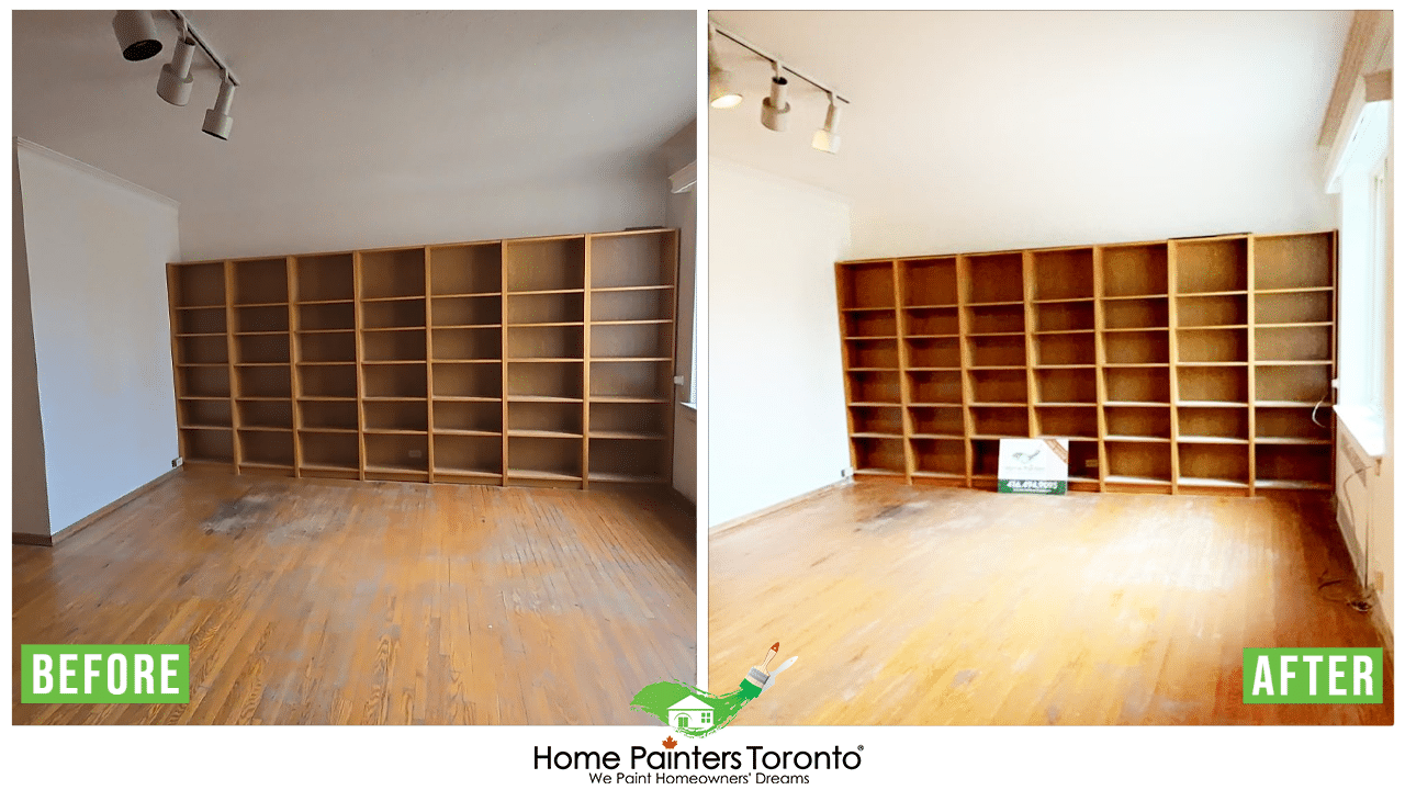
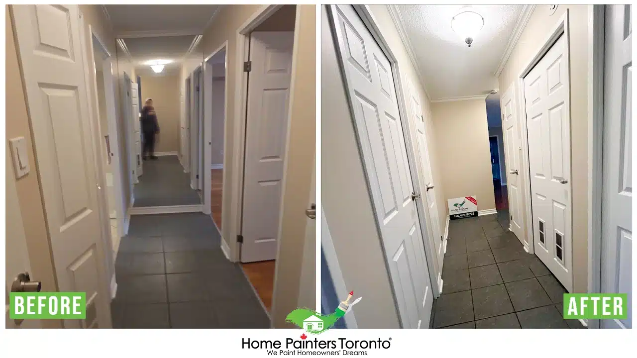
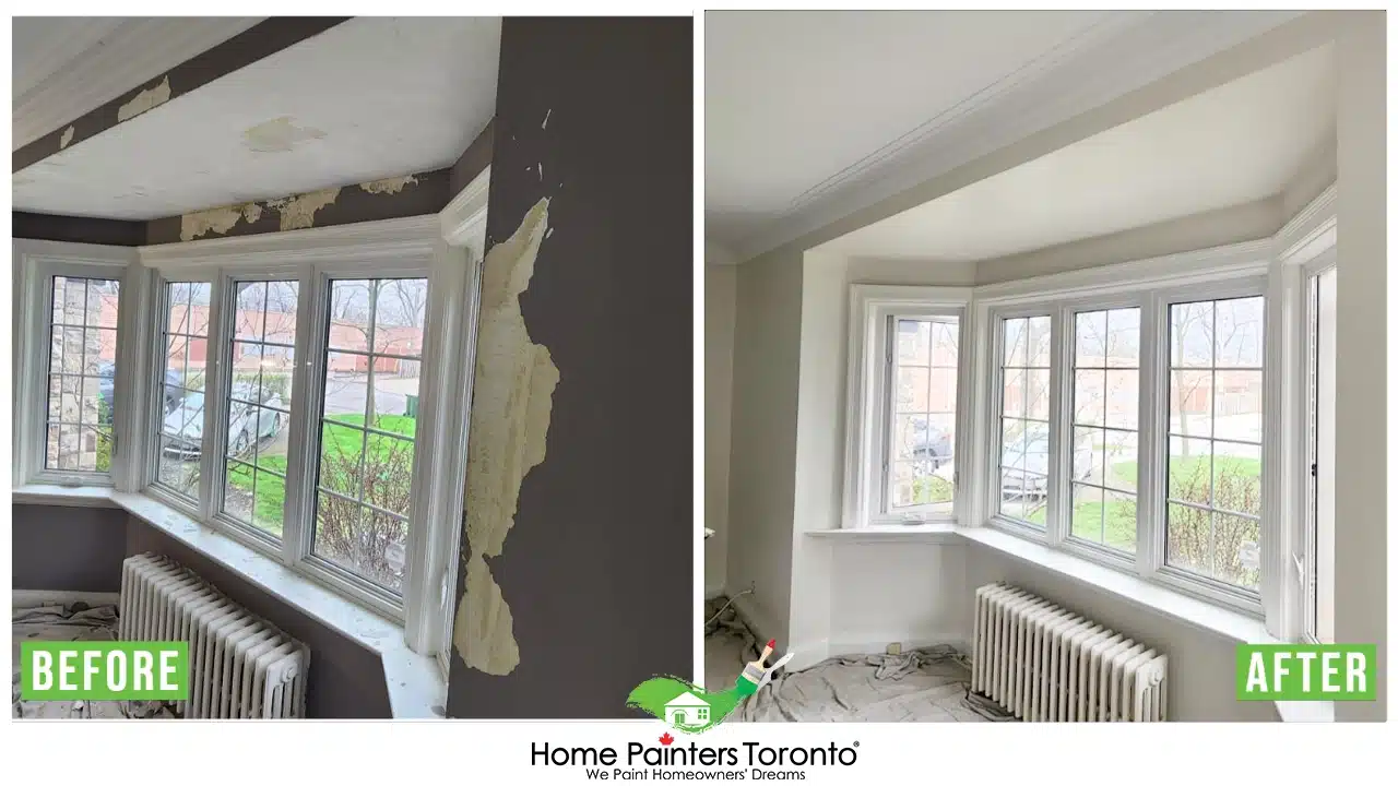
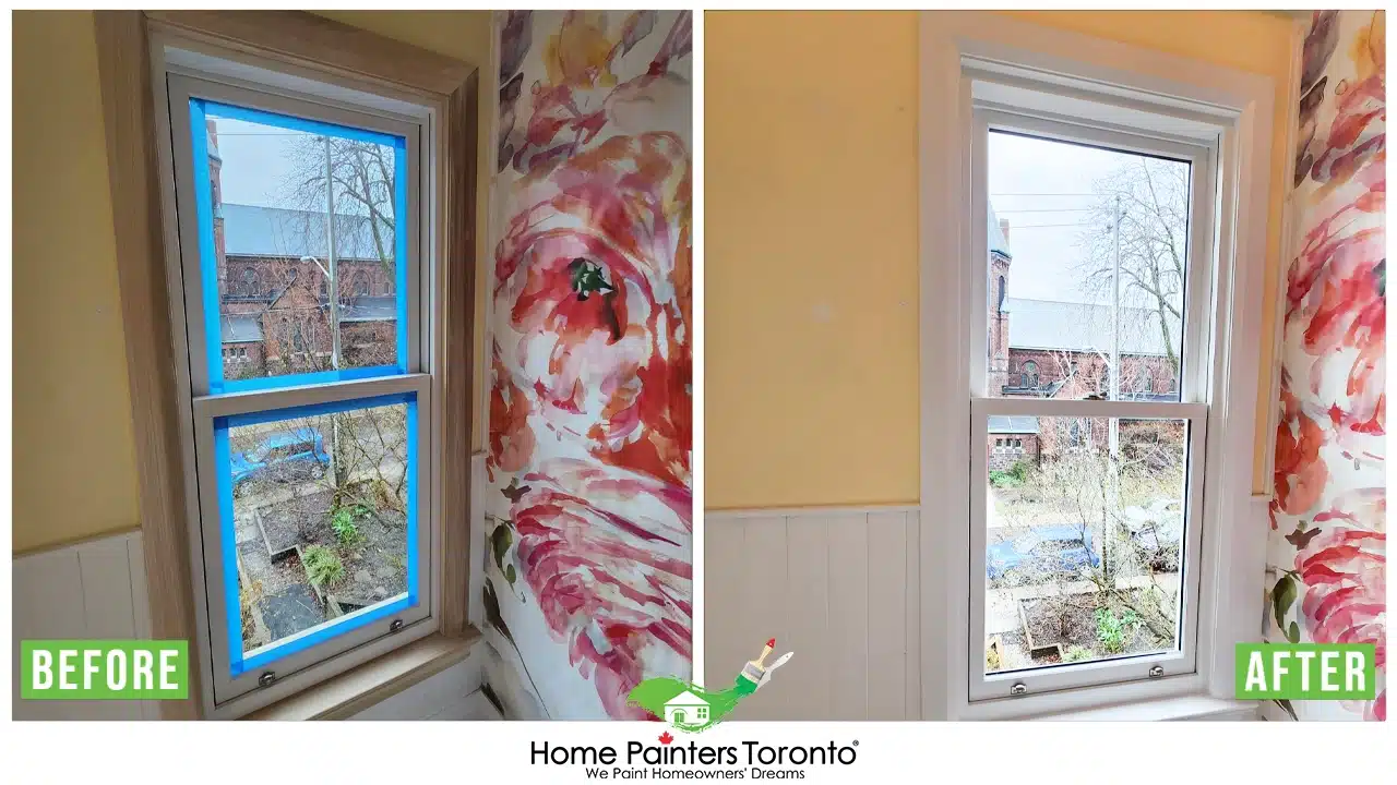
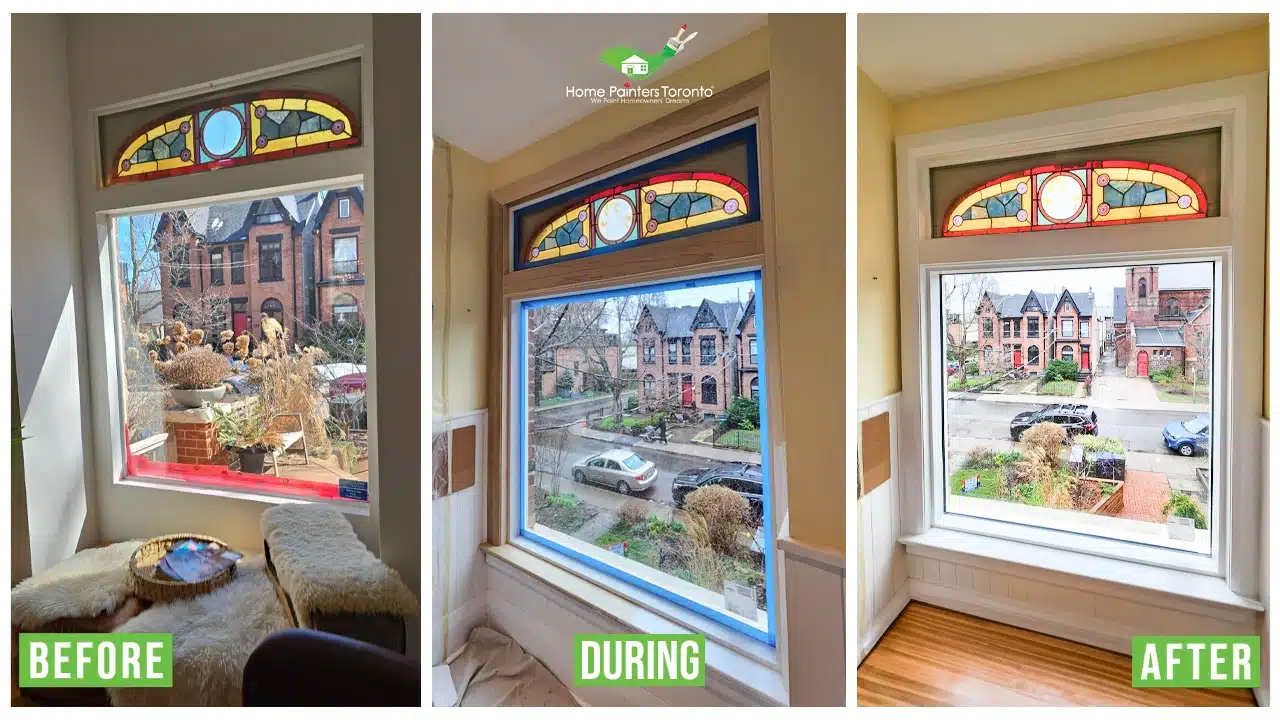
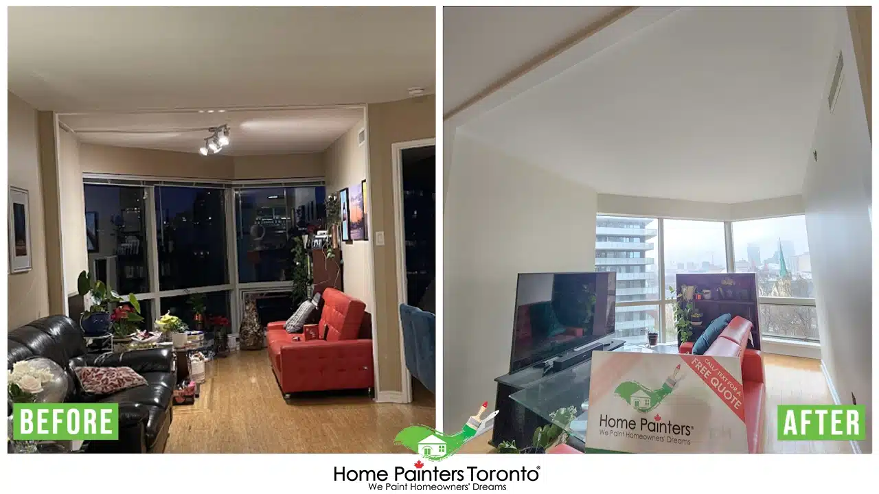
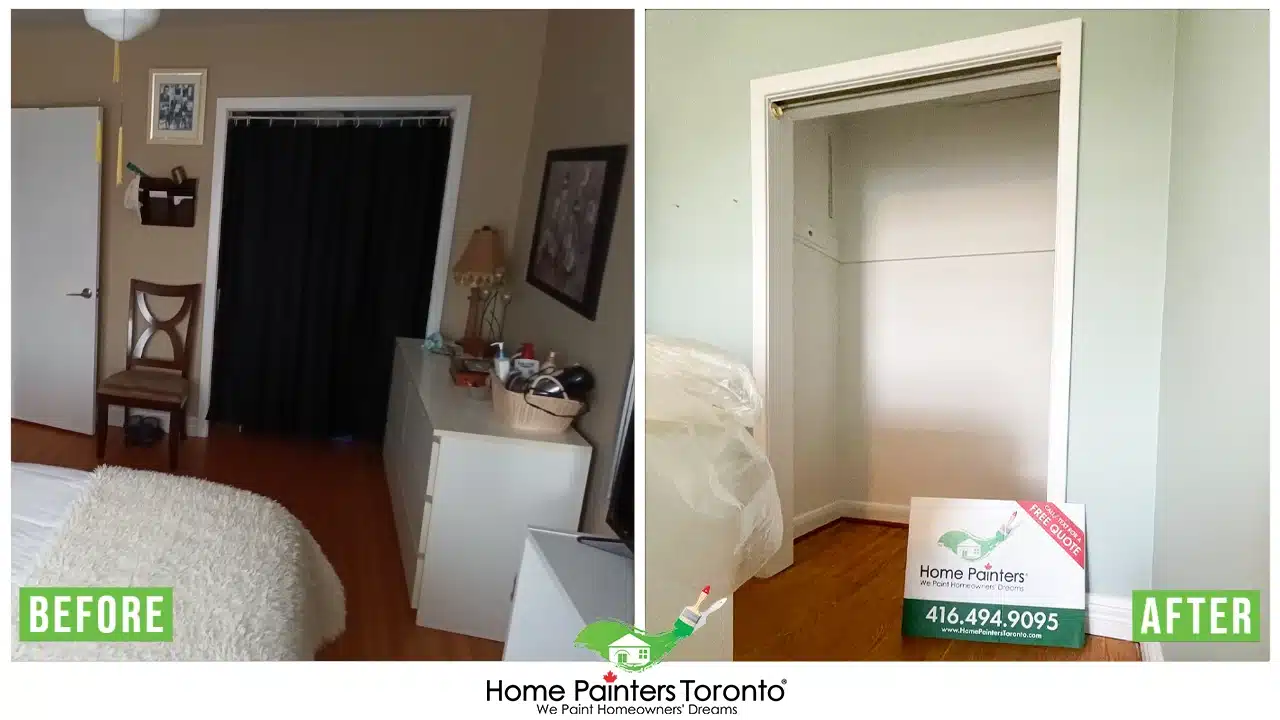
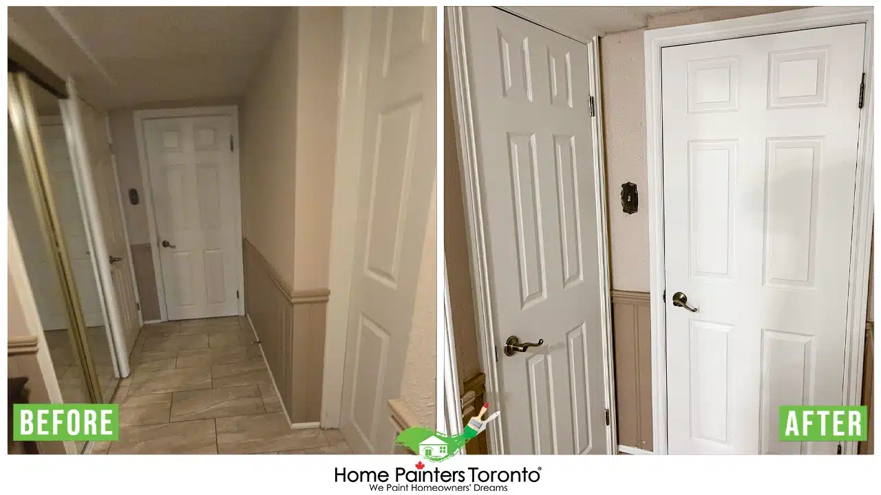
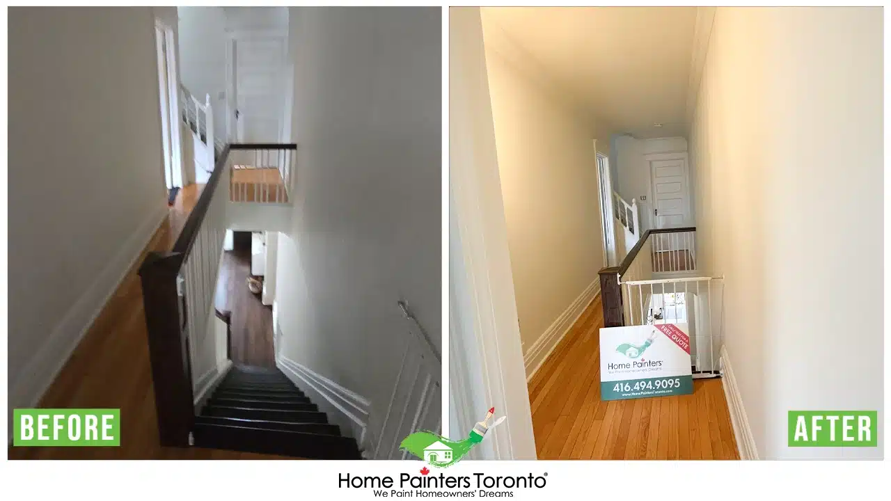
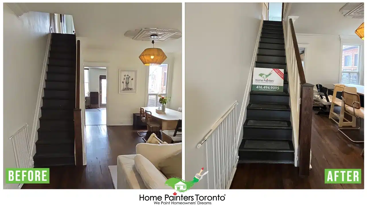
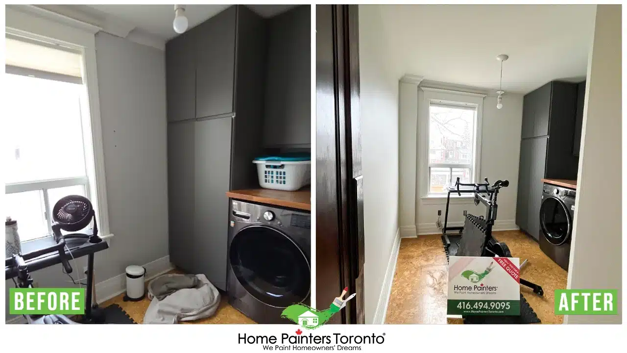
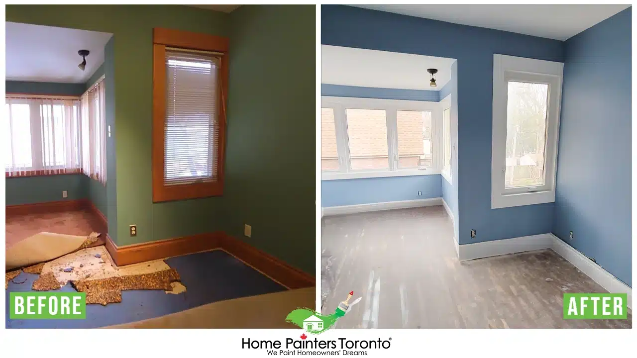
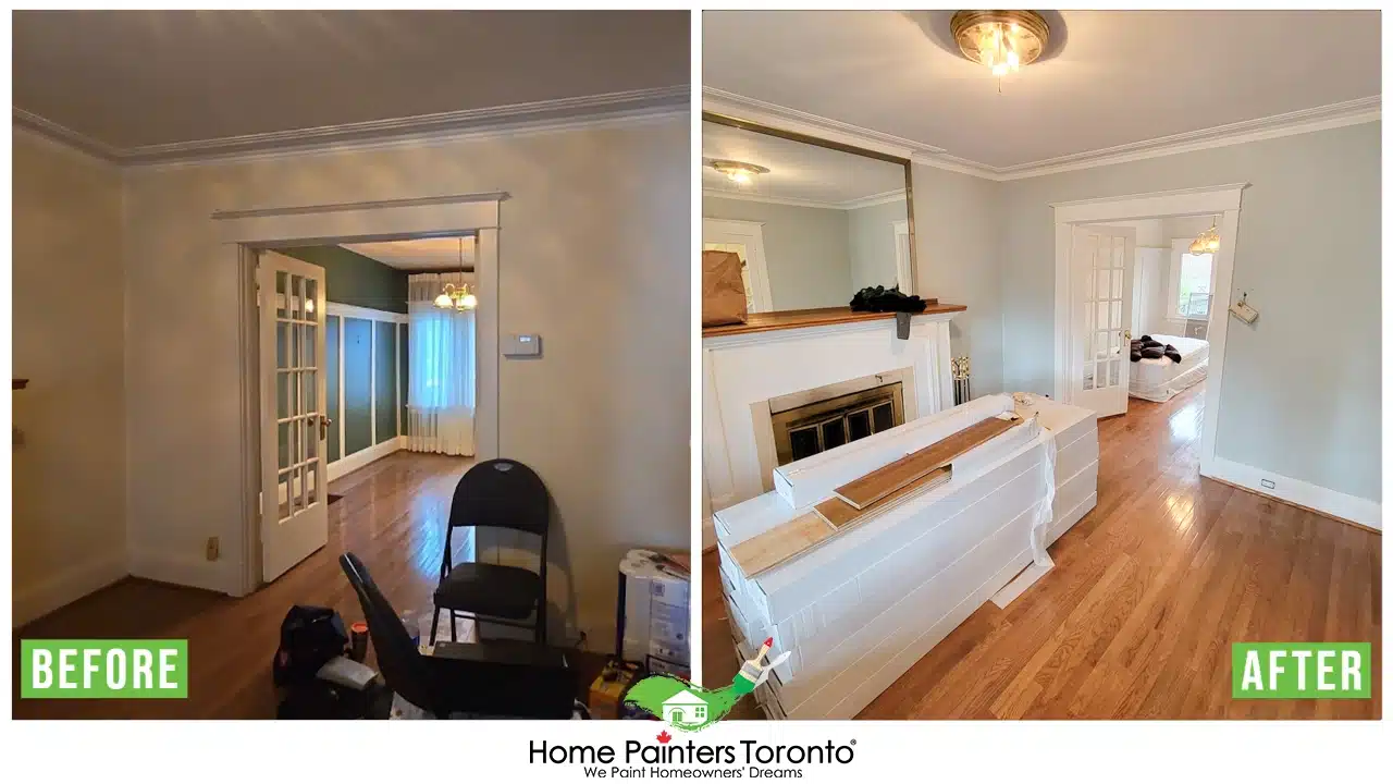
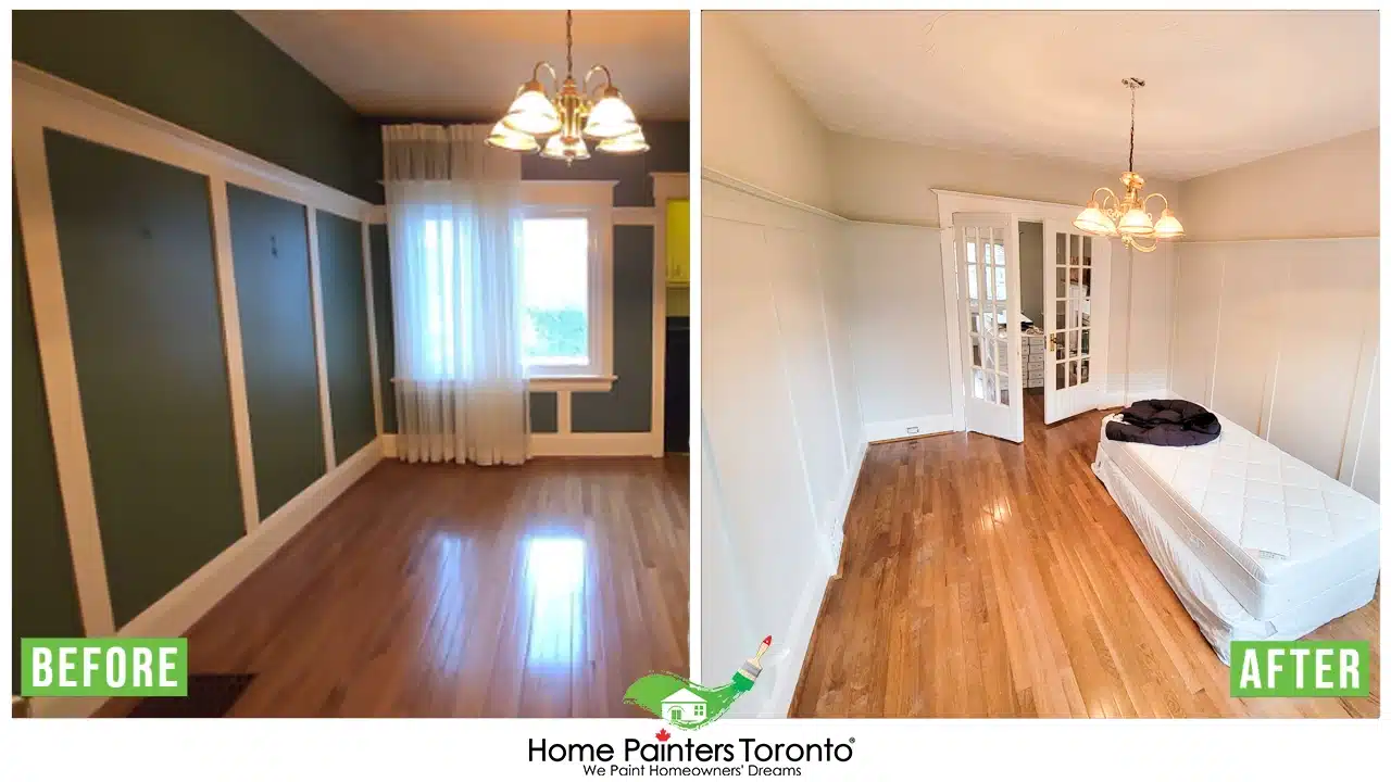
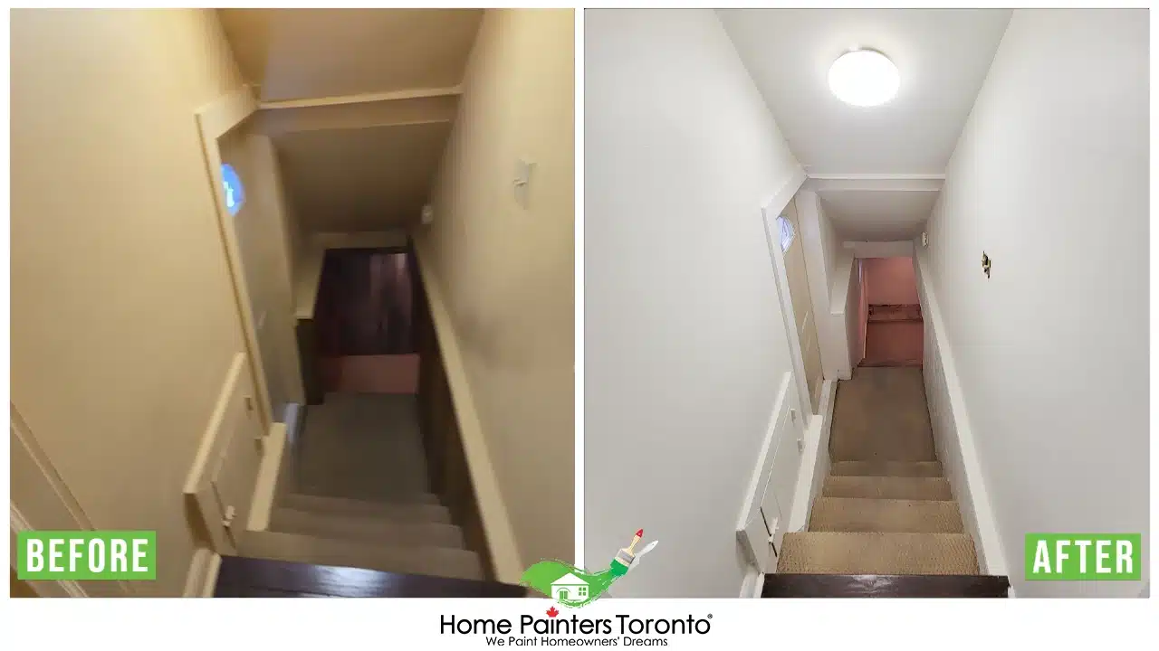
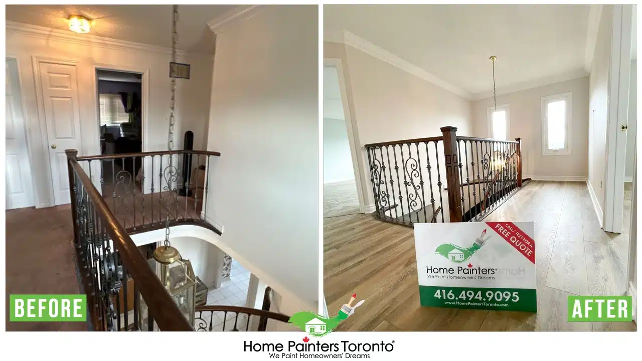
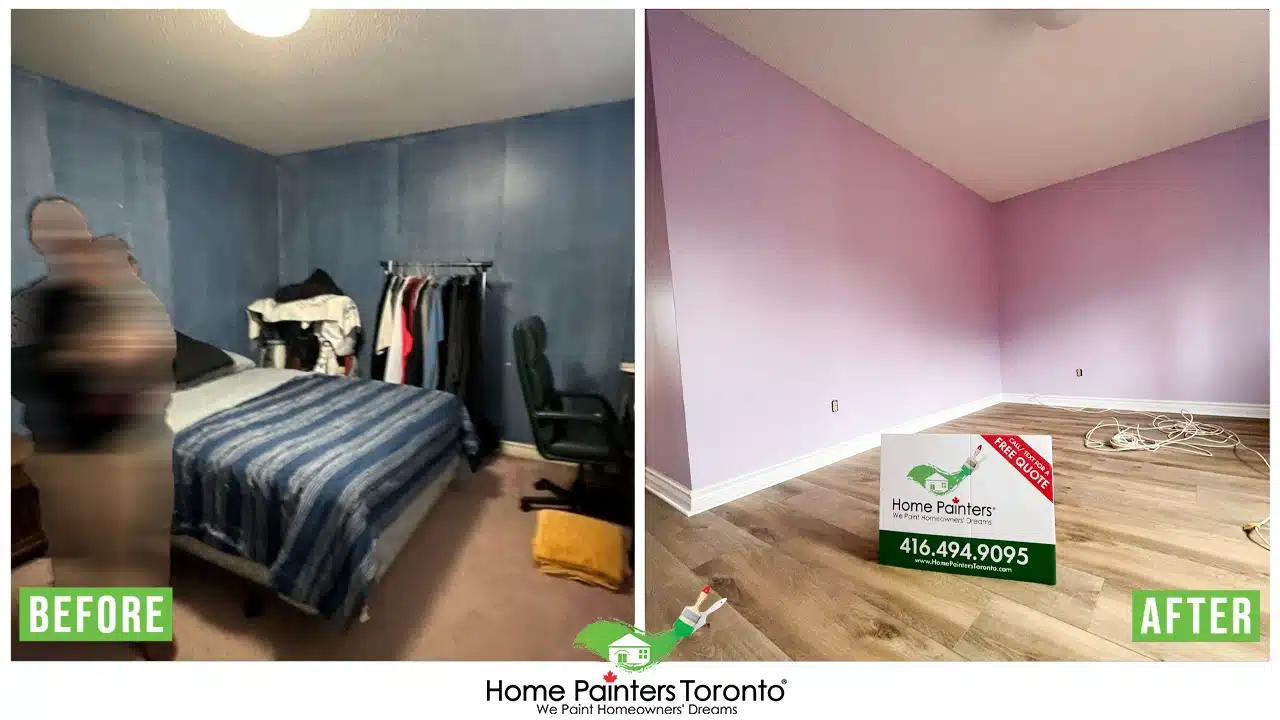
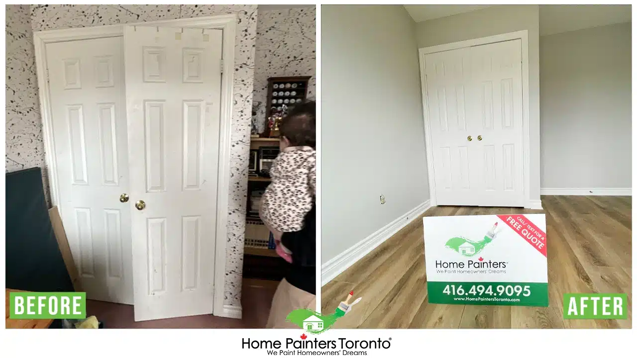
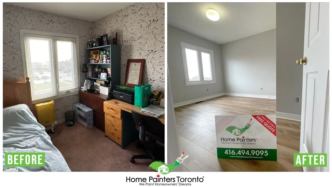
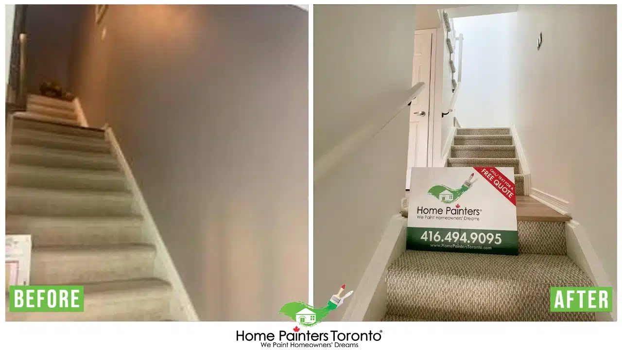
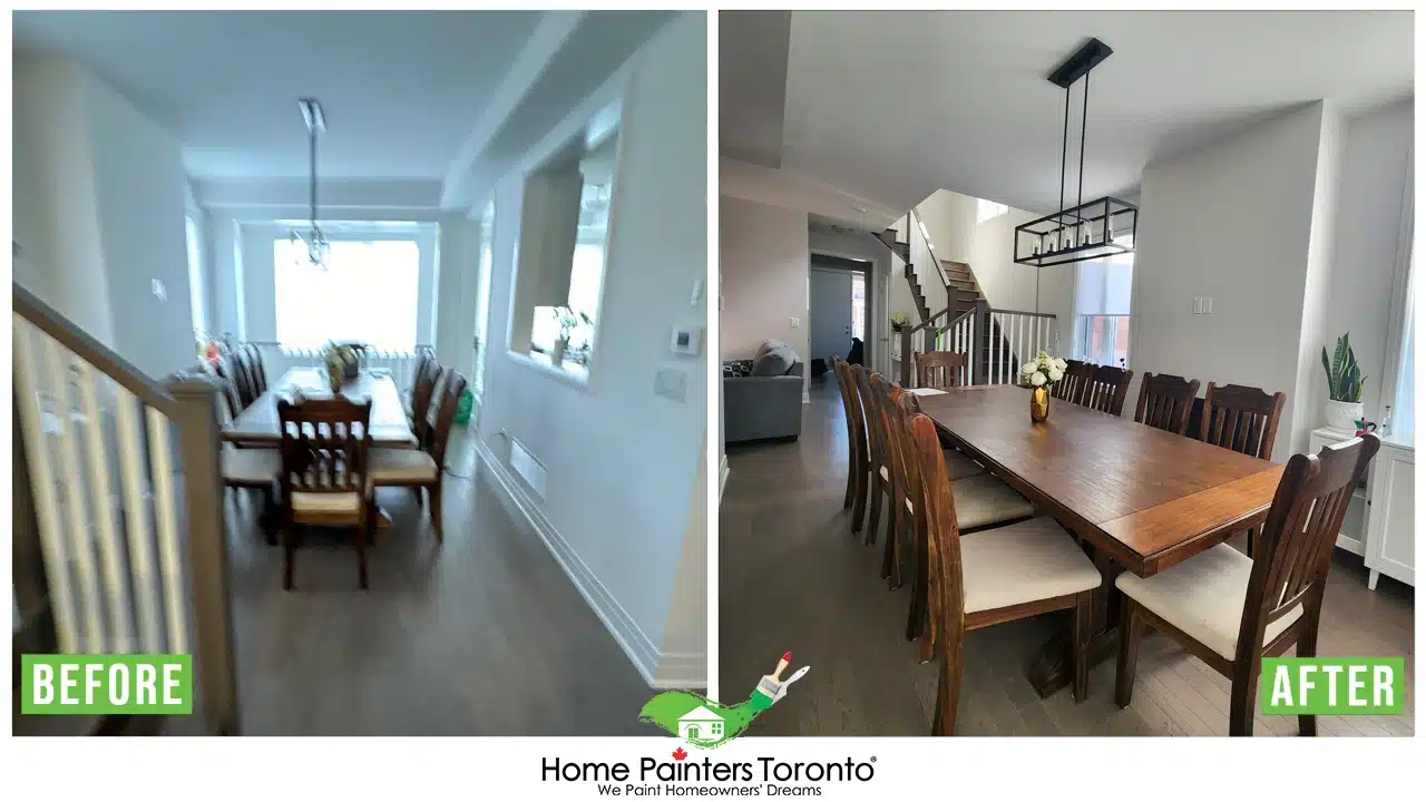
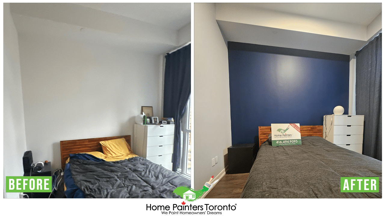
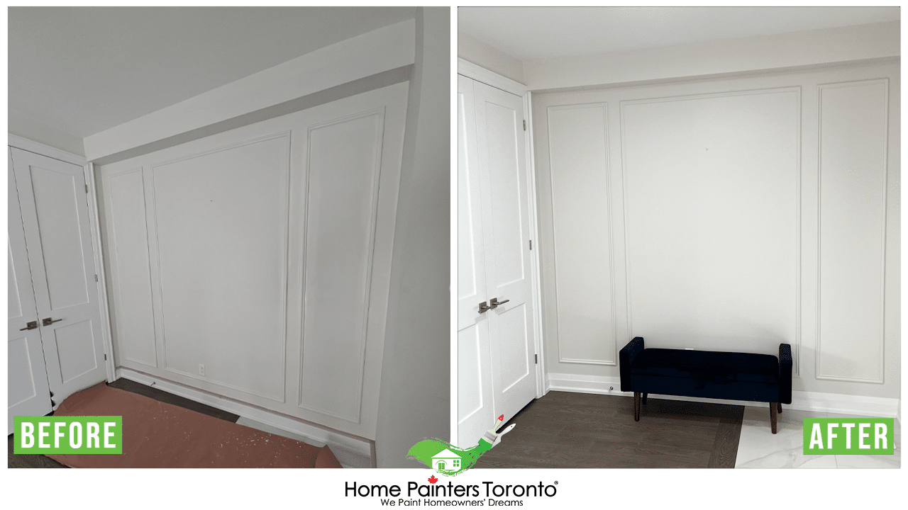
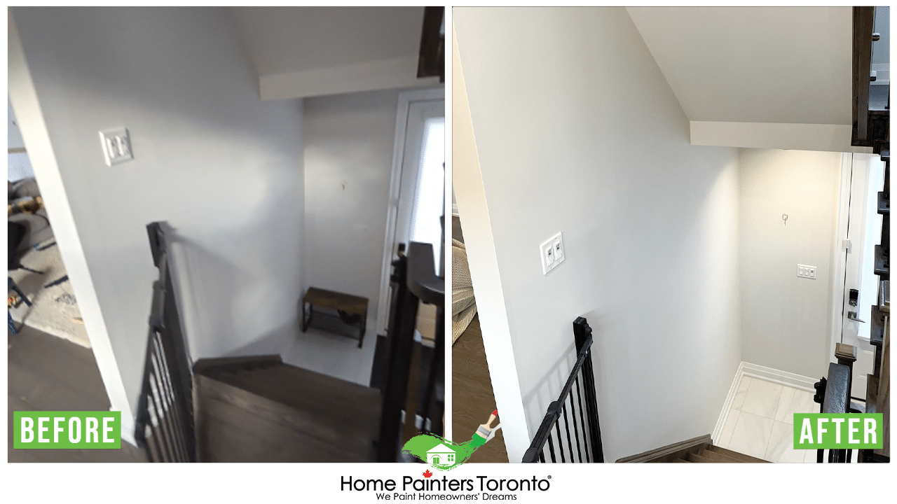
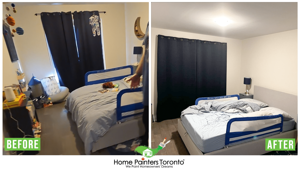
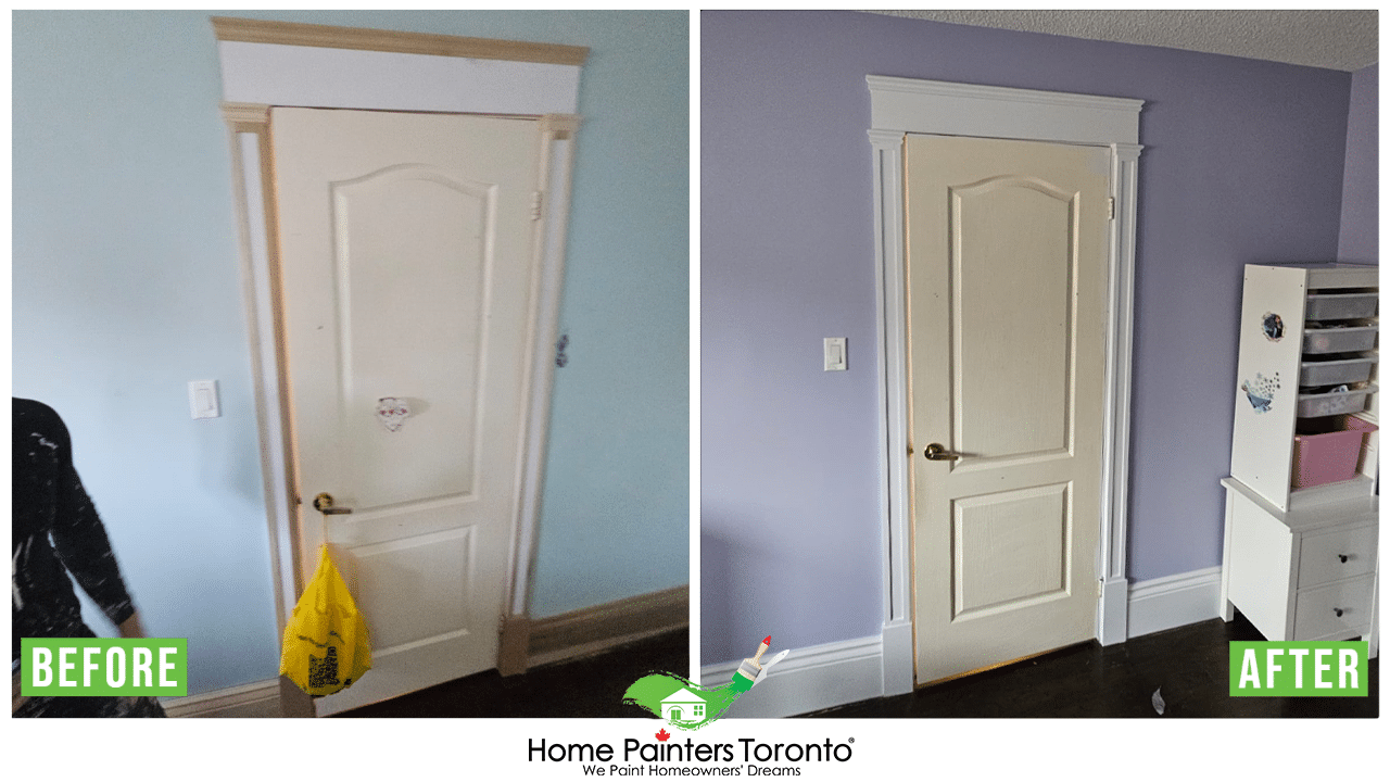
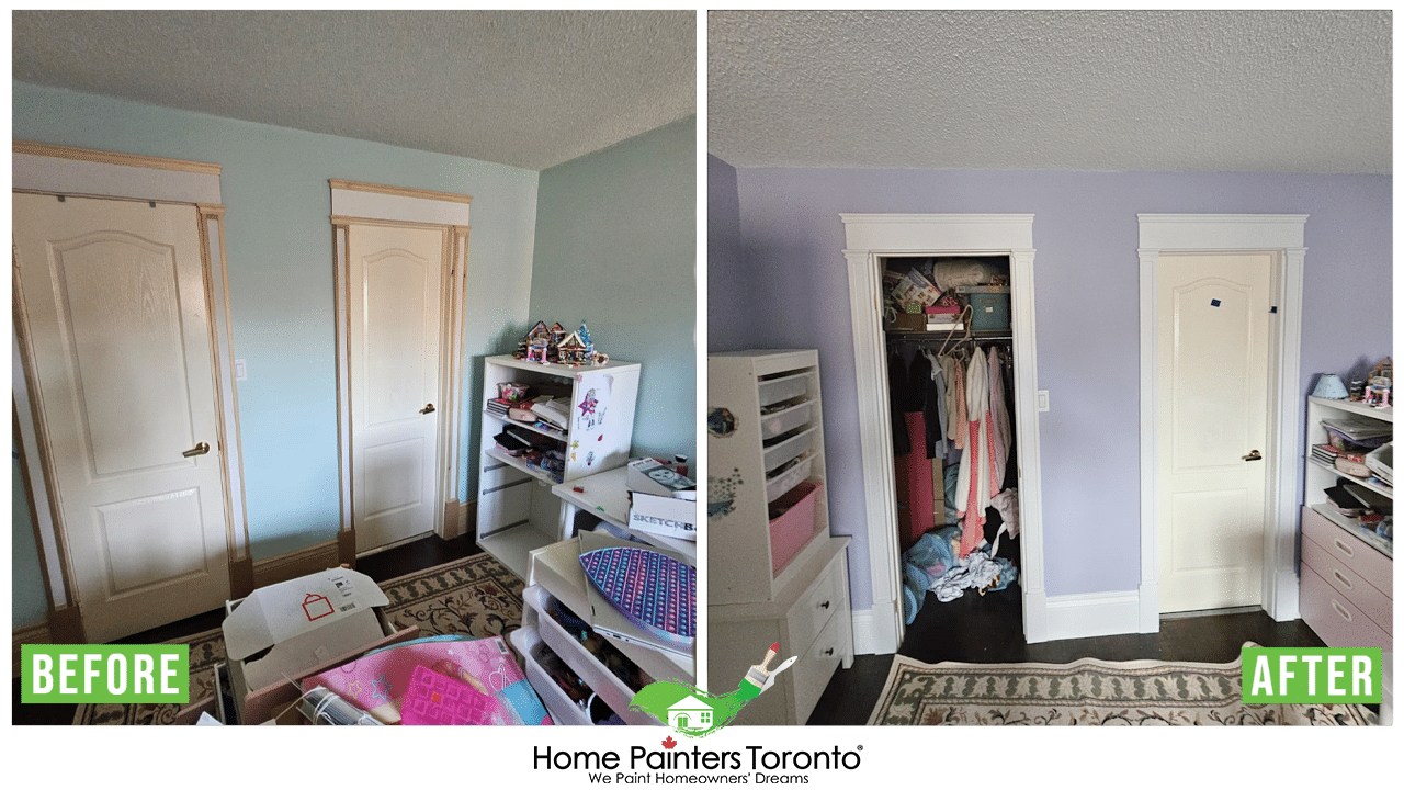
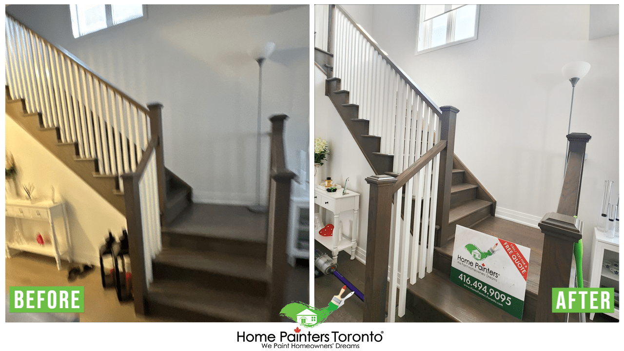
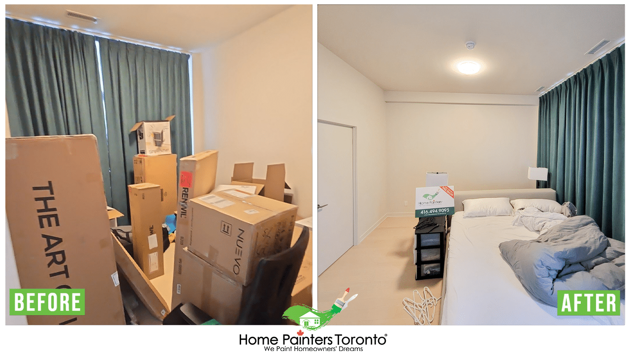
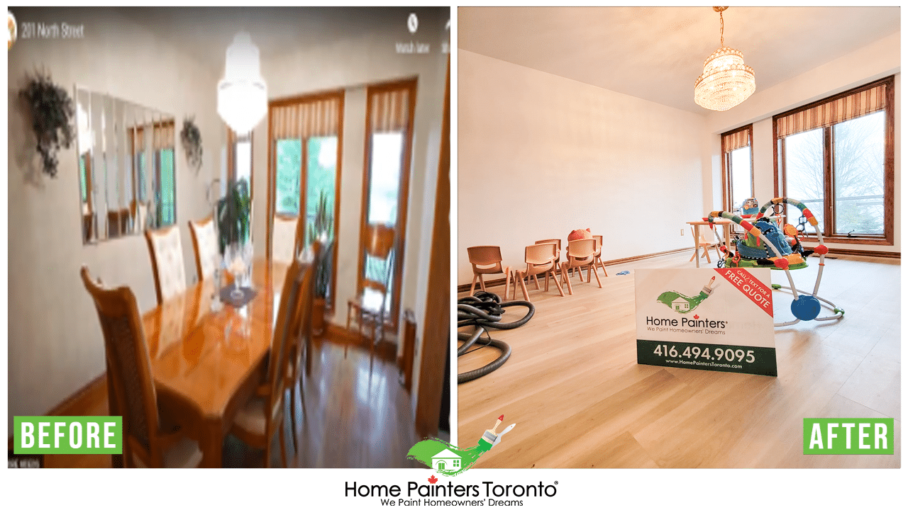
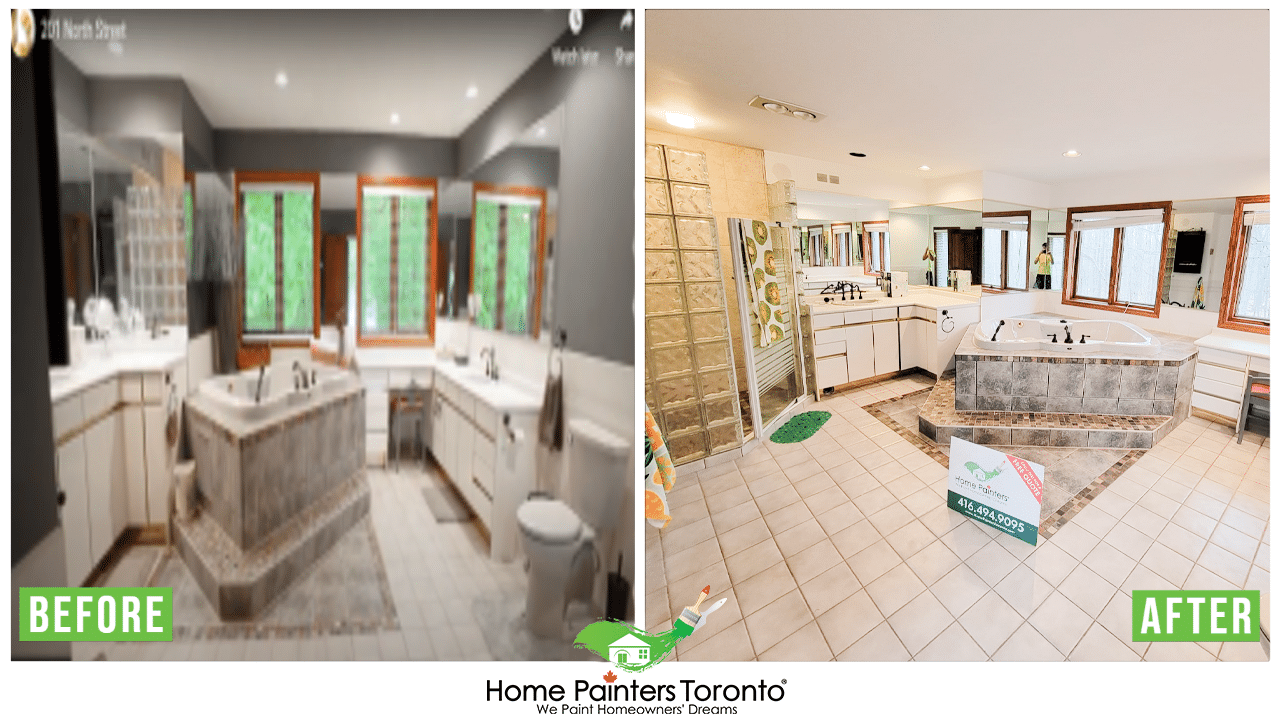
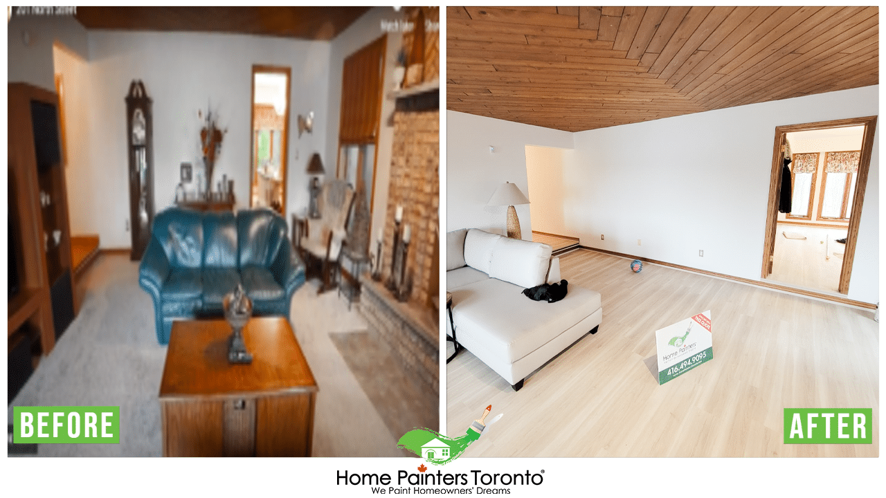
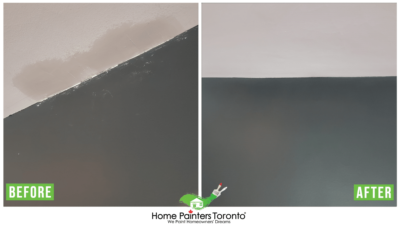
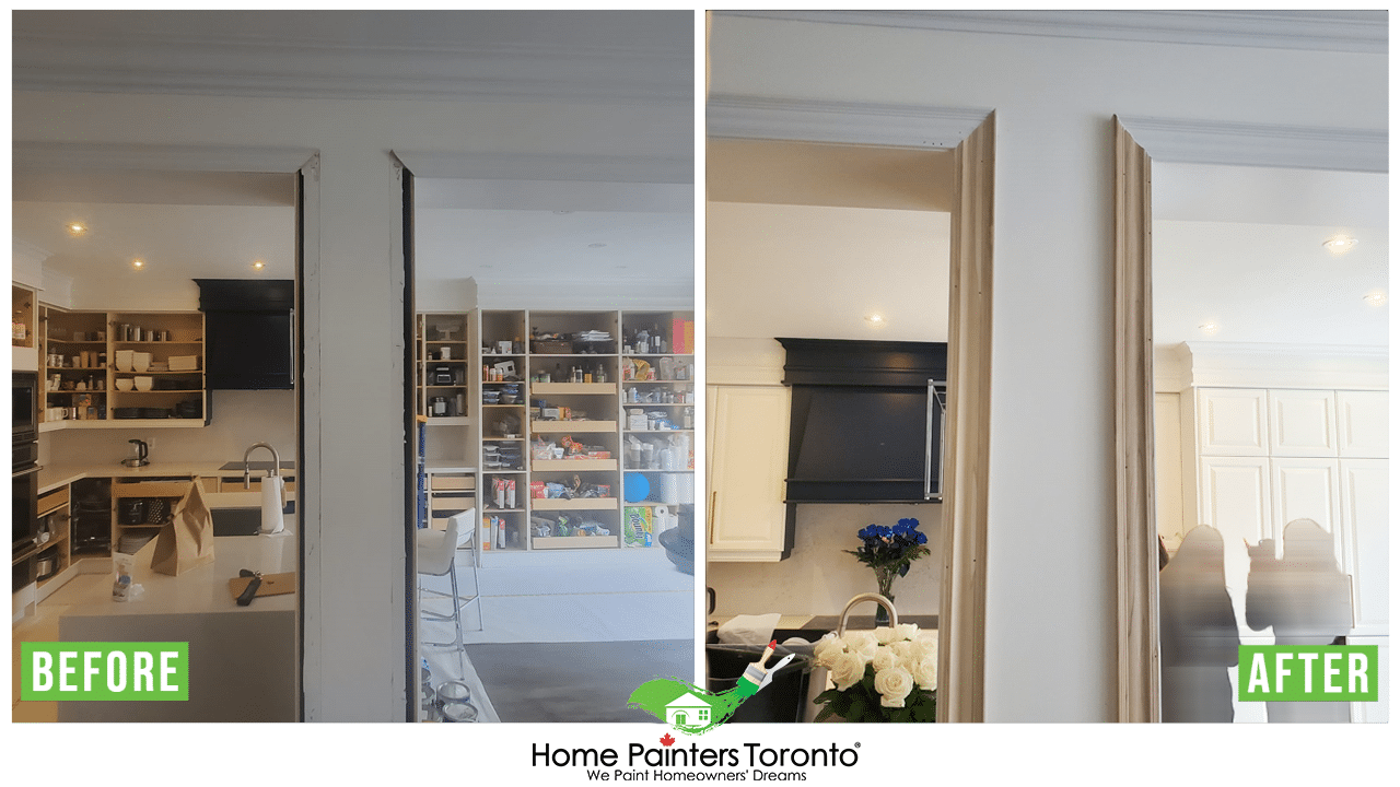
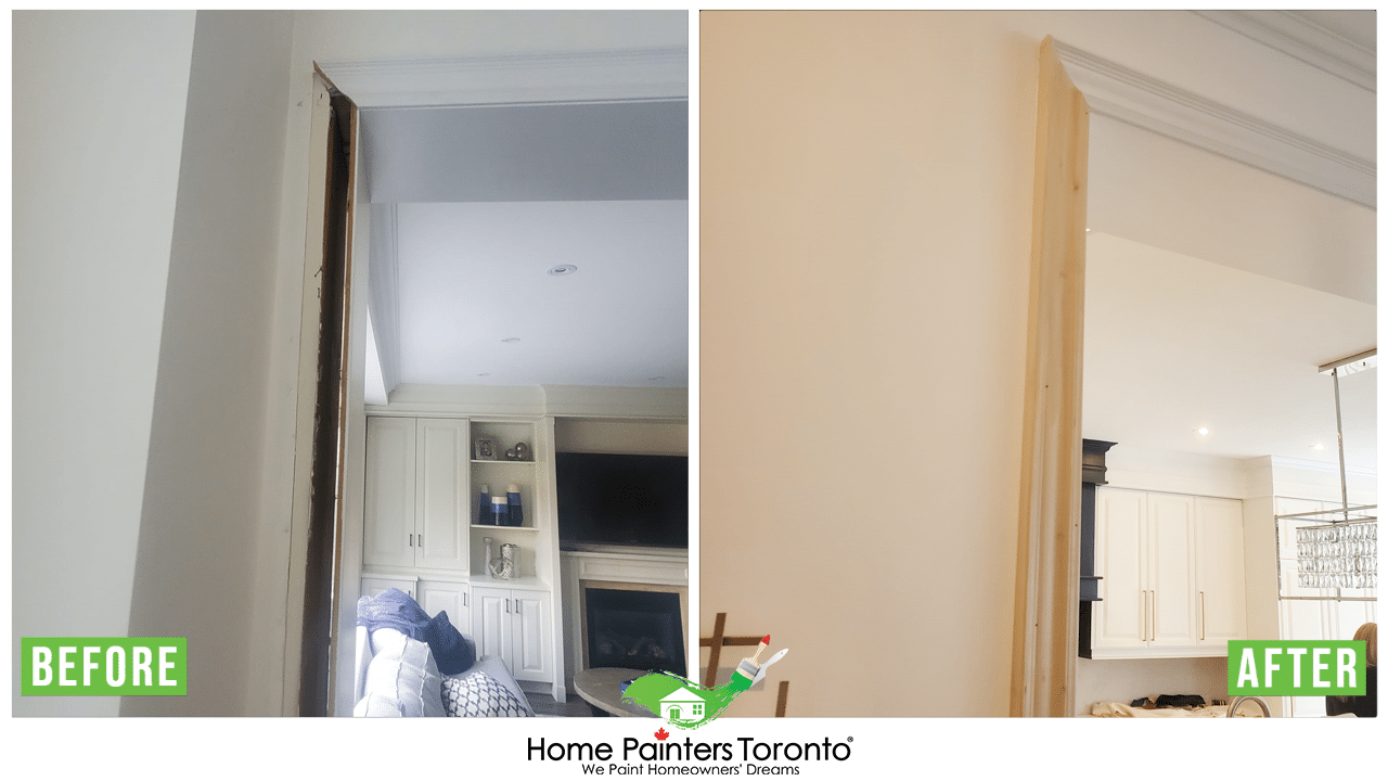
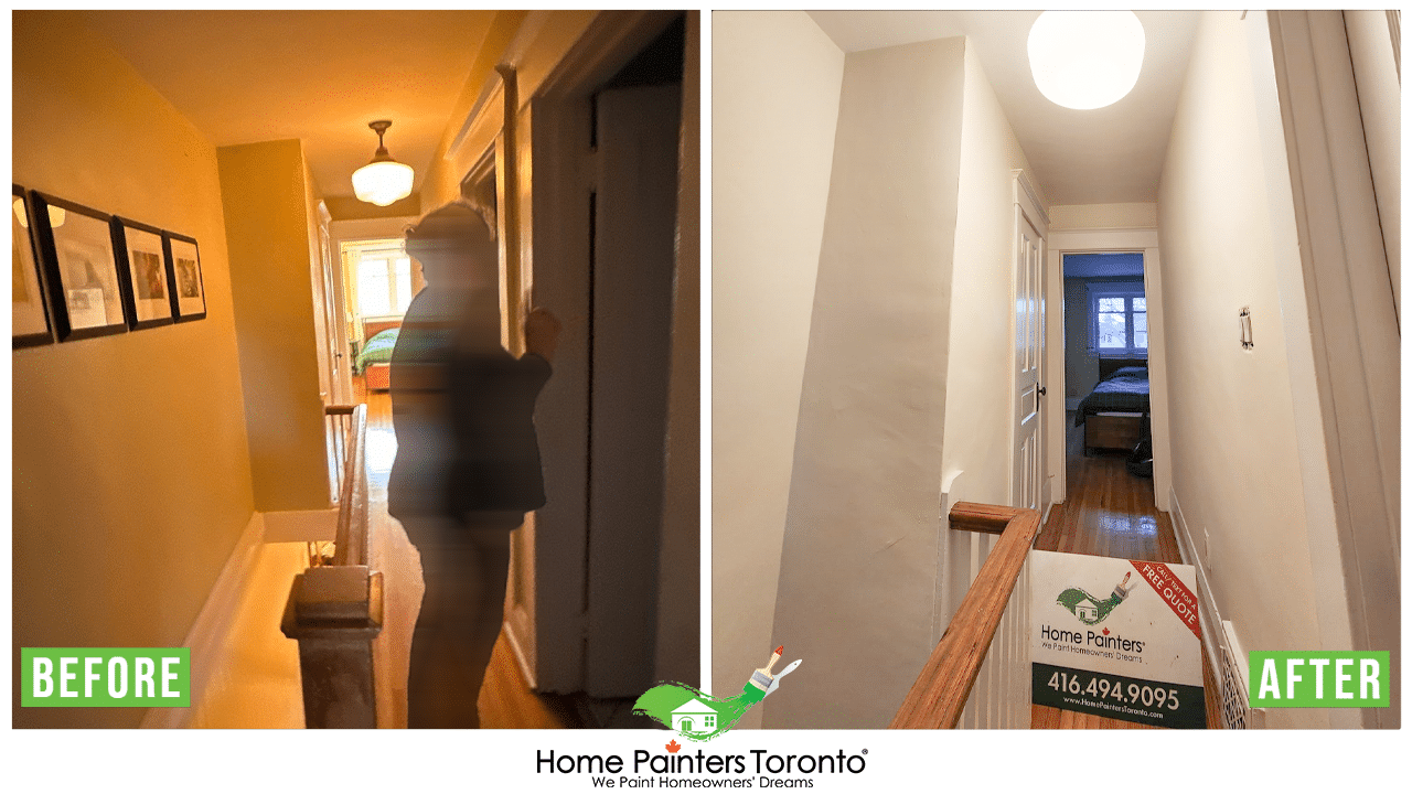
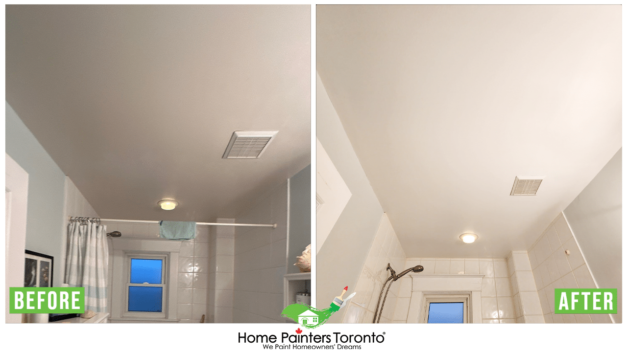
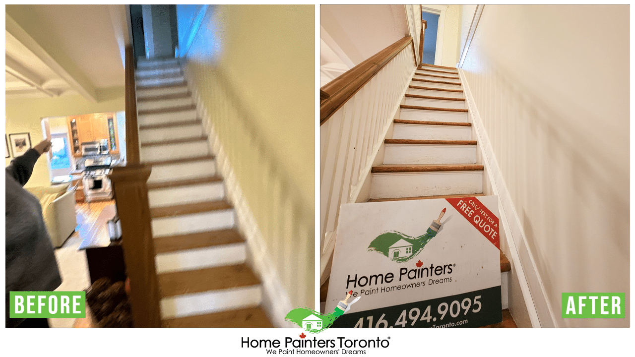
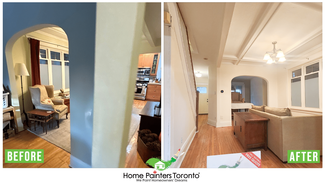
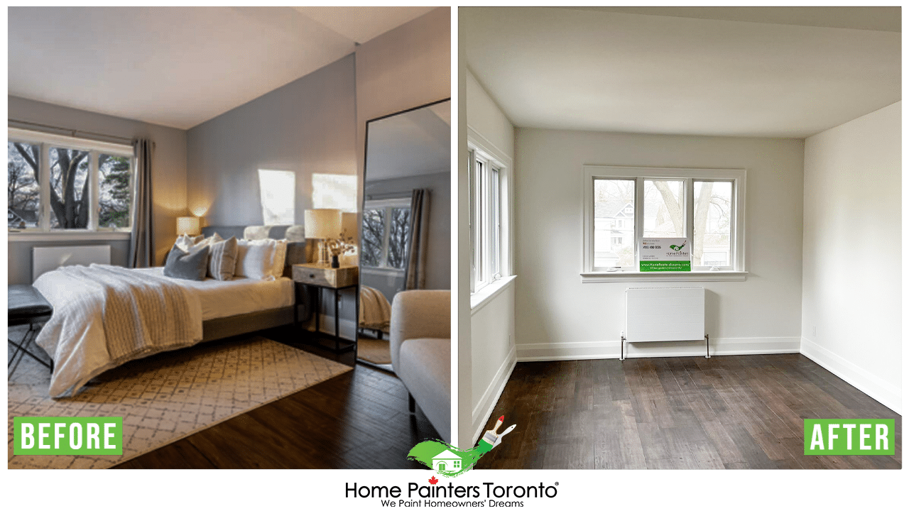
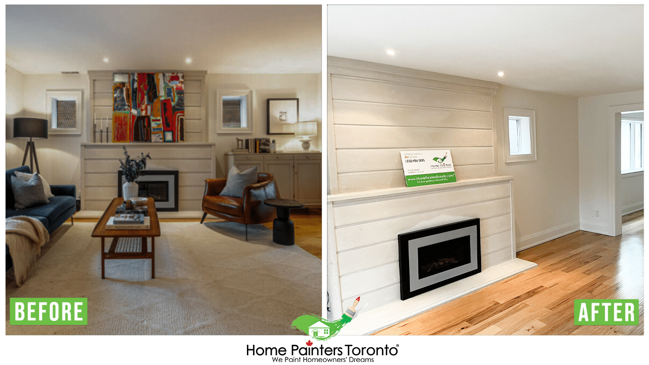
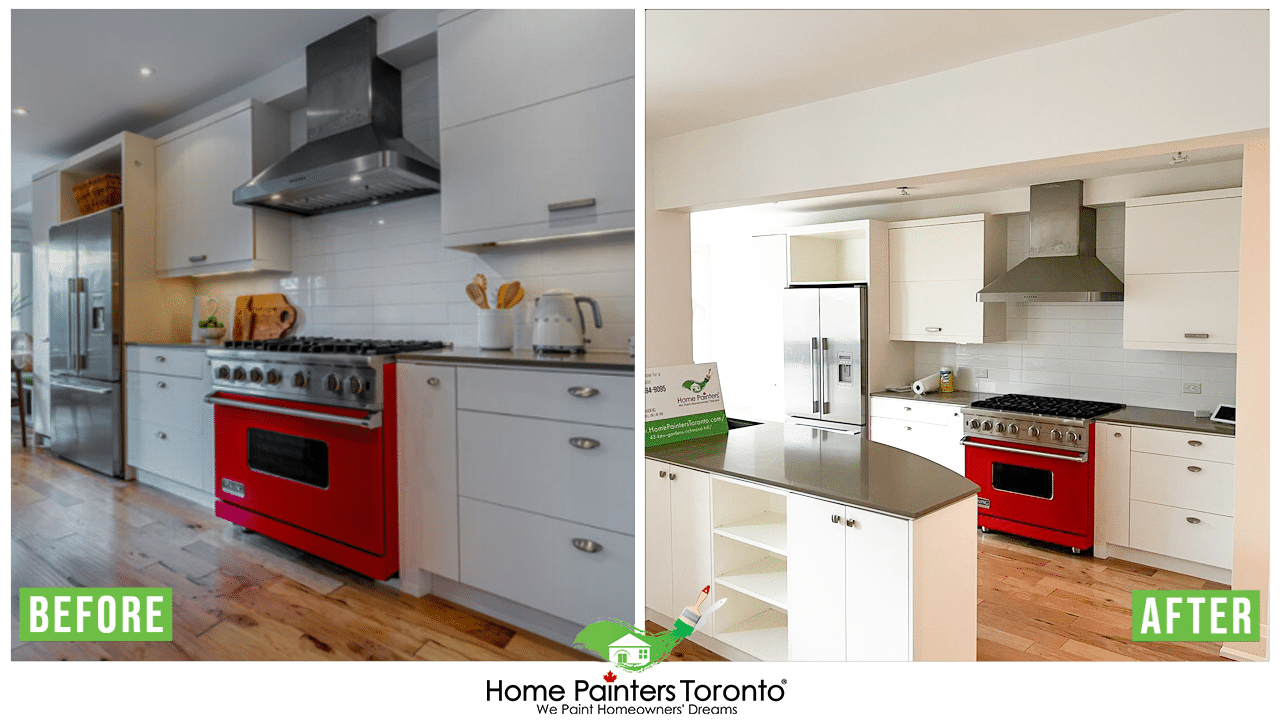
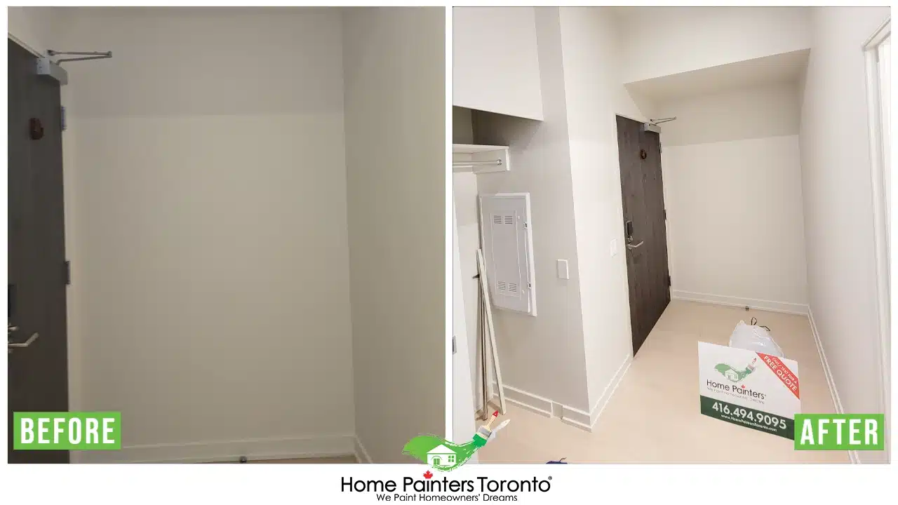
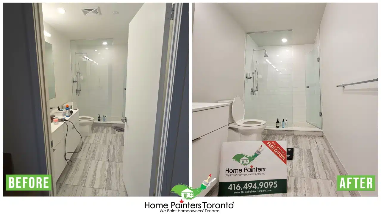
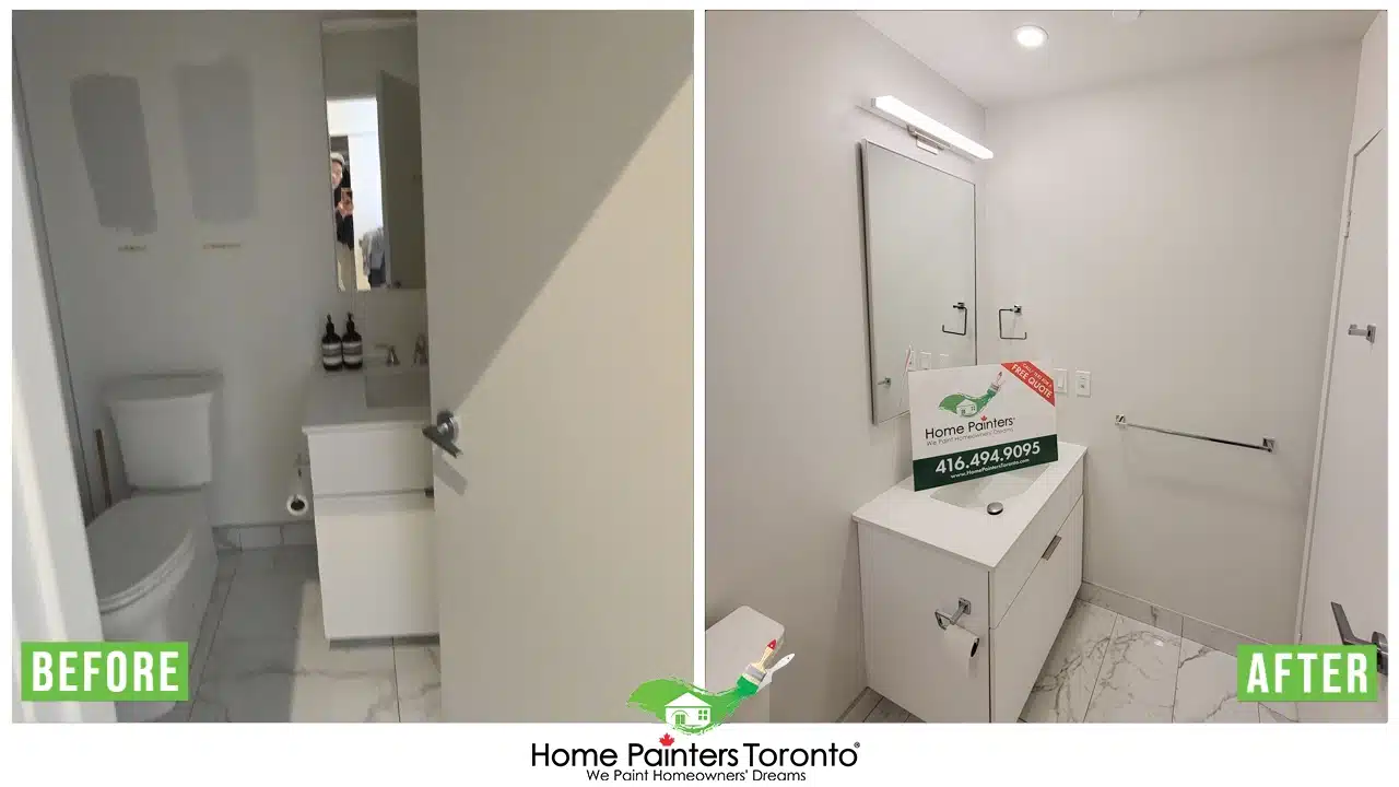
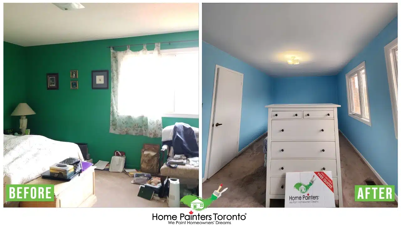
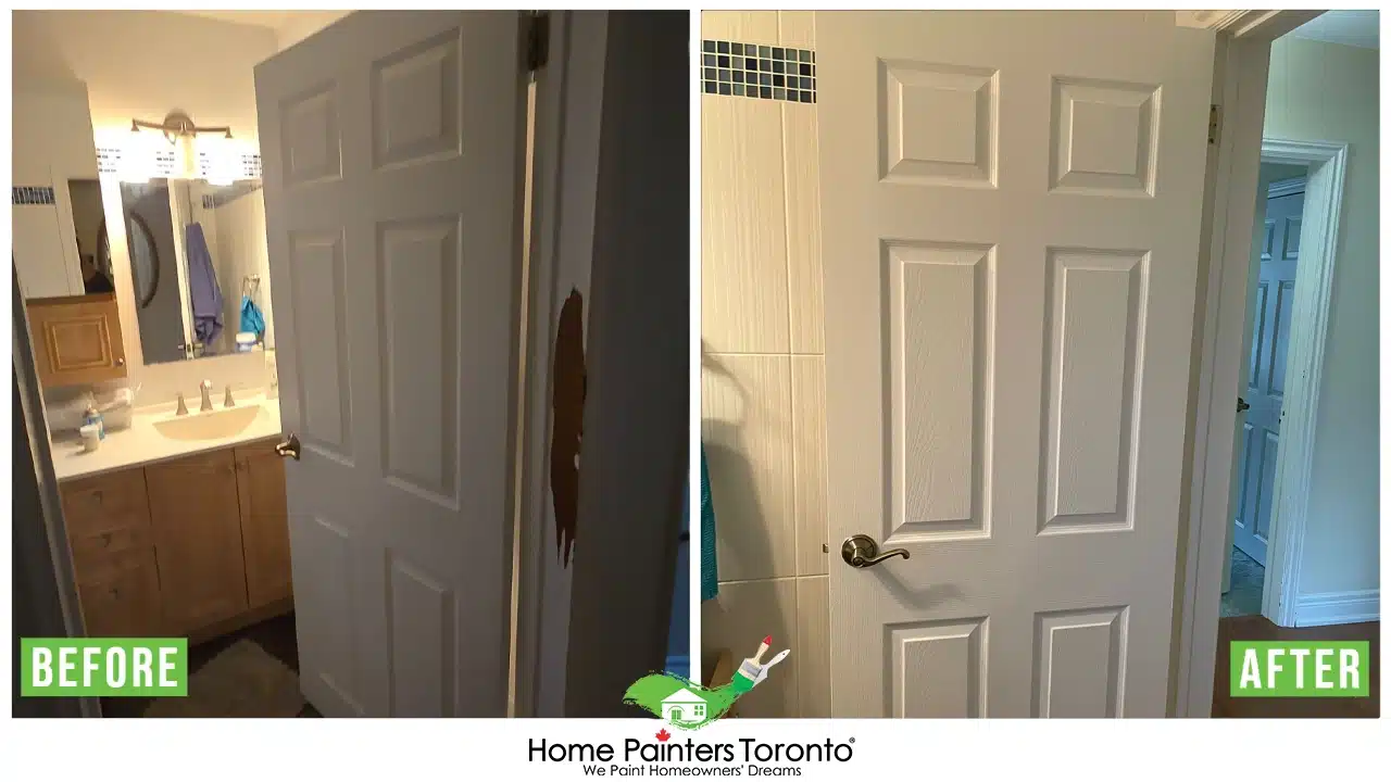
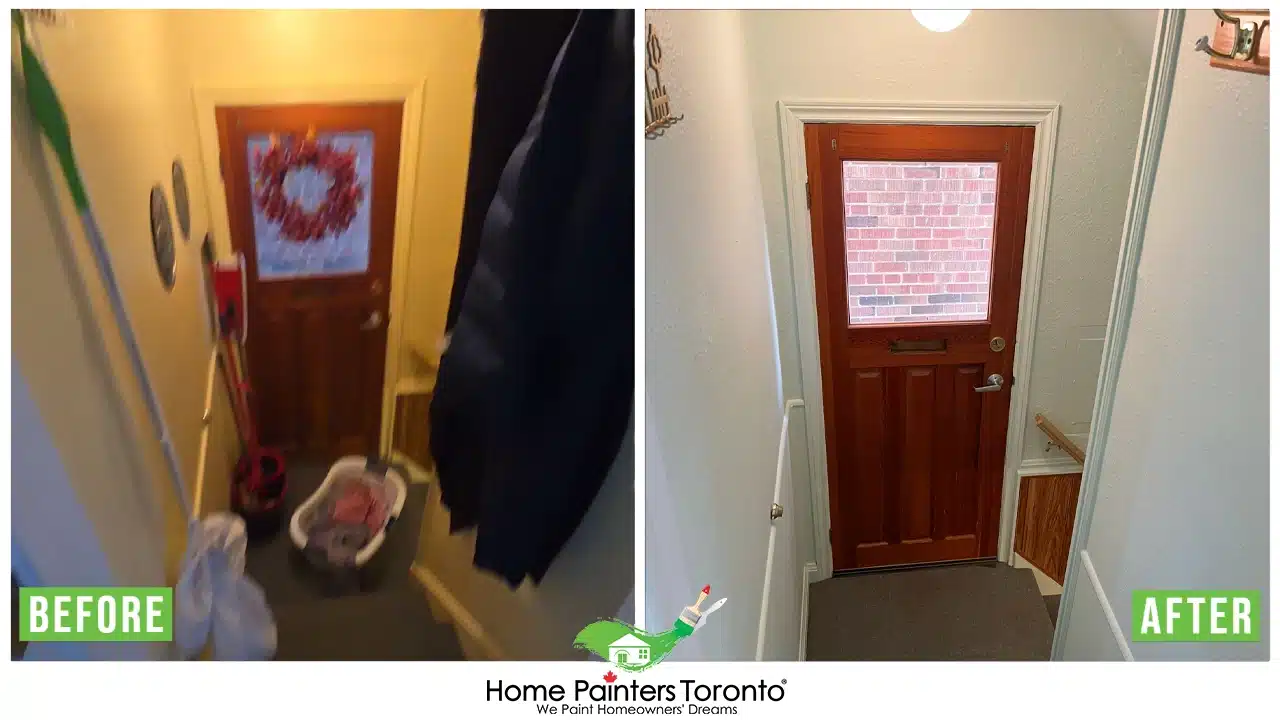
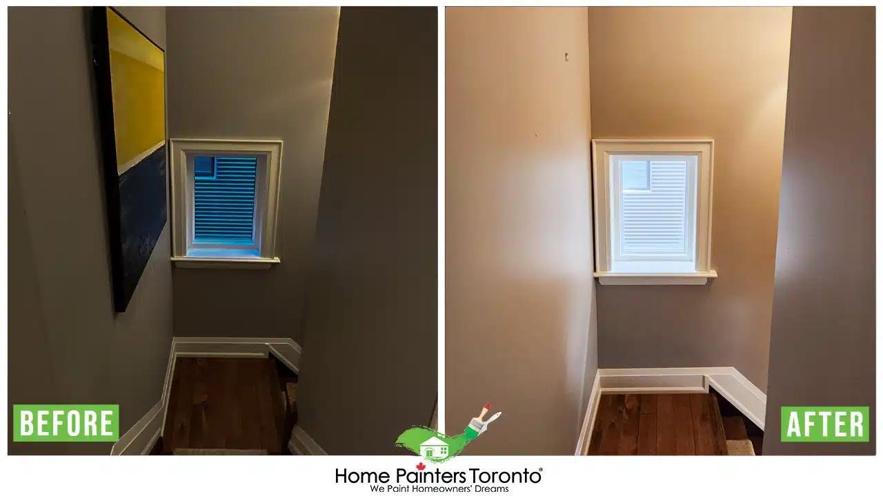
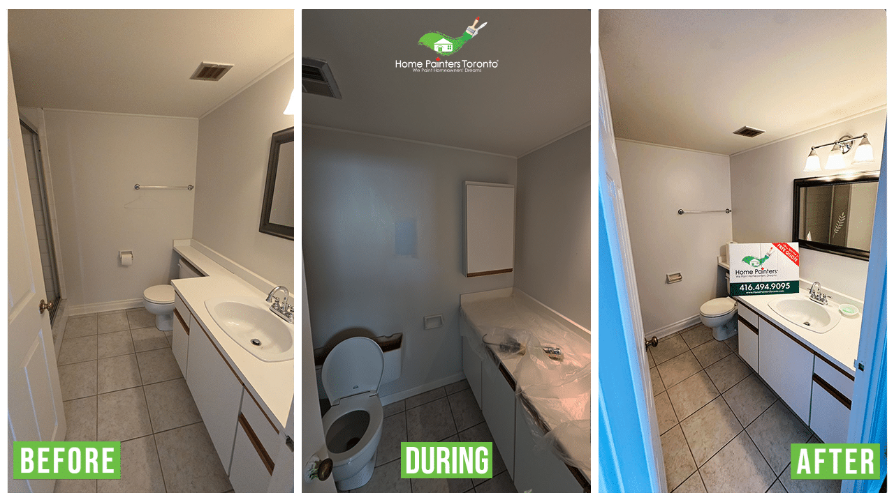
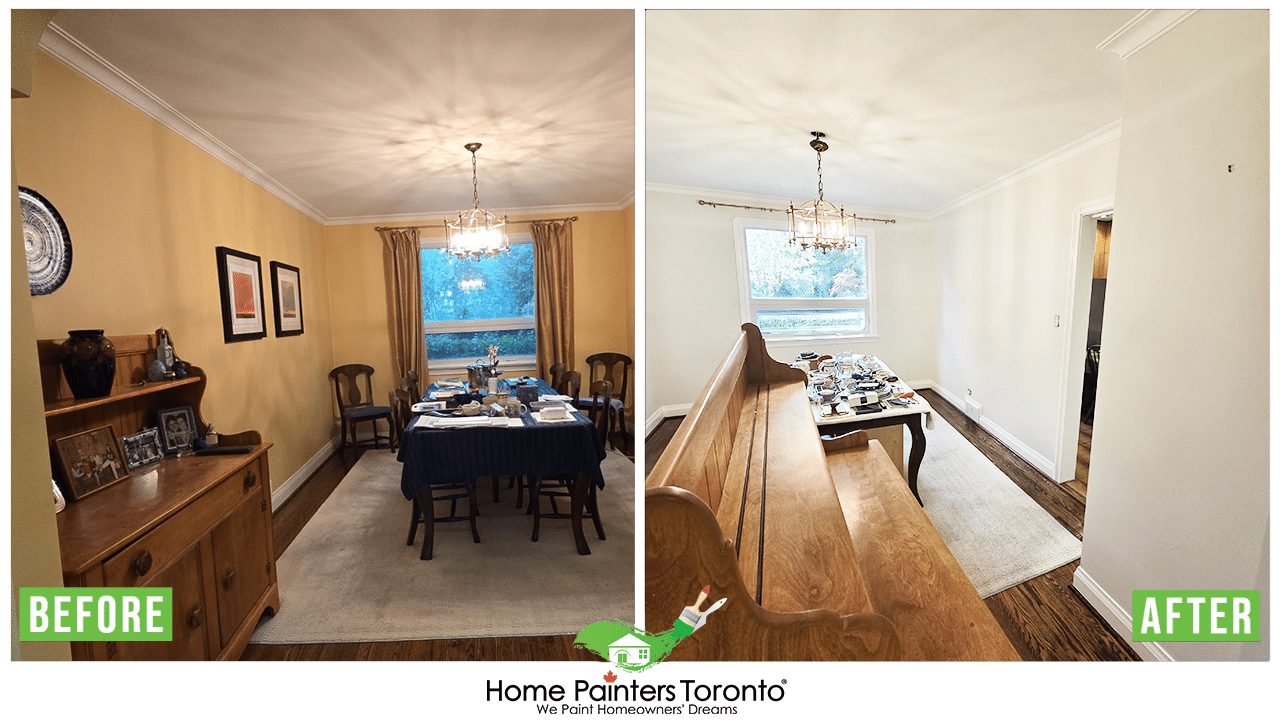
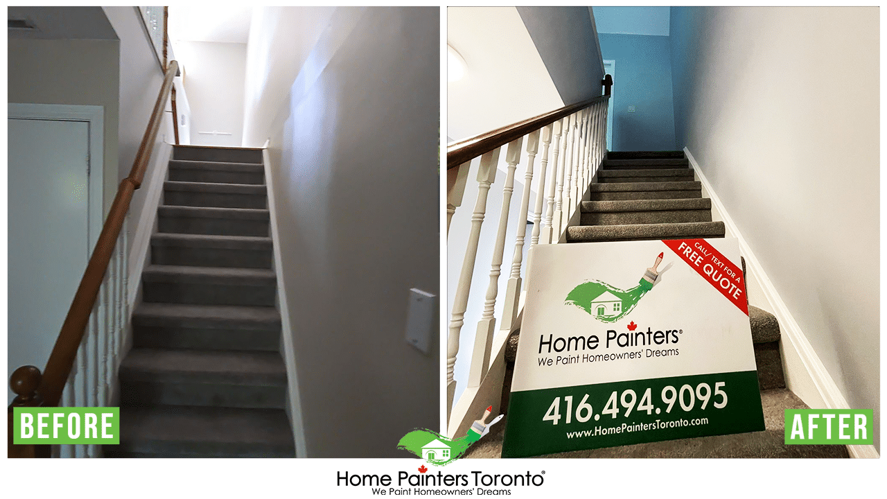
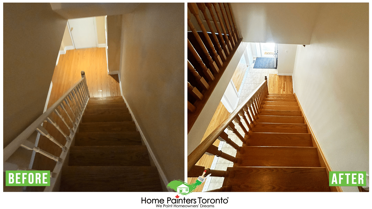
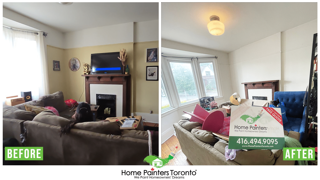
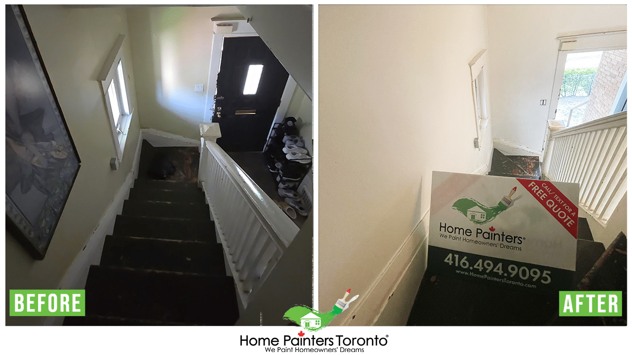
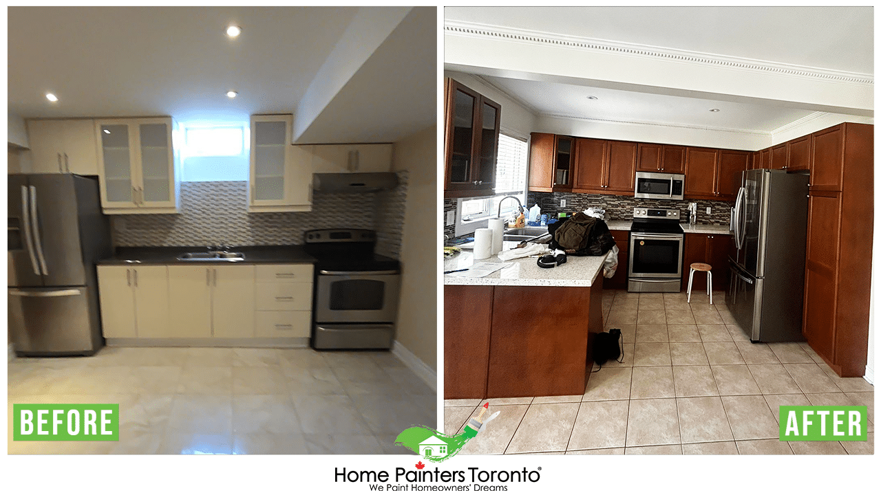
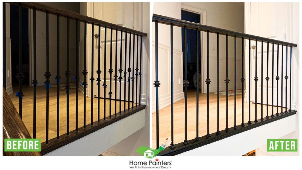
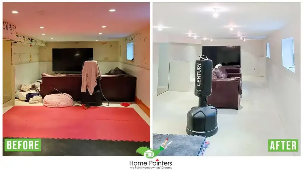
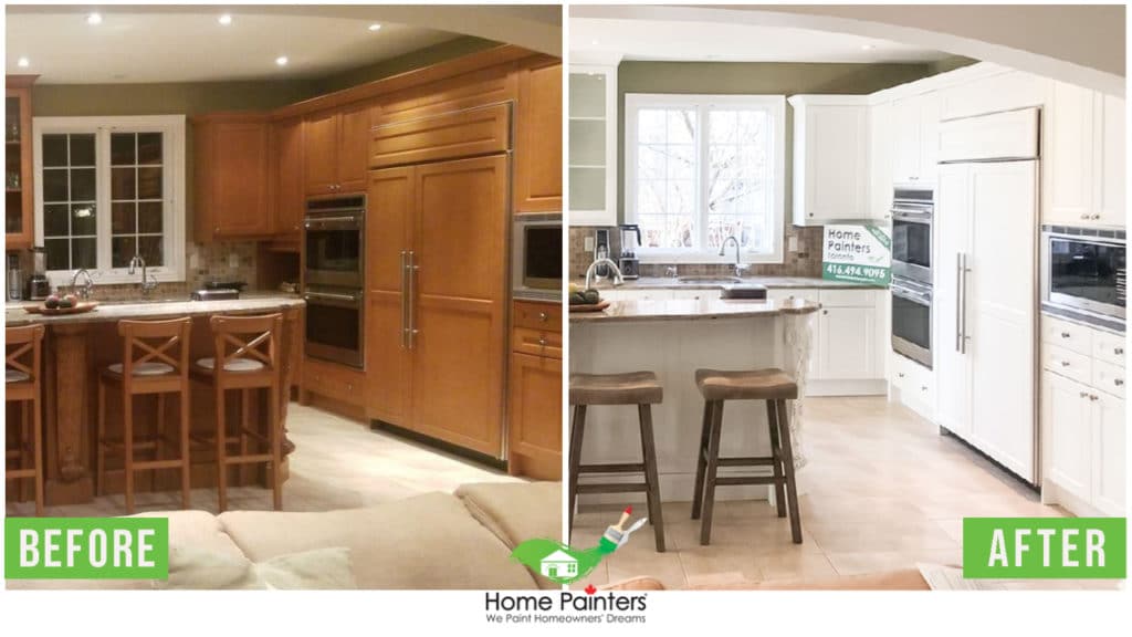
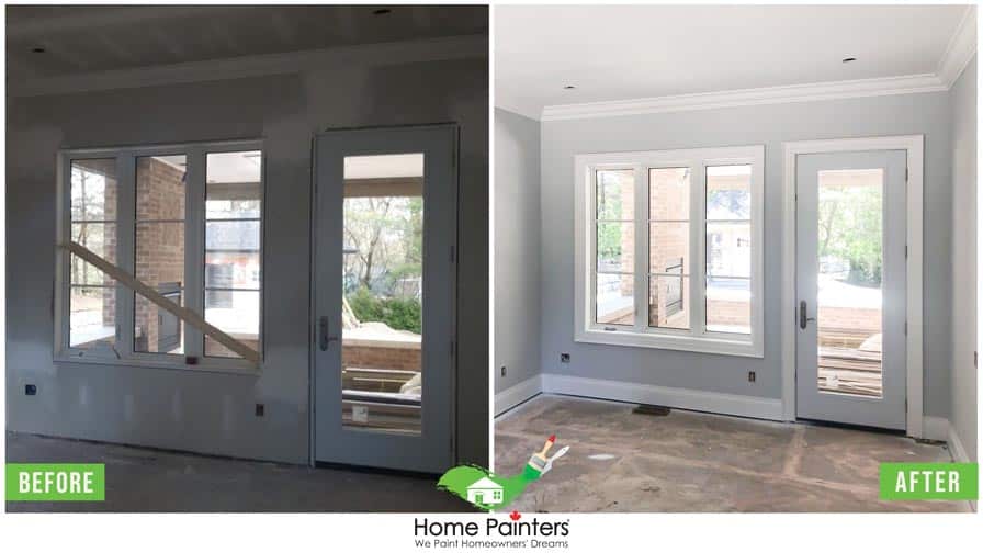
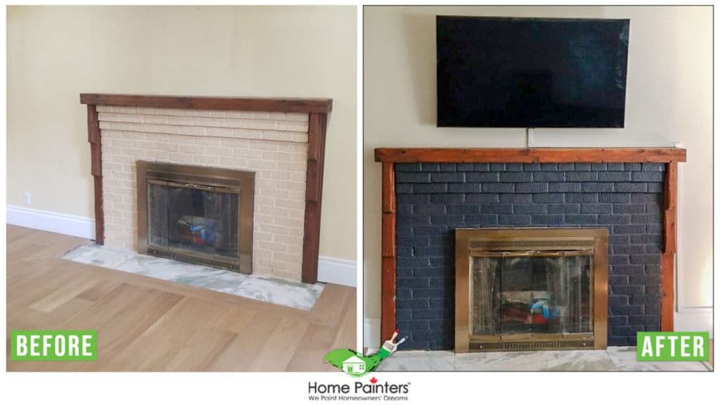
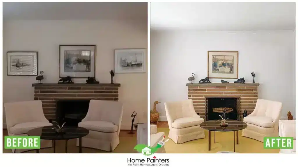
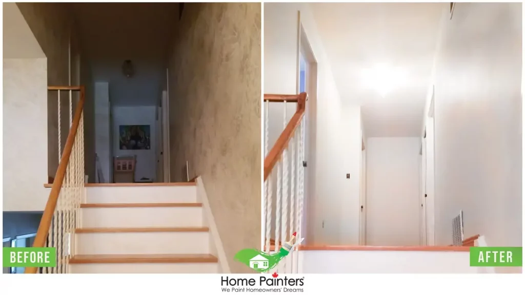
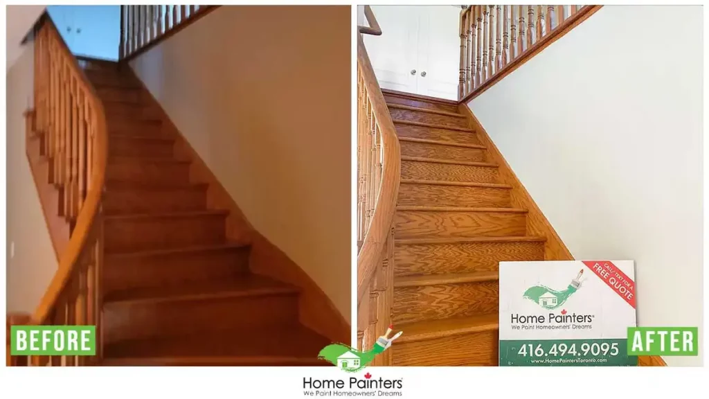
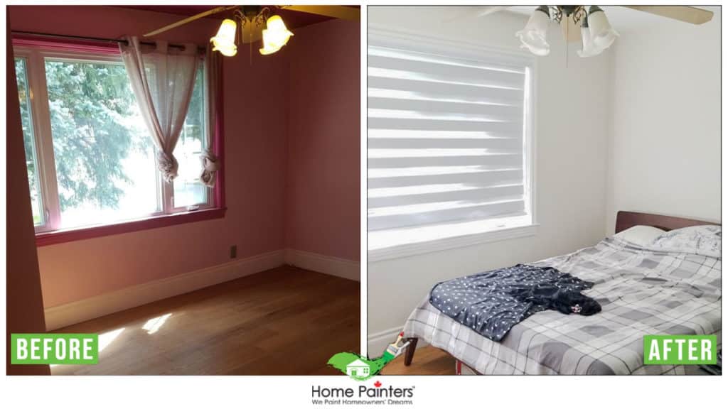
Interior House Painting Gallery


What to do now that you are ready for interior painting? (Step by Step):
Step 1. Reaching Local Interior Painters For A Free Quote
You can reach out to your home interior painters via email, phone call or on their website to receive a free quote on your interior painting project.
From there, your chosen painting company will either arrive on-site or perform a virtual consultation for your home interior painting work. After the painting project is assessed, you will receive a detailed and accurate quote.
Step 2. Colour Consultation From Professional Interior Home Painters
The next step in hiring local painters for your interior painting work is that they can often provide you with a colour consultation. If you find yourself unsure of what direction to go in terms of colour and the best interior house paint, the painting contractors you hire can provide guidance and suggestions for your interior painting.
Step 3. Your Interior Painting Job Is Booked & Scheduled!
This is the step when your home interior painting job is put into the books with your professional interior painters. They will confirm your interior painting colour choices, finalize your quote and other paperwork and set the date to begin!
Step 4. The interior Painting Begins!
Step 5. Quality Check & Satisfaction Guaranteed By Your Interior Painters
After all the interior painting has been wrapped up by your painting service then they will do a walk-through with you. This is to ensure you are fully satisfied with the work provided by the interior painters. They always want to find their clients feeling content and left with quality painting by professional painting contractors!
Find Answers To Other Questions You Have About Interior Painting
How do I estimate the cost of painting the interior of a house?
To estimate the cost of painting your home’s interior, remember that hiring a pro averages about $2.50 to $3.50 per square foot for just walls. If you’re including trim and ceilings, it jumps to $3.0 to $ 5.0 per square foot. Any needed repairs will add to the cost. This makes it easy to figure out your budget and decide if hiring a professional suits your needs.
Is it cheaper to paint your own house interior?
Absolutely, painting your own house interior can be cheaper, especially if you’re handy and live where labor rates are high. However, if you have high ceilings, need wall repairs, or want accent walls, the cost might rise to $8 per square foot or more. It’s a balance between saving money and the complexity of the job.
How much do painters charge in Ontario?
The cost to hire painters in Ontario typically ranges from $2 to $3 CAD per square foot, plus HST for paint. For a 1200 sq ft house, you can expect to pay between $3,000 and $5,000 CAD, plus HST. This works out to about $2.50 to $3 per square foot, plus HST. Always make sure to get a few quotes to find the best deal!
How often should I repaint my house interior?
Generally, you should repaint your house interior every 5-7 years. Some areas like kitchens and bathrooms may need a touch-up more often due to moisture and high traffic. Keeping an eye on wear and tear will help you decide. Regular repainting keeps your home looking fresh and can even protect your walls from damage.
Do ceilings need to be repainted?
Yes, about every ten to fifteen years. When you decide to spruce up your interior walls, it’s smart to do the ceilings at the same time. This way, you only have to move furniture and obstacles once. It’s a bit of work, but it keeps everything looking fresh and clean, and your home will thank you!
Should I paint entire interior house same color?
Painting your entire house one color can make the space feel flat. Instead, use a consistent color palette with varying shades and accent walls. This approach adds depth and keeps your home interesting. It’s all about balance—creating a cohesive look while injecting personality and flair into each room.
How often should I paint baseboards?
You should paint your baseboards every two to three years. Regular cleaning can help extend the life of the paint. Door and window trim, along with crown molding, don’t need to be painted as often since they’re out of reach. However, these areas can still get dusty, so cleaning them periodically is important. Think of it as part of your usual home maintenance routine.
Should ceiling paint be flat or eggshell?
Flat finish is usually better for ceilings because it hides imperfections and doesn’t reflect light, giving a smooth look. Eggshell might work in some rooms for a bit of sheen, but it can highlight flaws and make the ceiling stand out more than desired. Overall, flat paint is a safer and more forgiving choice for most ceilings.
What is the most popular color for baseboards?
White is definitely the most popular color for baseboards. It matches almost any wall color, giving rooms a clean, crisp look and making spaces feel more open. However, painting baseboards to match your wall color, like using light gray trim on gray walls, can create a stylish, cohesive look. So, while white is a classic and safe choice, don’t be afraid to experiment with matching colors for a modern vibe.
Do painters clean baseboards before painting?
Yes, painters usually clean baseboards before painting. It’s an important step to make sure the paint adheres well and gives a smooth finish. Typically, we recommend using a tsp (trisodium phosphate) “no-rinse” cleaner. This removes dust, dirt, and oils that might be on the surface. Clean baseboards help achieve a professional-looking paint job.
What are the disadvantages of eggshell paint?
Eggshell paint, while popular, has a few downsides. It doesn’t reflect as much light as satin paint, which can make small rooms look even smaller. Its low sheen finish isn’t ideal for creating a modern look. Plus, you’ll often need more coats to get even coverage. Despite these cons, it’s still a great choice if you prefer a muted, softer finish.
Should baseboards be satin or gloss?
Both satin and gloss finishes work well for baseboards. Satin has a medium sheen, making it durable and easy to clean. Semi-gloss has a higher sheen, stands out more, and is just as easy to maintain. If you want a subtle look, go with satin. For a shiny, standout finish, choose semi-gloss. Either way, your baseboards will look great and be easy to care for!
Should doors be the same color as trim?
Absolutely, matching your doors to your trim is a great idea! For example, having white doors with white trim makes a room feel continuous and unbroken. This little trick helps a space look more open and larger, which is really useful for small rooms where you don’t want anyone to feel trapped or crowded. It’s a simple way to keep your home feeling cozy and inviting.
How long does it take to paint a 1500 sq ft house interior?
Most jobs will take between 2 to 5 days to paint a 1500 sq ft house interior. However, if you’re in a rush, we offer 1 or 2 day painting services. Just let us know, and we’ll accommodate your needs. We aim to make the process efficient and smooth for you, whether you’re seeking a standard or expedited service.
Why Feel Secure Using Home Painters Toronto?

The Best Warranties in the Industry

Regular Health and Safety Inspections

We Aren’t Satisfied Until You Are Satisfied

Full Workers Compensation
5 Million General Liability Insurance

Criminal Background Checks
Why Choose Home Painters Toronto?
What Makes Us Unique From Other Painting Companies?

speed
– We are open 7 days a week
– We offer ‘same day pricing’ estimates
– We can schedule commercial painters for your project within 1-2 business days or sooner
– Moreover, we also offer ‘one or two day’ painting services

Payment Flexibility
– We offer no interest payment plans
– Also, we offer ‘no fee’ credit card payments
– Visa, Mastercard, Paypal, E-transfers, Cheque, or Cash

1 stop shop
– We are a full-service painting company
– Professional painting, carpentry and handyman services
– We offer specialty niche painting services such as professional kitchen and vanity cabinet spraying, exterior brick staining, faux painting, and much more!

Reliability
– 38 years of proven industry experience
– 1200+ raving online reviews
– 17,000+ satisfied clients
– #1 rated house painter on HomeStars, winner 9 times and 7 years in a row!

Security
– The best warranties in the industry:
“A Lifetime Warranty on Interior Painting”
– 3 year warranty on exterior painting
-15 year warranty on brick staining
– 5 year warranty on cabinet spraying
– 100% Satisfaction Guaranteed!
Interior House Painter Near You
Looking to speak to our team about your painting project? At Home Painters Toronto, we want to make it easy to turn your vision into reality, and so we provide several different locations with our painters near you.
Our friendly, professional painters have decades of experience in transforming homes like yours!
Related Topics About Interior House Painting:


Ready to Transform Your Townhouse?
Your space deserves to shine. At Commercial Painters Toronto, we bring your vision to life with stunning, professional painting. Don’t wait—make your townhouse a standout commercial space today. Contact us now for a free consultation and let’s get started!