When discussing colour theory, the conversation often gravitates towards the vibrant reds, the calming blues, or the energizing yellows—hues that capture our eye with their intensity and emotional impact. However, an unsung hero in the palette of design and aesthetics is the nuanced and versatile category of neutrals.
Neutrals are often mistakenly assumed to be a mere backdrop—the canvas upon which more pronounced colours paint their story. Yet, there is a profound complexity within neutrals themselves, which when understood and applied effectively, can transform a space with sophistication and balance.
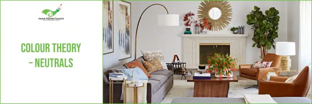
Neutrals
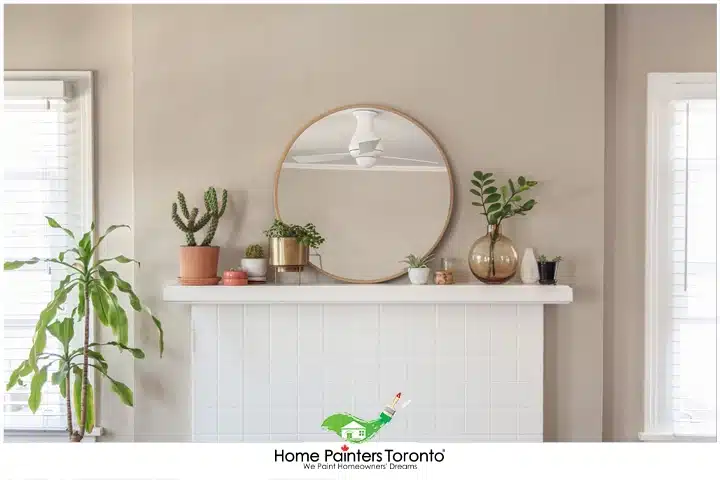
Aside from the colours on the colour wheel, this is where we usually move into the realm of neutrals. These colours are often the top-tier choices in terms of design because, due to their very impartial nature, they work in most spaces, and you can often place them with a nice pop of colour, and it’s very likely to work. Colours in the neutral realm involve everything from white to cream to beige and brown. And of course, you can also find black and gray in the neutral world as well.
The Science of Neutrals
Scientifically, neutral colours either absorb or reflect all wavelengths of light rather than a select range—which vibrant hues do through their specific wavelength ranges. This lack of selective absorption allows them to pair well with practically any colour, offering a visual rest in the dynamic field of coloured space.
The Role of Neutrals in Design
In the world of design, neutrals play a pivotal role. They serve as:
- Anchors: They provide a grounding force in a colour palette, ensuring that brighter and more assertive colours do not overwhelm the senses.
- Connectors: Neutrals can serve as a transitional element between more vivid colours, creating a harmonious flow in design.
- Enhancers: By their nature, they enhance surrounding hues, allowing them to stand out without competition.
- Amplifiers of Texture and Material: Since neutrals do not draw attention to their own hue, they can accentuate the texture and quality of the materials used in construction and design.
The Versatility of Neutrals
The true strength of neutrals lies in their chameleonic ability to adapt to various styles and atmospheres.
In a minimalist design approach, neutrals create clean and crisp spaces that feel tranquil and spacious.
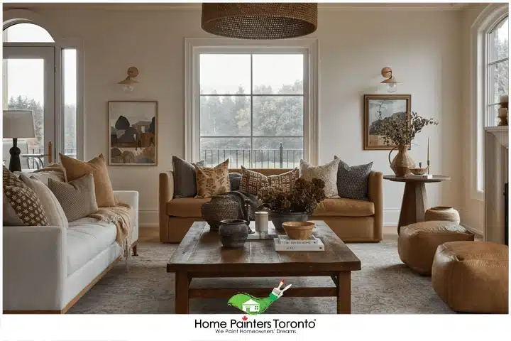
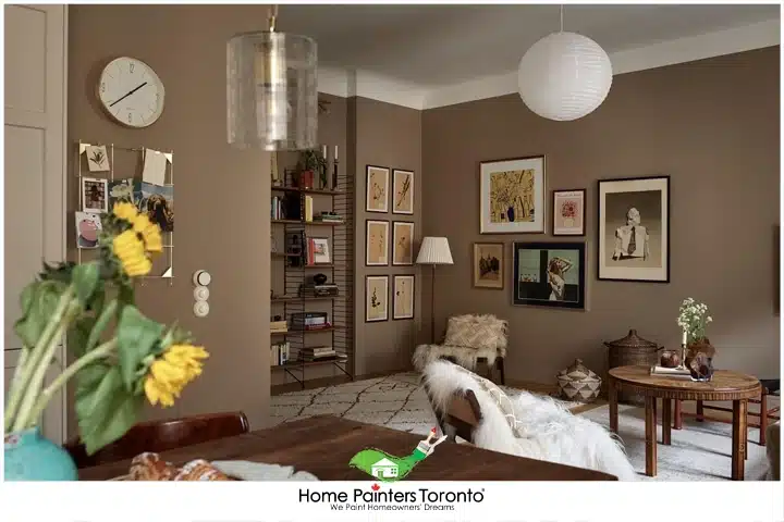
In a more traditional or rustic setting, browns and beiges can introduce warmth and organically tie together natural elements like wood or stone.
Neutrals in modern and contemporary spaces provide a sleekness and sophistication that allow architectural details to stand at the forefront.
Neutral Colour Palette
The Basics:
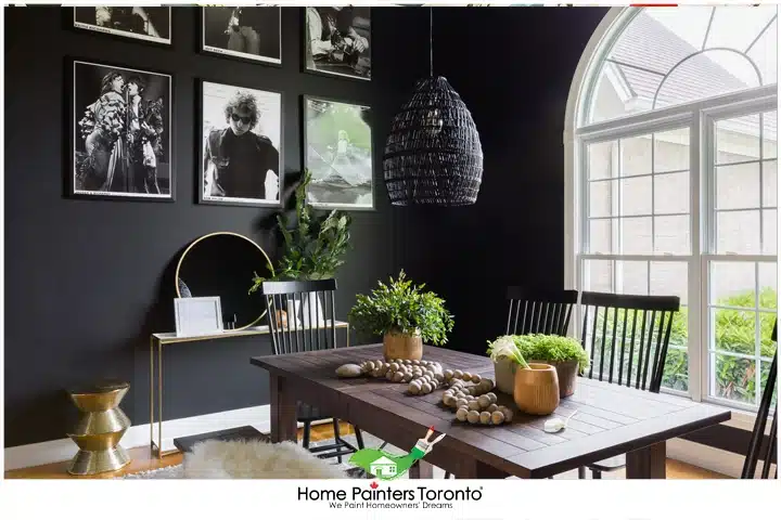
Black
If you think of black, especially in terms of paint colour and design, it’s obviously very bold and strong. Some people can associate black with mourning, but more often than not, there’s a strong sense of elegance and formality. Over the past several years, black has become increasingly popular in terms of paint colour and design. The great thing about blacks nowadays is that muted blacks are completely in style, as they’re not as harsh. If you don’t want to overpower things, black also makes a great accent for a lot of rooms because it can really work to tie things together seamlessly.
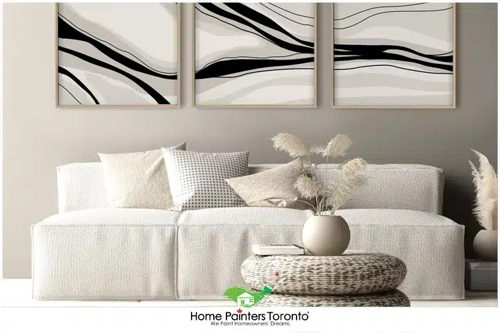
White
If you think of black, especially in terms of paint colour and design, it’s obviously very bold and strong. Some people can associate black with mourning, but more often than not, there’s a strong sense of elegance and formality. Over the past several years, black has become increasingly popular in terms of paint colour and design. The great thing about blacks nowadays is that muted blacks are completely in style, as they’re not as harsh. If you don’t want to overpower things, black also makes a great accent for a lot of rooms because it can really work to tie things together seamlessly.
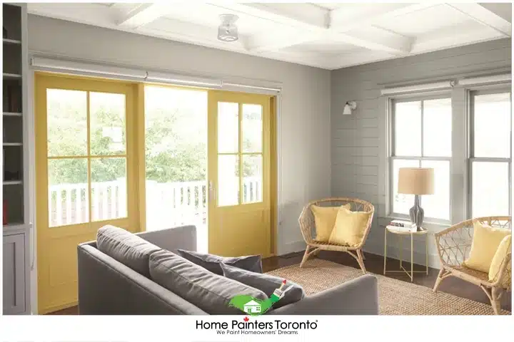
Gray
Moving into gray. In the 2024 design world, it’s often considered the most modern neutral to have in any space. Chances are, if you’re undecided about what colour to paint your kitchen or living room and you know you want to go modern, gray is always a nice choice. It’s funny because, for years, a lot of people stayed away from gray tones because they were often associated with moodiness or sadness. But now, it’s completely moved up to neutral modern elegance. There can also be a sense of formality and professionalism in gray, so it’s often a good choice for businesses.
The Sub-neutrals:
Beige
Another neutral that has been popular over the years, that’s more traditional side of things, is beige or tan. Beige is unique because it can range from really warm where they take on more of a taupe-brown. Or they can go cool as well and steer more towards the creams. It really depends on which direction you go in, but beiges and tans can often give off a more conservative vibe. Also, depending on how rich the colour is, they can be more earthy as well. For the most part though, beiges and tans are such typical background colours. They simply take on the design and other colour characteristics happening around them. Moving into the creams or ivories. These colours are often what individuals decide on when they don’t want to go with white due to the sheer starkness.
Cream
Cream is just a little warmer than white and it can often evoke feelings of stillness and quiet. There’s a sense of elegance and calm as well, which allows it to be a nice colour for bedrooms or for someone wanting to bring tranquillity into a space.
Brown
Lastly, when you think of brown, your mind will likely think of wood and the earth, due to its overwhelming naturalness. Brown is a warm neutral, and it’s often associated with wholesomeness and dependability. It’s frequently used as a nice background colour. Or, if you want a monochromatic look, it blends nicely with wood and stone. Brown is a great warm option too, if you’re looking to replace black or even white. It can give such an earthy elegance to a space.
Conclusion
Neutrals, when leveraged with intent and understanding, offer a spectrum of possibilities that extend far beyond their quiet first impressions. They are the silent yet potent foundation of a well-composed design scheme. As we navigate the intricate relationship between aesthetics, functionality, and cost-effectiveness in our projects, it becomes evident that the considered application of neutrals is not merely a default setting but a deliberate strategy for timeless design.
For the discerning designer, architect, or homeowner, the sophisticated use of neutral colours in conjunction with an acute awareness of their implications can result in spaces that are as functional as they are beautiful—an endeavour well worth the nuanced approach.
MORE INTERESTING BLOGS RELATED TO
“Colour Theory – Neutrals”


If the work involved in picking out the exact right neutral paint colour sounds like it involves too much time and energy to do yourself, call 416.494.9095 or email Brian@HomePaintersToronto.com for a FREE quote or visit our website. And don’t forget to follow us on all our social channels below!