Colour Page Interiors
INterior Colour BLOGS
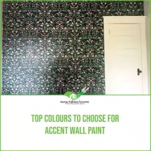
There are many reasons why you might be interested in painting an accent wall for a room in your house. If you’re someone who has gone for a neutral interior colour scheme, the right accent wall paint could be the ideal feature. It can finally allow for the opportunity to play with some bold colours and add personality into a room.
Painting an accent wall is a great idea if you’re looking to bring attention to a cool feature, like a fireplace or an art piece. Also, accent walls are ideal for those who are looking to spruce up a room, but they don’t have the time or a hefty budget. They are one of the most cost efficient ways to do a quick home improvement project.
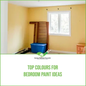
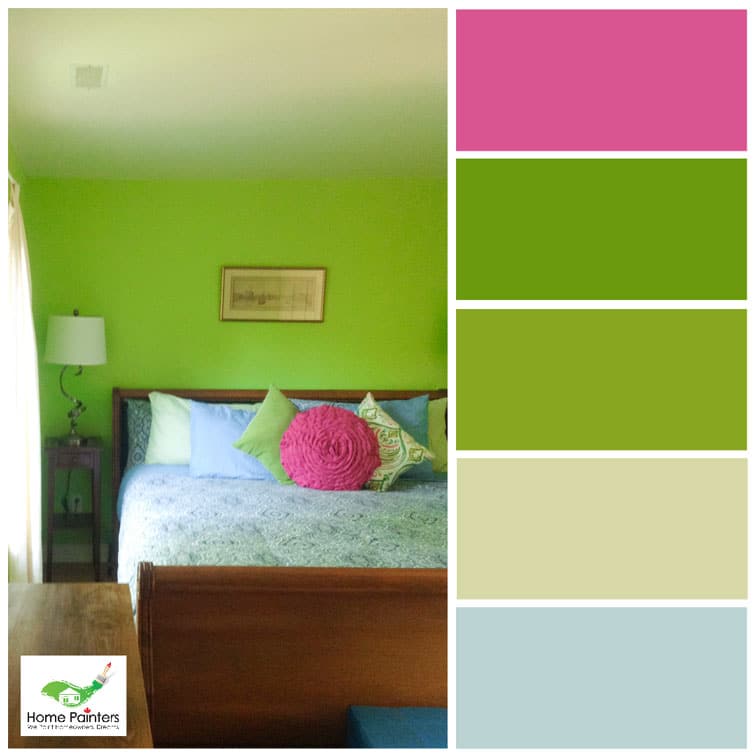
Everyone has different style ideas and aesthetics when it comes to decorating their bedroom. Some people are all about creating a relaxing oasis filled to the brim with coziness. While others need a bright and enticing paint colour to help get them out of bed in the morning. In order to give you all the best options, we’re here to give you the top colours for bedroom paint ideas for 2020!
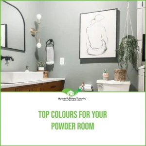
Don’t you just love the idea of a cool and aesthetically pleasing little powder room? There’s just something about the idea of using your powder room to create a completely unique yet functional space — it really gets those home renovation juices flowing!
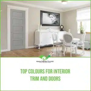
So, you want to liven things up at home with a fresh coat of paint? Once you have your paint colour picked out, there are still the trims to think about. It’s actually an important step too because trim really works to tie the whole room or space together. If you’re overthinking things, we’re here to help you choose the top colours for interior trim and doors of the season!

Life can move forward in ways you really hadn’t even imagined. Experiencing change can be a difficult thing for a lot people out there, but really, it can be a beautiful thing because that’s how you know life is actually moving forward. If you’re at a place where you’re looking to sell your house and you want to ensure that you get the best price for it, it might be time to consider what interior paint colours will help make that vision a reality.
Colour IMAGES
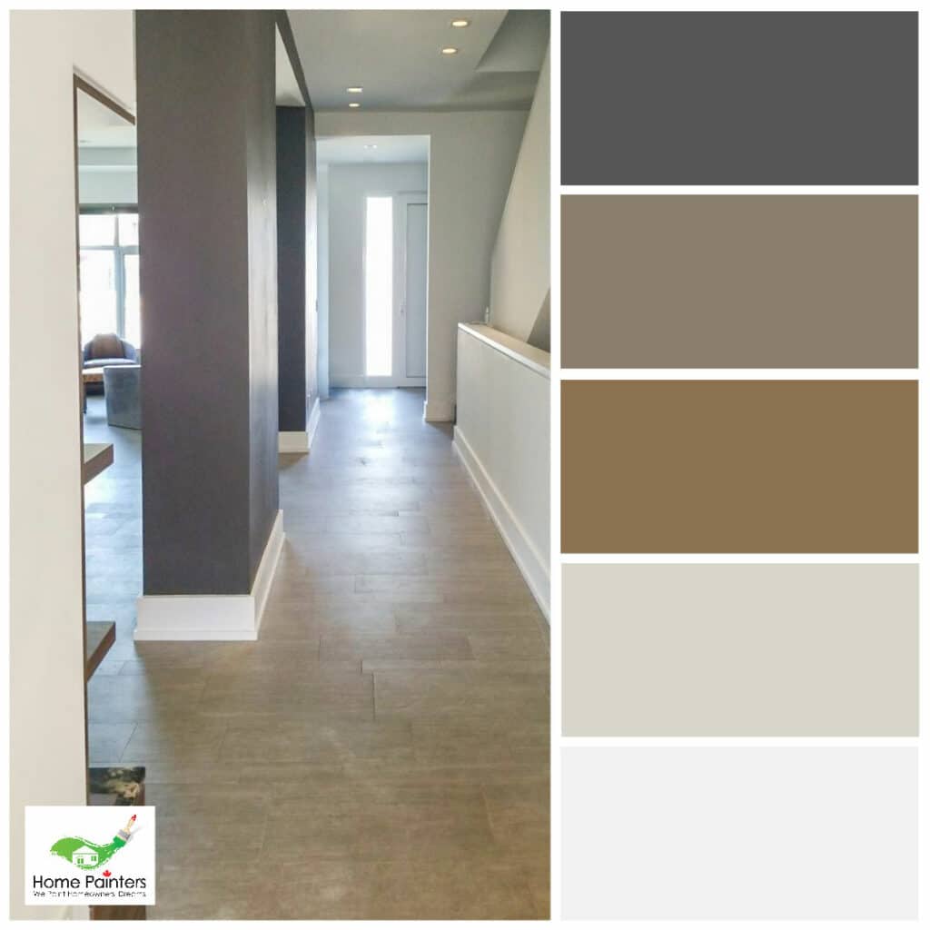
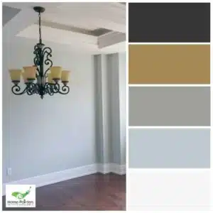
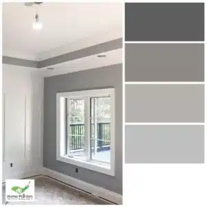
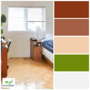
Want to get those creative juices flowing?
Consider these colour palettes!