The Top New Paint Colours

Paint colours trend are constantly changing, and the year 2024 is no exception. Every year, colour experts at the world’s best-known paint brands pick their “Color of the Year” and put out their “Color Forecast.”

So, what’s in store for the world of paint in 2024?

Compared to last year’s paint trends, the colour trends for 2024 are going to be even more diverse and exciting.

This article will provide a comprehensive look at the top new paint colours for 2024 as selected by the industry’s leading manufacturers.

Top New Paint Colours for 2024

1. Benjamin Moore: Raspberry Blush

raspberry blush

Raspberry Blush is the colour of the year 2024 for Benjamin Moore. It is an upbeat coral with pink undertones. Raspberry Blush is an eye-catching hue that’ll draw attention wherever it’s used. The colour coordinates well with neutrals such as beige and taupe, but it can also be combined with bolder colours.

It’s perfect for bedrooms and bathrooms, but it would also work well in kitchens and dining rooms.

The Top New Paint Colours for 2024
Photo: Courtesy of Benjamin Moore

Benjamin Moore’s Colour Palette for 2024

The new Benjamin Moore colour palette includes 8 different shades that cover a range of different tones. It contains a mix of warm and cool tones, as well as some vivid colours. These colours will help make your home look fresh and modern in the coming year.

Benjamin Moore colour palette

How to use Benjamin Moore’s Paint Trends in Your Space

The new Benjamin Moore colour palette is ideal for making your home look fresh and modern. The colours are bright and bold, but they also work well together when combined in different rooms. And if you want to use this particular palette, here are some tips on how to do so effectively:

Use a neutral base coat with any of the shades in this palette. A neutral basecoat will allow the brightness of the colours to stand out and make them pop.

Choose a large but not overpowering feature wall in one room and paint it in one of the bright colours from the palette.

  • You can use an eggshell finish, which is a semi-gloss paint that has a smooth surface but still allows light to pass through it.
  • Provide contrast with a vibrant accent colour.
  • Create depth by combining two or three of the shades together. also, Use colours that match your décor theme.
  • The colours are perfect for use on walls or ceilings, but they can also be used on furniture if you want to add some personality to your space.
  • The colours are also suitable for both indoor and outdoor use, thus, making them a great choice if you want to give your home an update.
Blue Paint 109 North Sea Green 2053 30 rgb
Benjamin Moore’s “North Sea Green”
Blue Paint 167 Starry Night Blue 2067 20 RGB
Benjamin Moore’s “Starry Night Blue”

2. Sherwin-Williams: Redend Point

Redend Point

Sherwin-Williams’ colour of the year 2024 is Redend Point. This neutral, earthy shade is a perfect choice for those who are looking for a sophisticated, elegant look. Furthermore, it’s subtle and understated but it still gives your space a fresh look.

06 Coty 2023 Commercial
02 Coty 2023 Residential
17 Coty 2023 Residential
Photo: Courtesy of Sherwin Williams

Sherwin-Williams’ Colour Palette for 2024

The colour scheme features rosy pinks and brown tones, gentle reds, and a warm white. The colour palette was inspired by the natural beauty that surrounds us. It’s a reflection of our desire to create beautiful spaces filled with warm undertones and earthy colours.

Sherwin Williams colour palette
Sherwin Williams Carnelian colour
Sherwin-Williams’Carnelian’

How to use Sherwin-Williams’ Paint Trends in Your Space

The colour palette is intended to be calming and soothing while also providing a modern touch. The Sherwin-Williams colour trends will be popular among homeowners who want a classic look that’s still on trend.

This scheme can be used in almost any room of your house, including bedrooms and bathrooms.

Here are some ways:

  • Try painting a single wall or room in this colour scheme for a dramatic focal point in your space.
  • Or paint an accent wall with one of the colours from the palette for a subtle hint at what’s to come!
  • You could also pair it with other shades like black or white. This can help you create a sophisticated look that will make your home stand out from others on the street.
Sherwin-Williams Auburn
Sherwin-Williams’ “Hushed Auburn”

3. BEHR: Blank Canvas

BEHR
BEHR 22.03 Coty Livingroom KM 001.jpeg

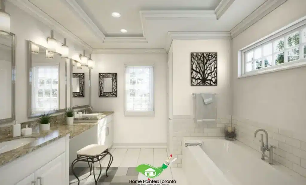
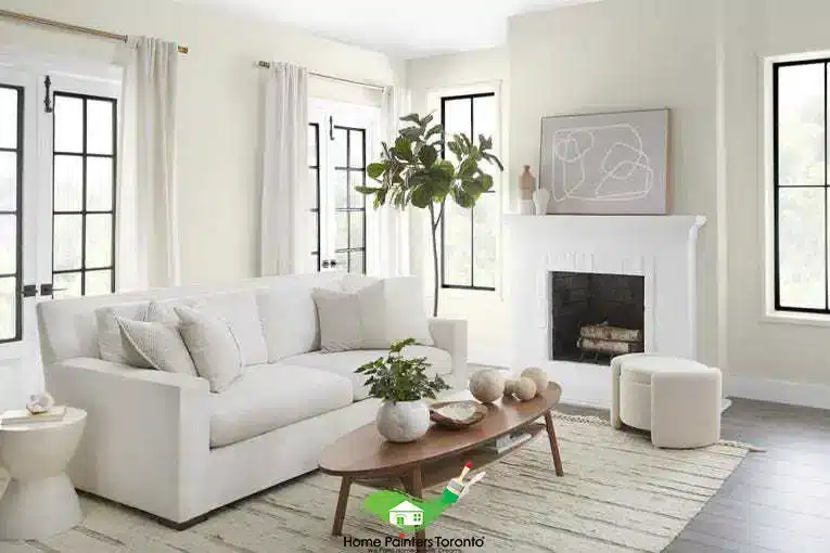
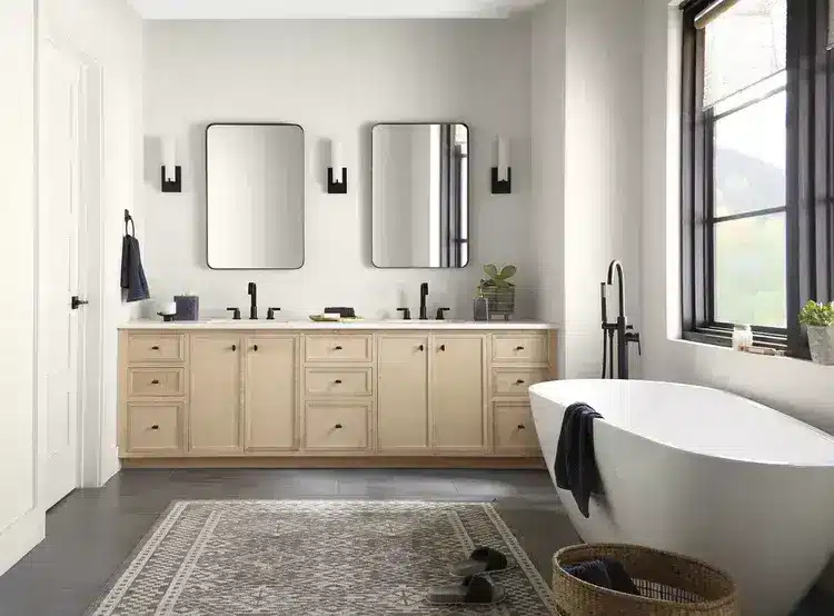
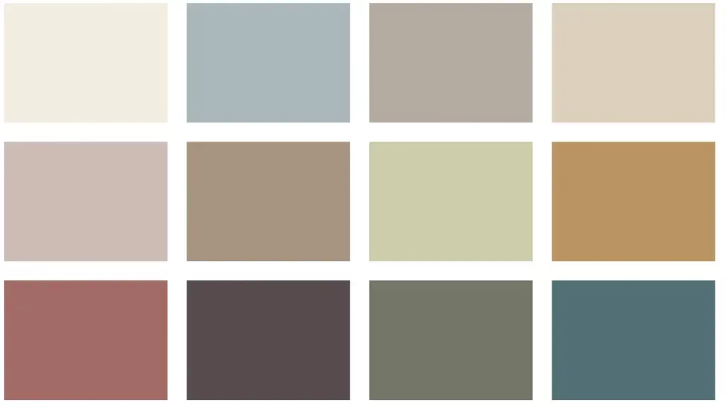
Blank Canvas is Behr’s colour for the year 2024. It’s a warm, welcoming shade of white. The name is fitting because this is an understated neutral that could work in any number of spaces.


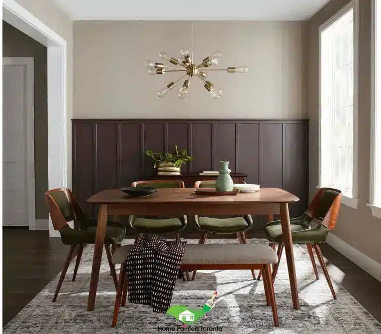
Indeed, it’s a fresh, clean look that will make your home feel spacious and airy. This shade is great for first-time home buyers looking to keep things simple.

It’s also a great option for those who are just moving into their first apartment and don’t want anything too bold or flashy.

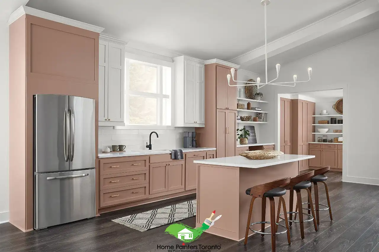
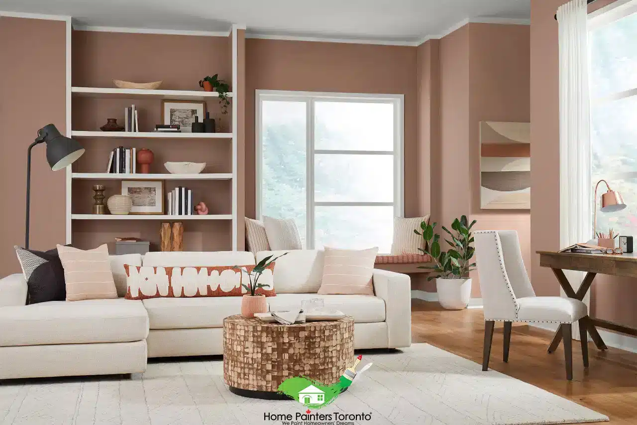
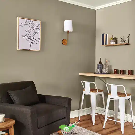
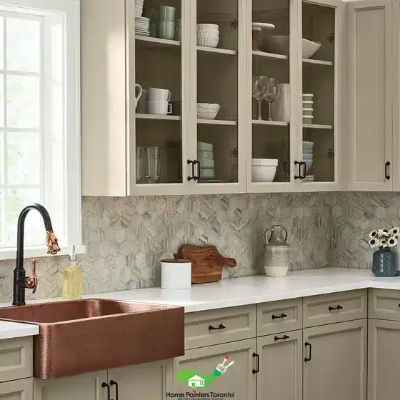
Pairing it with other neutrals like black, grey, or beige will help you create a sophisticated look that’s also easy to maintain.

BEHR Color of the Year 2023 Blank Canvas Bathroom
Photo: Courtesy of Behr

BEHR’s Colour Palette for 2024

BEHR’s colour palette trends are really about renewal, minimalism, and bringing back the past. You’ll see lots of vintage-inspired colours and patterns, as well as a return to the clean lines of modern minimalism. The key is not going overboard with these trends: they should feel subtle, not overwhelming or distracting.

BEHR Colour Palette

How to use BEHR’s Paint Trends in Your Space

  • Blank Canvas is a versatile backdrop, which can be used with bolder colours or patterns in furniture and accessories. It also works well as part of a timeless aesthetic anywhere—even without any other elements.
  • Also, you could pair it with other neutral shades like taupe or pure earth for an elegant look that will last for years to come.
  • For a more modern look, you can use BEHR Paint’s Half sea fog and Sophisticated Teal to create a chic palette. This combination is perfect for a room with clean lines and minimal furniture, as it will let your accessories stand out without being too distracting.
  • While, in the kitchen, Blank Canvas can be used on its own or paired with a lighter shade like white or almond. And if you want to go bolder and brighter, try using it as an accent wall behind your stove or fridge.
  • The key is to use colours that complement each other, not clash. So if you’re feeling adventurous, try creating a pallet using two or more colours from the Behr Paint trend palette. And then apply them to furniture or accessories for a fun pop of colour in your space.
Perfect Taupe BEHR
Photo: Courtesy of Behr
Valspar Colour Palette

4. Valspar:

Valspar has chosen- not just one, but 12–to serve as Valspar’s colours of the year for 2024. This includes:

  • Cozy White – White with a hint of yellow.
  • Villa Grey – Calming grey with a warm yellow undertone.
  • Rising Tide – Soft light blue
  • Gentle Violet –White with a faint violet tint
  • Holmes Cream – Traditional bronzer with a yellow undertone
  • Ivory Brown – A faded brown that was inspired by the colours in nature.
  • Blue Arrow – Muted blue with a touch of yellow.
  • Green Trellis – Blurry, two-toned green
  • Desert Carnation – Discolored natural terracotta
  • Southern Road – subdued clay hue with a brown undertone
  • Flora – Dark  olive
  • Everglade Deck – Dark navy blue


The brand has chosen these colours because they said these tones inspire creativity and allow anyone to picture what they want their home to look like.

How to use Valspar’s Paint Trends in your space

  • Choose a colour palette that matches your needs and style
  • Also, create depth in your space by adding layers of colour
  • Try using one of the colours as an accent
  • In addition, if you want to create a vibrant and fun look, try using the Desert Carnation on your walls with a combination of Blue Arrow and Ivory Brown.
  • Use Everglade Deck as an accent wall or even in place of your baseboard trim if you are wanting to get away from the traditional white, crisp look.
  • But if your home is more traditional and timeless, then use the Ivory Brown with Desert Carnation or Southern Road.
Valspar Desert Carnation
Photo: Courtesy of Valspar
Valspar Ivory Brown
Valspar’s “Ivory Brown”
Valspar Kitchen
Valspar’s “Villa Grey”

5. Pantone: Viva Magenta

Viva Magenta Pantone Colour Year 2023 Nordroom 1 1500x1463 1

Pantone’s new colour of the year is strong and empowering. This fresh shade of red is a bold statement that’s sure to draw attention to your home.

Specifically, Viva Magenta is a happy, upbeat, and vibrant colour.

It’s perfect if you want to create a fun atmosphere in your home with the added bonus of being able to coordinate with almost anything!

Pantone’s Magentaverse

The Magentaverse is made up of eight colour stories that range from bold and vibrant to subtle and soothing.

These colours will help you create a space that speaks to your individual style. Additionally, it is an explosion of colour, a celebration of individuality and diversity.

magentaverse colours

How to use Pantone’s Colour Trends in your space

  • Choose one or two colours from each of the eight Magentaverse tones to create your own unique combination. The key to success here is keeping it simple and using a small number of colours in each area of your home.
  • The colours can be used as an accent or a feature wall or even in your upholstery to create a bold statement.
  • Moreover, if you want to create a relaxing space then try using one of the earthy colours such as Pale Khaki or Gray Lilac.
  • But, for a more contemporary look, opt for a bright Viva Magenta or Pale Dogwood. Lastly, don’t be afraid to mix and match different styles within your home and experiment with new colour combinations.
Pink Houseboat Amsterdam Nordroom1
Photo: Courtesy of The Nordroom

How do you feel about the paint colours for 2024? Have you fallen in love with a specific colour and decided to use it in your home?

3 Important Tips on How to Pick Your Paint Colors

Still Not Sure?

…then Home Painters Toronto has you covered! We’re here to help you, whether it’s with a simple colour consultation or even all the way through your painting project.

More Interesting Blogs Related to
“THE TOP NEW PAINT COLOURS FOR 2024”

We have a team of experts who are able to bring your ideas and inspirations to life, so don’t hesitate to reach out! Call us NOW at 416.494.9095or email us at Brian@HomePaintersToronto.comAlso, don’t forget to follow us on all our social channels below as well!