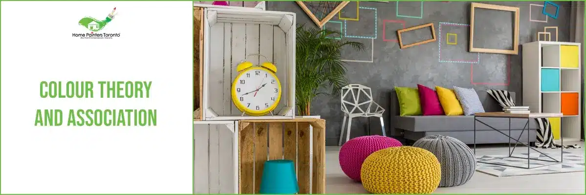
Did you know there’s an actual science behind what each colour has the ability to make you feel? There’s a lot that goes into it as well because you’ll usually find that if you change the saturation of a colour (the strength or weakness of a colour), just that little nudge in a different direction can offer brand-new feelings and emotions. This all comes back to colour theory. It’s both the science and the art of using colour. Basically, it all comes down to how colour can make a person feel when they look at it. And furthermore, when they step into a room with a specific colour palette.
The Basics of Colour Theory
Colour theory is a branch of design dedicated to understanding how colours interact, how they can be combined effectively, and the message they convey. At its heart are three primary concepts: the colour wheel, colour harmony, and the context in which colours are used.
The Colour Wheel
Let’s go over some of the basics for what some of the hues on the colour wheel typically make people feel. To start, if you look at the colour wheel, you have your basic primary colours. Those are red, blue and yellow. Remember when you first learned about those back in our school days? Those colours were always the main building blocks that led to all of the other colours in the spectrum.
Between those are secondary colours, as in, if you mix red with blue, you get violet. Or there are intermediate colours as well, like the blue-greens or the red-violets. Let’s break it down even further.
Warmer Colours
Let’s designate things up even further into the warm colours. Which, as you might suspect, are the reds, oranges and yellows and all of their variations. These colours are associated with the gorgeous leaves of the fall season, the sun and fire. Often, if you decide to use one of the warm colours and their variations in your home, they can reflect happiness, passion and enthusiasm. If you’re looking to evoke some high energy in one of your spaces, a warm colour can certainly do that for you!
In particular, red can be a very powerful colour when used in design, to the point that some people find it to be too overwhelming in large portions. If you want to evoke strength and boldness but still maintain elegance in a space, going for some of the darker shades of red can work, but still bring forth a nice sense of sophistication.
In terms of using shades of orange in a room, again, it’s a very vibrant and energetic colour. There can be an association with the earth too as it’s the colour that signifies the autumn season. Some might find themselves feeling a sense of creativity when stepping into a room that features orange. While others think of good health and liveliness, they think of fruit.
In terms of the colour yellow, it’s almost always thought of in regards to brightness light and happiness. A lot of people find lighter yellows really hopeful and you’ll often find them used in gender-neutral babies’ rooms. A splash of yellow might also go well in a fun office space as well to help with productivity.
Cooler Colours
Let’s move on to the cooler colours, which include green, blue and purple. If you’re looking to go a bit more toned down and muted from the warmer colours, these are all great options because they usually make people think of the ocean, the sky above and nature and the outdoors in general. Often, these are the colours that evoke feelings of peacefulness and a sense of calm and tranquillity.
There is such a range used for the colour blue, especially in design. Light blues can evoke feelings of stillness and serenity. They can also be regarded as welcoming and friendly, which could make it a nice colour to put in a living space in your home that gets a lot of traffic, like your kitchen or living room. Darker blues can evoke feelings of strength and reliability. Similar to how the ocean is deep and vast, so are all the connotations when it comes to colour blue.
The colour green is another colour that’s all over the map. Some people often associate the colour green with wealth and vitality, as for years it was the colour of money. Green is often related to new growth and nature as well due to its connection to the earth and plant life and trees. Green can also convey a sense of balance and harmony as people often feel a sense of security and anchoredness towards it.
Since the colour purple is a combination of red and blue, it can often take on the characteristics of both. Lighter purples, which are more soft can often have a bit of a romantic feel to them. Some people also think of springtime and flowers when they see a nice light purple too. Typically, a lot of the darker and mid-range purples make people think of royalty and wealth due to its historical context.
Colour Harmony
Harmony in colour theory is the balance and appeal achieved when colours are well combined. It can evoke feelings of calmness or excitement, depending on the palette. Common harmonies include analogous, complementary, and triadic colour schemes, each offering different levels of contrast and visual interest.
Context Matters
The power of colour extends beyond its physical appearance; its perception is heavily influenced by context. Factors such as lighting, size, and adjacent colours can significantly alter our interpretation of a particular hue. It’s a challenging aspect, requiring a keen understanding of environmental variables to predict how colours will behave in real-world settings.
Psychological Associations of Colour
Colours evoke a wide range of emotions and associations. For instance, blue is often linked to calmness and stability, making it a popular choice for office and healthcare interiors. Red, in contrast, is vibrant and energetic, commonly used in spaces that want to stimulate activity and appetite, such as restaurants. These colour associations are not universal, however, as cultural differences can shift the emotional impact of certain colours
Application in Design and Construction
Incorporating colour theory into construction and design projects is an art and science. It demands a thorough analysis of the intended use of space, the demographic of the users, and the emotional tone the space aims to convey.
Challenges and Considerations
Designers must navigate the potential disparities between theoretical colour harmony and practical application. The real-world interaction of light and material can transform colour, demanding flexibility and innovative thinking to achieve the desired outcome.
Striking a Balance
Choosing colours is a balancing act between functionality, aesthetics, and psychological impact. For instance, while a vibrant orange might be perfect for a creative studio to inspire energy, it might be less suitable in a space designed for relaxation. Similarly, the trend towards sustainability and natural materials necessitates a palette that complements and enhances these elements.
Closing Thoughts
The mastery of colour theory is a powerful tool for architects, interior designers, and builders. It not only elevates the aesthetic appeal of a space but also enhances its functionality and the well-being of its occupants. By embracing the complexities and nuances of colour, professionals can craft environments that resonate on a deeper level, creating spaces that are not only seen but felt.
As we continue to explore the intersection of colour and space, let us remember that the greatest designs often emerge from a harmonious blend of theory, practice, and intuition. With each project, there lies an opportunity to redefine boundaries, challenge conventions, and, most importantly, evoke emotion and connection through the strategic use of colour.
Don’t forget to check out our Pinterest page for all sorts of painting inspiration!
More Interesting Blogs Related to
“Colour Theory & Association?”


If you’re having trouble picking out the right colour or are just unsure of what direction to go in, call 416.494.9095 or email [email protected] for a FREE quote or visit our website. And don’t forget to follow us on all our social channels below!