
Incorporating stress-relieving colours into your surroundings, either by painting your walls or through more minor decor elements, can significantly enhance your emotional state and relieve stress. Colours can indeed be essential in promoting wellness and improving your mental health. The colours that surround us can significantly impact our mood and stress levels.
We all have experienced very stressful days, especially this year. It can come from all sorts of things, from our jobs to relationships to the state of the world. Regardless, stress is a part of everyday life. It is how we cope with it and try to lead a positive life. Believe it or not, science has shown us that colours help us mentally, emotionally and spiritually guide us. Colours that reduce anxiety have a significant impact on our lives because they have the power to enlighten and relax us. So, what stress-relieving colours can you incorporate into your home? Let’s find out!
Stress Relieving Colours for 2024
Knowing what colours help with anxiety and depression can be very helpful. In fact, new research suggests that calming colours can have a significant impact on our mental health and well-being. So, which colour is best for stress relief that you can incorporate into your home?
According to Sherwin Williams, the upcoming year will be paint colours that balance fast and slow, quiet and expressive, and virtual and physical. Also, these four colour palettes resemble rhythm and are stress-relieving colours.
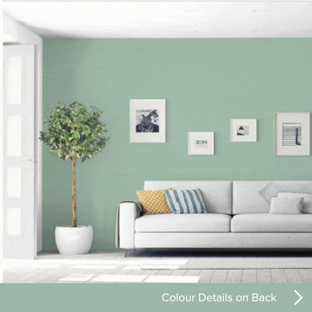
- Sanctuary: There is a nurturing wellness and calmness about this palette. There is also a connection to the natural world. If you cannot get out much this year, this palette will make it feel like you are in nature.
- Encounter: This palette reflects rich earthy tones and a modern bohemian aesthetic. Also, there are stories and deep connections related to this palette.
- Continuum: Technology has changed the lives of so many people worldwide, and with many of us working from home due to the pandemic, it is more apparent now than ever. This palette represents how technology and intelligent living mesh into our daily lives.
- Tapestry: This is a cutting-edge palette, including very bold colours. Also, it elevates vibrancy with lavish pinks (Jaipur Pink) and greens and inspires classicism.
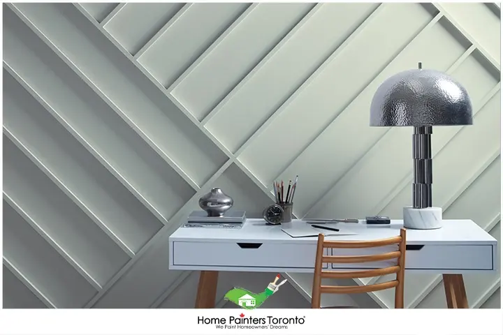
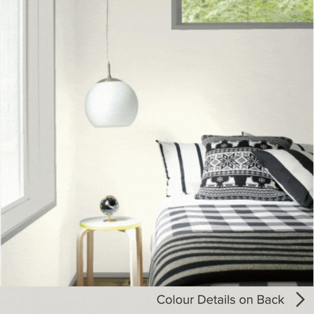
Light Shades for Interior Painting
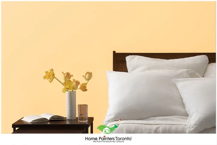
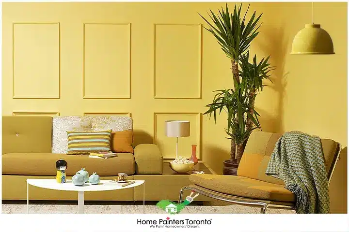
It’s pretty safe to say that the lighter the shade, the more energy and positivity it gives off. Yellow is the colour of the sun and the epitome of vibrancy! You instantly feel good and not stressed when you lay your eyes on a yellow wall. A research study has found that being in a yellow room causes people to become more active in their day-to-day tasks and are more conscious of their surroundings. So, if you feel lazy and out of sorts, a yellow wall can instantly change that.
Check out Yellow Haze for a shade that’s not too bright but still happy and mellow. Also, pink is a shade that balances energies because of how stress relieving it appears. In addition, using pink in any room promotes sensitivity and peacefulness.
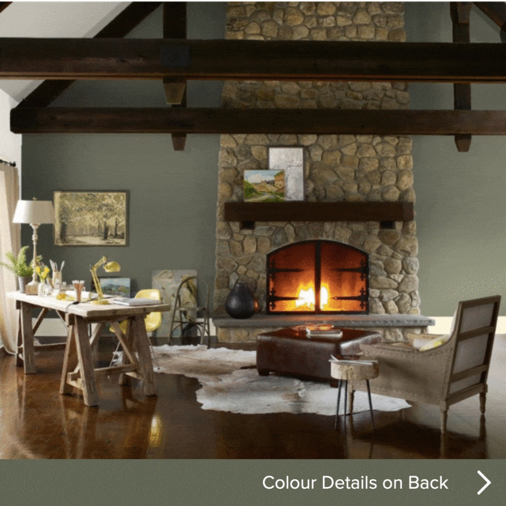
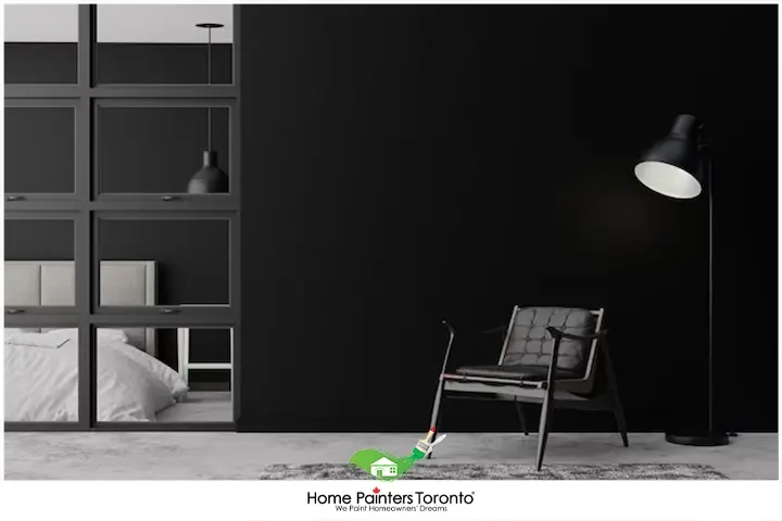
Darker Shades
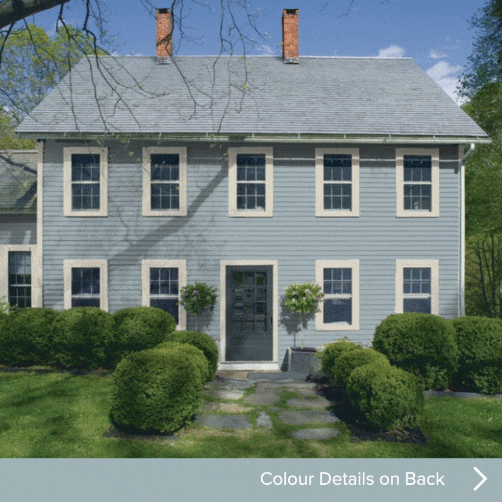
Gray can be a very trendy interior painting colour. This is because it is a great neutral colour that can make your setting stand out from the pack. Not to mention that shades of gray blend perfectly with black and white. In interior design, elegant grays are a staple. This is because it works perfectly with non-sunny and sunny areas.
If your setting is lighting dimmed, you should consider choosing a lighter shade of gray for the walls to compliment any bright accents you may have. Gray creates a calming environment when paired with white and blue shades. Look at Gray Wisp for a beautiful neutral that’s modern and inviting.
Top Interior Paint Colour Trends 2023
According to Behr, these are the top 10 colour trends for the upcoming year! They created this palette from a desired mood that will complement your style in any room of your home.
- Smoky White BWC-13: It’s soft and serene and great for a relaxing common area, like your living room or kitchen.
- Almond Wisp PPU5-12: This interior painting colour is a beautiful beige. It’s really comfortable and adaptable.
- Seaside Villa S190-1: This colour is a lovely light pink that is elegant and subtle.
- Sierra N240 – 4: This shade is heading more toward a light tan, and it’s classified as warm and approachable. We agree!
- Cellini Gold HDC-CL-18: If you want something more confident and playful, this gold interior painting colour is just the ticket.
- Canyon Dusk S210-4: This shade is ideal if you’re opting for something that’s more earthy and harmonious.
- Modern Mocha N150-4: For us, this is exactly how you might picture a creamy coffee to look!
- Maple Glaze PPU3-16: If terracotta is your idea of welcoming and vibrant, then this is the interior painting colour for you!
- Kalahari Sunset MQ1-25: This rich burnt orange is one step above terracotta towards a deeper and rich orange-brown.
- Saffron Strands PPU6-02: This colour is described as fiery and festive, and if you’re looking to go gold, that’s a very accurate description.
- Barnwood Gray PPU24-07: A deep gray that’s modern, solid and relaxed.
- Euphoric Magenta M110-7: This interior painting colour is a deep magenta purple that’s said to be creative.
The Most Stressful Paint Colours To Avoid in Your Home
Now that you know which calm inviting colours are best to paint your walls, let’s look at what not to do. While the above colours are great for bringing life and vibrancy into your home, there are also some colours that can cause stress if you choose them as your interior paint colour. Here’s a list of the most stressful colours:
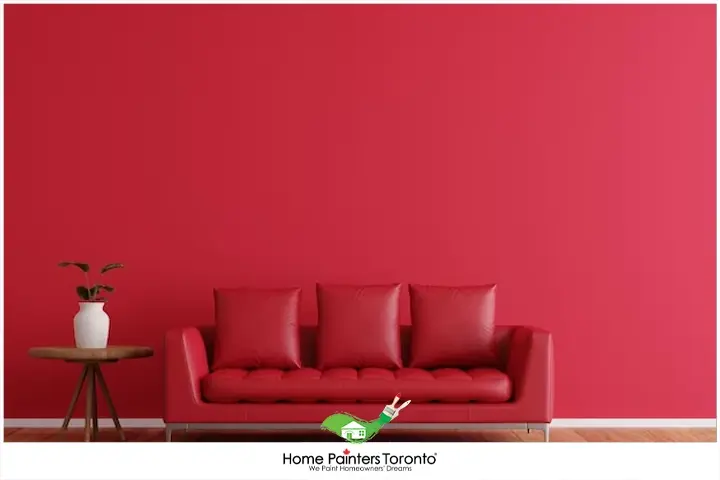
1. Bold Red
While red may signify passion and energy, it can also increase feelings of stress and tension. Red is known for raising blood pressure and heart rate, making it the last colour you want to use in a space meant for relaxation.
Instead, opt for muted shades of red, such as rosy pink or rusty red, which can still add warmth without causing too much emotional response.
2. Bright Yellow
Though yellow is often associated with happiness and sunshine, bright yellow can overstimulate the senses and incite anxiety. The intense nature of this colour might be more suitable for accent pieces rather than the main paint colour in your living spaces.
To embrace yellow’s cheerful side without overloading the senses, consider using pale yellow or buttery cream shades that provide warmth without stress.
3. Dark Brown
Dark brown might create a warm and cozy atmosphere, but it can also evoke feelings of sadness or gloom when used excessively. A room painted entirely in dark brown can feel oppressive and may contribute to stress and anxiety.
If you love the richness of brown, use it sparingly as an accent colour or choose lighter shades like taupe or beige, which can still add warmth without overwhelming the room.
4. Electric Orange
Vibrant and overwhelming, electric orange can unleash a hyperactive energy that’s not conducive to relaxation. The intense hue might prove too much for a room where you plan to unwind.
For a soothing orange hue, consider terracotta or burnt orange, which can still add a touch of warmth and character without ramping up stress levels.
5. Deep Purple
As a colour that represents luxury and royalty, deep purple can be very dramatic and overwhelming, particularly in smaller spaces.
Overusing dark purple shades might contribute to feelings of stress and anxiety, especially in poorly lit spaces.
Opt for lighter shades like lavender or lilac, which can provide a peaceful and calming atmosphere without the intensity of their darker counterparts.
3. Dark Brown
Though black can be sophisticated and chic, it can also evoke feelings of negativity and depression when used excessively as the main colour in living spaces. With its potential to create a closed-in and dark atmosphere, black paint can lead to a stressful space.
Instead, use black as an accent colour alongside brighter or lighter shades, or opt for dark gray tones that still offer elegance without promoting negativity.
When choosing paint colours for your home, it’s essential to consider the psychological impacts of each colour. Avoiding overly intense, dark, or overwhelming shades will help you create a relaxing, calming environment where stress can melt away.
It’s important to remember that personal preferences matter. What might be a stressful colour for one person may not affect someone else similarly. Choose colours that make you feel at ease and contribute to the calm atmosphere you want to foster in your home.
Other Helpful Ways to Relieve Anxiety in Your Life
If you’re looking for other ways to release some of that tension and anxiety in your life, we have a few helpful hints:
- Daily exercise: Setting up a regular exercise routine for yourself is one of the best things you can do to combat anxiety. Exercise works to release endorphins, which are chemicals that can improve your mood. So, go for a run, take a yoga class, or hop on your bike because any of those things will help your body and mind!
- Reduce caffeine intake: Do you need 4 – 5 cups of coffee a day to get you going? Caffeine is a stimulant, and if we consume too much of it, it can make us jittery and even more anxious. If so, cut back to one coffee in the morning and see how you do!
- Write things out: Did you know that regularly writing down your feelings and thoughts can significantly reduce stress? It’s true. Whether you have a gratitude journal and use it to think about what you’re grateful for or find it helpful to write down those anxious thoughts, it can make a difference.
More interesting blogs related to
“THE TOP STRESS RELIEVING COLOURS 2024”

If you reside in Toronto and the GTA and need help picking out interior painting colours, don’t hesitate to call us! We will help you pick the colours you want and show you the latest painting and home renovation trends. Our home painting services with the best pro painters have been around now for over 36 years. Call 416.494.9095 or email [email protected] for a FREE quote for your home painting needs. And don’t forget to check us out on our social media channels below!