Embarking on the journey of selecting the perfect paint colours can be as thrilling as it is crucial. Think of paint as the backdrop of your brand’s story; the canvas upon which all other elements will find their harmony.
The beginning of a new year is always so exciting. You just feel those feelings of possibility in the air! Once January rolls around, it can immediately give us the urge to give our space a little refresh. And with that comes the announcement of the Pantone Colour Of The Year 2025. In case you didn’t know, Pantone is one of the foremost colour institutes that works at forecasting the year ahead in terms of popular interior painting colour choices. We have all the information about their two top picks for 2024 below!
Understanding the Impact of Colour
Before we delve into tints and shades, it is important to understand the psychological impact of colour on our surroundings. Colours are not just visually pleasing; they influence mood, perceptions, and behaviours. The Pantone colours have been selected with an awareness of their potential impact, promising to offer your space the very essence of contemporary zeitgeist coupled with sublime psychological effects.
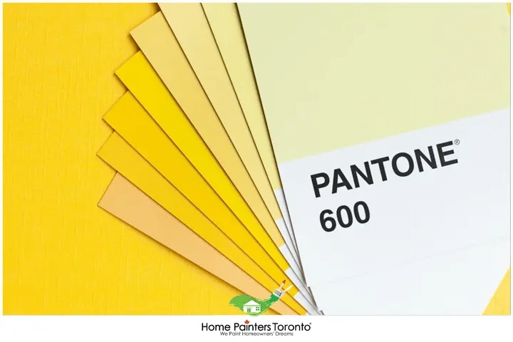
The Pantone colour of the year 2025
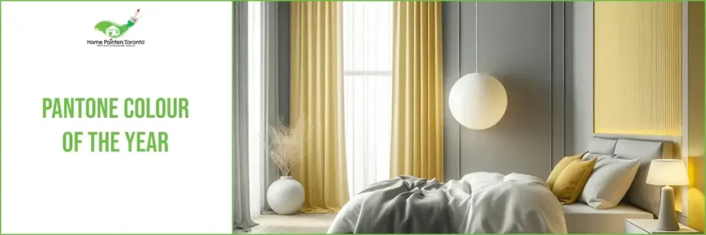
Pantone has made it official with their colour of the year, and there are two this year! Pantone has actually established the importance of showing these two interior painting colour picks together. And without further adieu, they are ‘illuminating’ yellow and ‘ultimate gray’. According to the colour strategists at Pantone, the “marriage” of these two colours together is supposed to “convey a message of strength and hopefulness.” They also hope for people to feel a great sense of “enduring” and “uplifting” in response to this duo of interior painting colour picks. Of course, you can always choose to pick one for your main interior painting choice and use the other as a complementary colour. Let’s work to break down each one and where it might make the most sense.
Ultimate Gray: How it makes you feel & where to use it
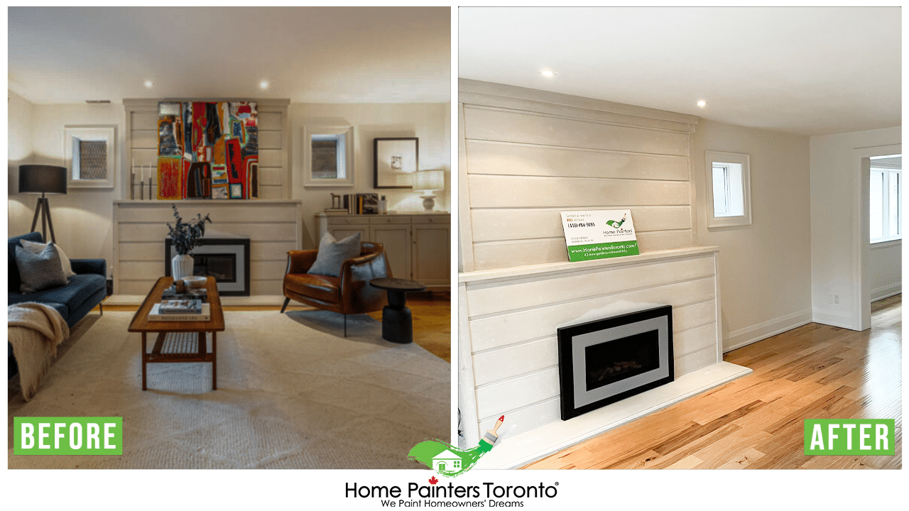
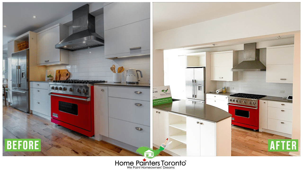
Over the past few years, they have often gone with gray for their interior house paint because it’s modern and contemporary. For others, though, they think maybe gray is still a bit much for them for their interior painting. Looking at Pantone’s pick of Ultimate Gray, though, it’s supposed to invoke feelings of “composure,” “steadiness,” and “resilience.” So, in simple terms, it’s something you can count on! Which actually sounds pretty amazing in terms of what you want to incorporate into your home in 2025. So, where should I use Ultimate Gray? There are so many spaces in a home where using an interior painting colour like Ultimate Gray makes a lot of sense. For one, if you want to incorporate a great neutral palette in the main living area of your home, this is the interior painting colour to choose. Ultimate Gray is an amazing pick for both living rooms and kitchens. This interior painting colour pick goes so well with white kitchen cabinet painting. If you use Ultimate Gray on the walls in your living room, perhaps some couch cushions in Illuminating Yellow would accent perfectly! Ultimate Gray also works well for main entryways and hallways. It has the great ability to remain neutral and contemporary, but never boring.
Illuminating Yellow: All the details
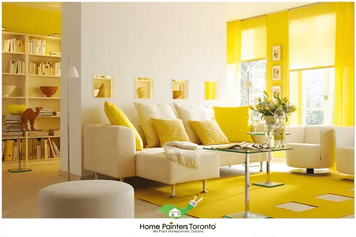
More often than not, when we think of the colour yellow, we think of the sun. That in itself often makes us smile and feel warm on the inside. For the Pantone Colour Of The Year 2025 pick Illuminating Yellow, it’s supposed to evoke feelings of “strength” and “positivity”. We’re not at all surprised. The experts at Pantone note that they predict Illuminating Yellow to also bring forth “a message of happiness.” Even more, there are hopes that it will rest within a world that’s “aspirational” and optimistic. That all sounds about right! So, where could you incorporate Illuminating Yellow into your interior painting? If you’re someone who is working from home right now (which is a lot of us) and you have a bland home office, this is the perfect interior house paint to use! When you surround yourself with the colour yellow, it often makes you more productive and alert. Also, muted yellows are said to be one of the best colours to put in your bedroom. When you wake up in a yellow room, it helps you immediately feel cheerful and bright. If you don’t want to go for a full-on yellow look throughout, opt for an accent wall!
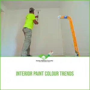
Choosing the Right Paint
Selecting the right paint goes beyond picking a colour; it involves understanding finishes, lighting, and the overall ambiance you aim to create.
Evaluating Paint Finishes:
- Matte: This finish absorbs light, offering a non-reflective surface. It’s ideal for hiding imperfections and creating an elegant, sophisticated aura.
- Eggshell & Satin: These have a slight sheen to them and are easier to clean, making them good for high-traffic areas or spaces that need a subtle glow.
- Semi-Gloss & Gloss: High reflectivity defines these finishes. They’re durable, easy to clean, and excellent for drawing attention to spaces.
Considering Lighting:
Natural and artificial lighting will dramatically affect how your selected Pantone colour appears in your space.
- Natural Light: Rooms with ample sunlight can handle deeper or brighter hues without feeling too enclosed.
- Artificial Light: Consider the type of lightbulbs you use—different temperatures can cast hues that can either enhance or detract from your paint colour.
Creating Ambiance:
Think about the mood you want to evoke in each room.
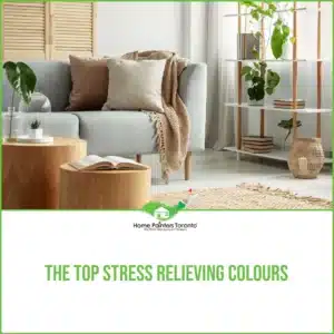
- Restful and Calm: Use softer shades and tints of the Pantone 2025 colour to foster a tranquil environment.
- Energetic and Vibrant: Go bolder with richer saturations for areas where creativity and energy need to flow.
Applying Pantone’s Colour of the Year in Your Space
Feature Walls:
A feature wall in the Pantone 2025 colour can become a focal point, offering a burst of freshness and dynamism without overwhelming the space.
Complementary Colours:
Pair the Pantone colour with complementary shades to create a visually cohesive and appealing palette. Use a colour wheel to find harmonious combinations that will enhance your brand’s narrative.
Accents and Trims:
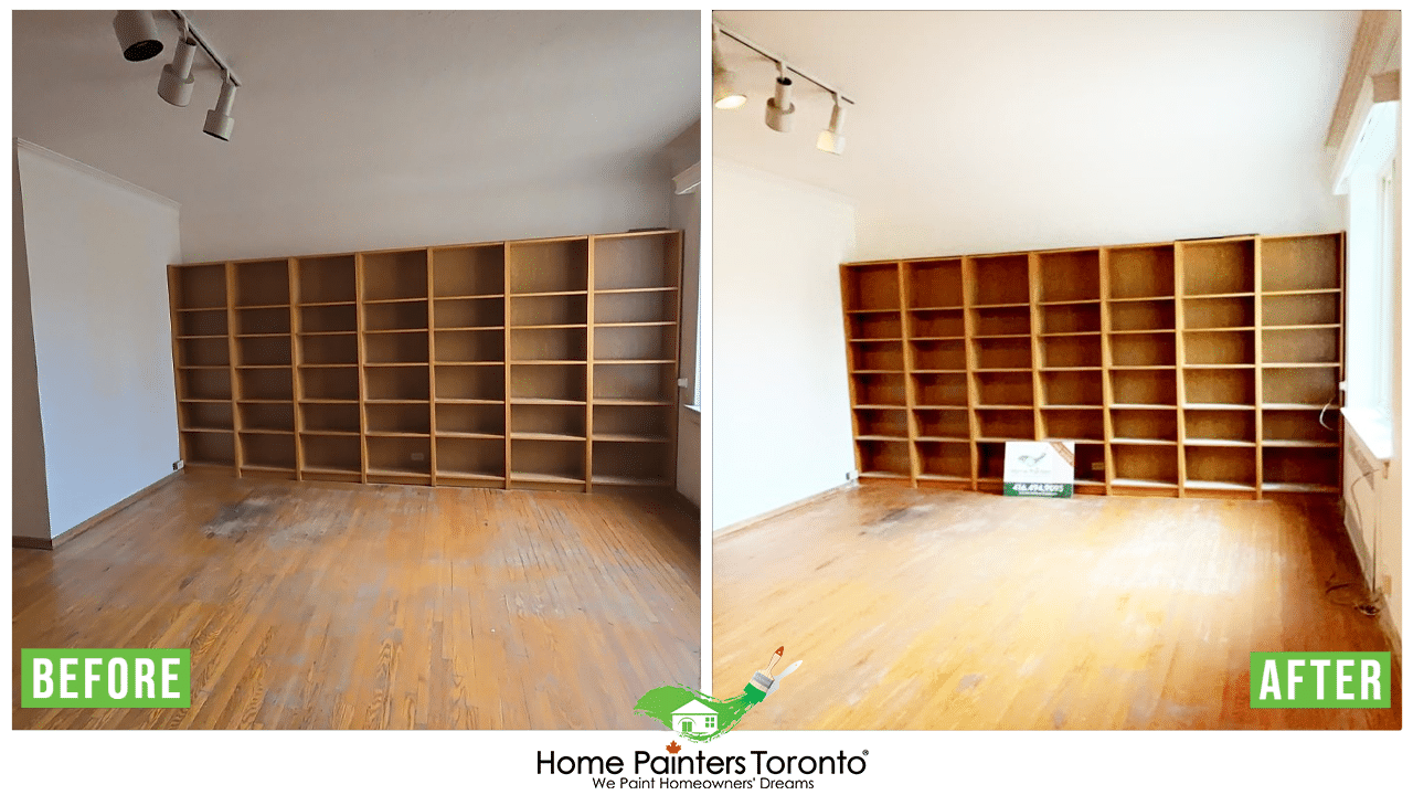
Use the colour for accents like door trims, bookshelves, or other small elements for a subtle yet powerful injection of contemporary relevance.
Sustainability in Paint Choices
Responsibility in your paint choices includes considering the environmental implications. Opt for paints with low or no volatile organic compounds (VOCs), and consider the longevity and lifecycle of the products you select.
Finalizing Your Vision
As you take these considerations into play, remember, that your choices here are more than cosmetic—they’re an integral part of your brand story. The right ambience can make your space inviting, inspiring, and a testament to your brand’s vision.
Approach this decision with confidence, armed with the knowledge that the colour you paint your space will speak volumes about your brand. Every stroke of the brush is an opportunity to align your physical branding with the narrative you’ve so carefully crafted.
If you’re feeling hesitant, I’m here to guide you through each brushstroke. Together, we’ll ensure that the Pantone Colour of the Year 2025 is not just a shade on your walls, but a strategic step towards a more cohesive and resonant brand identity.
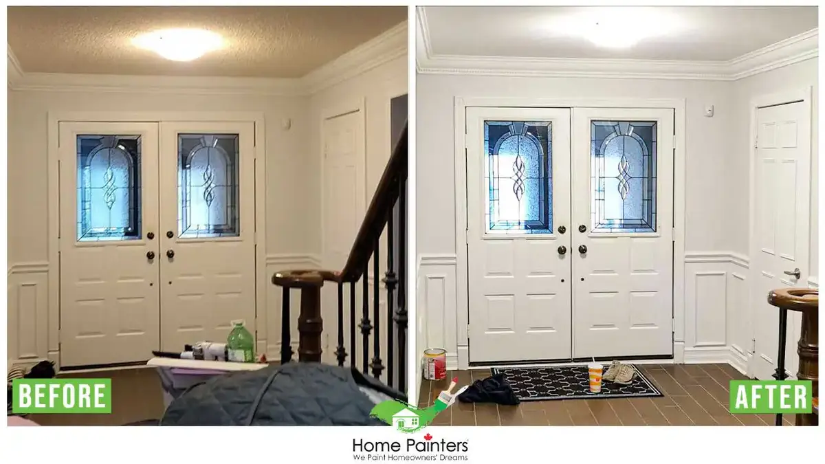
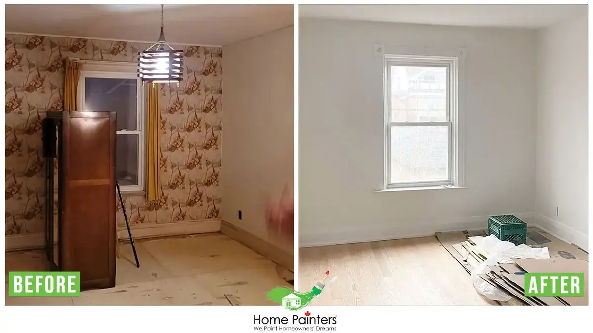
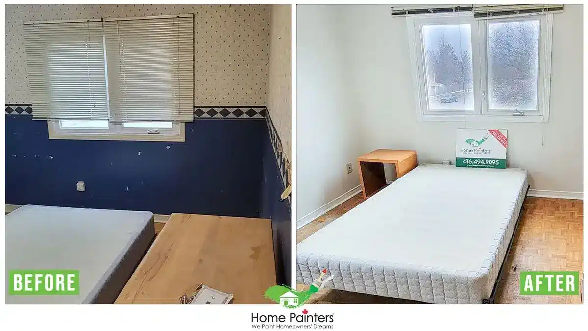
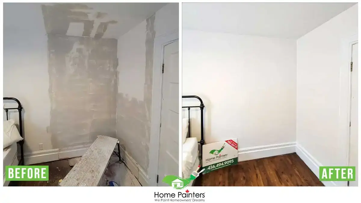
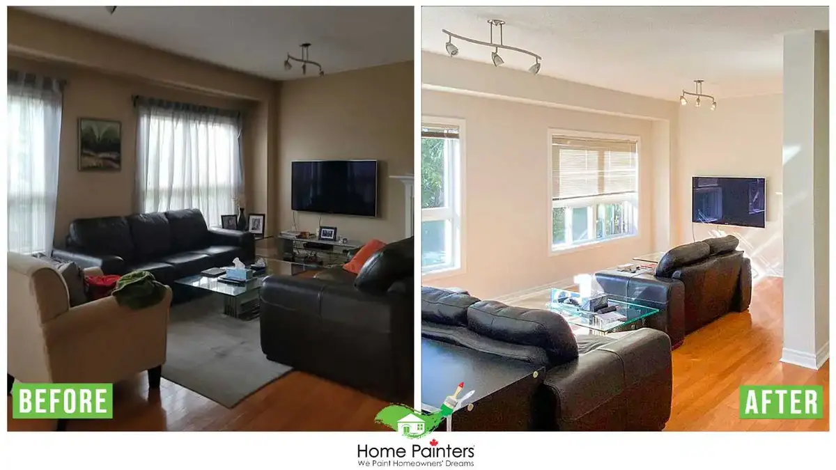
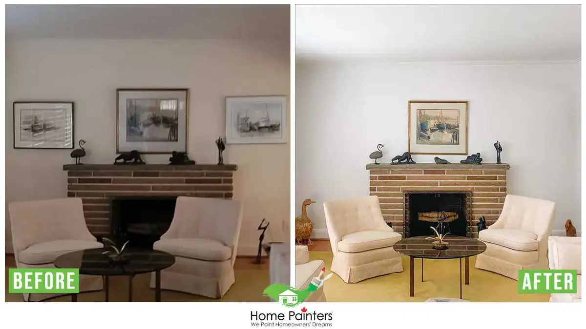
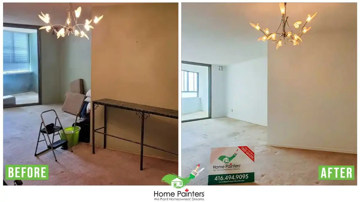
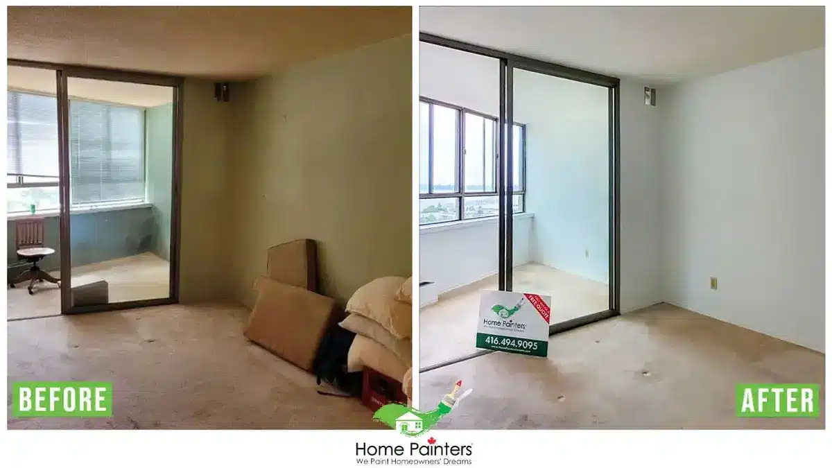
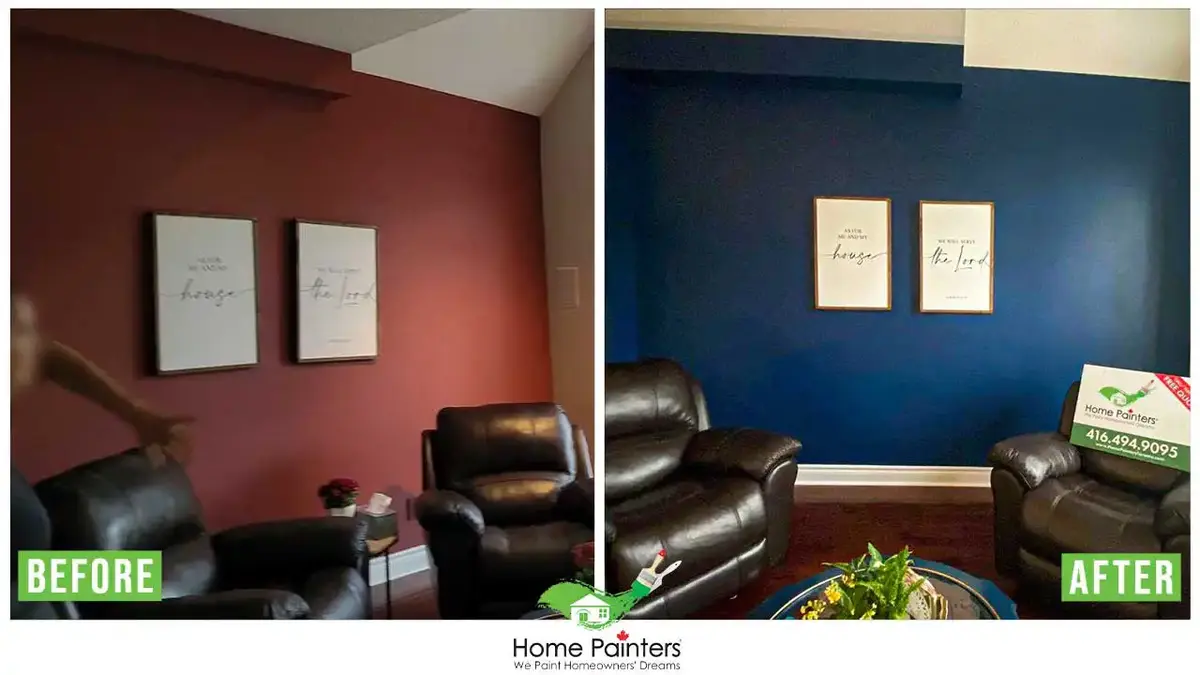
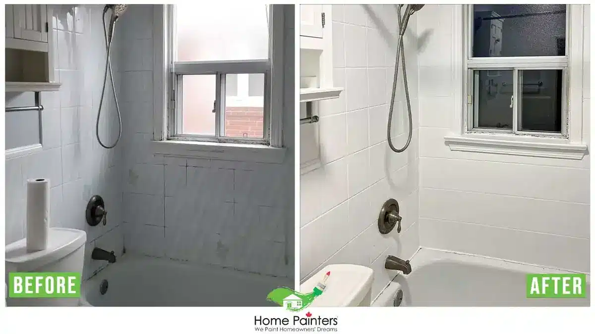
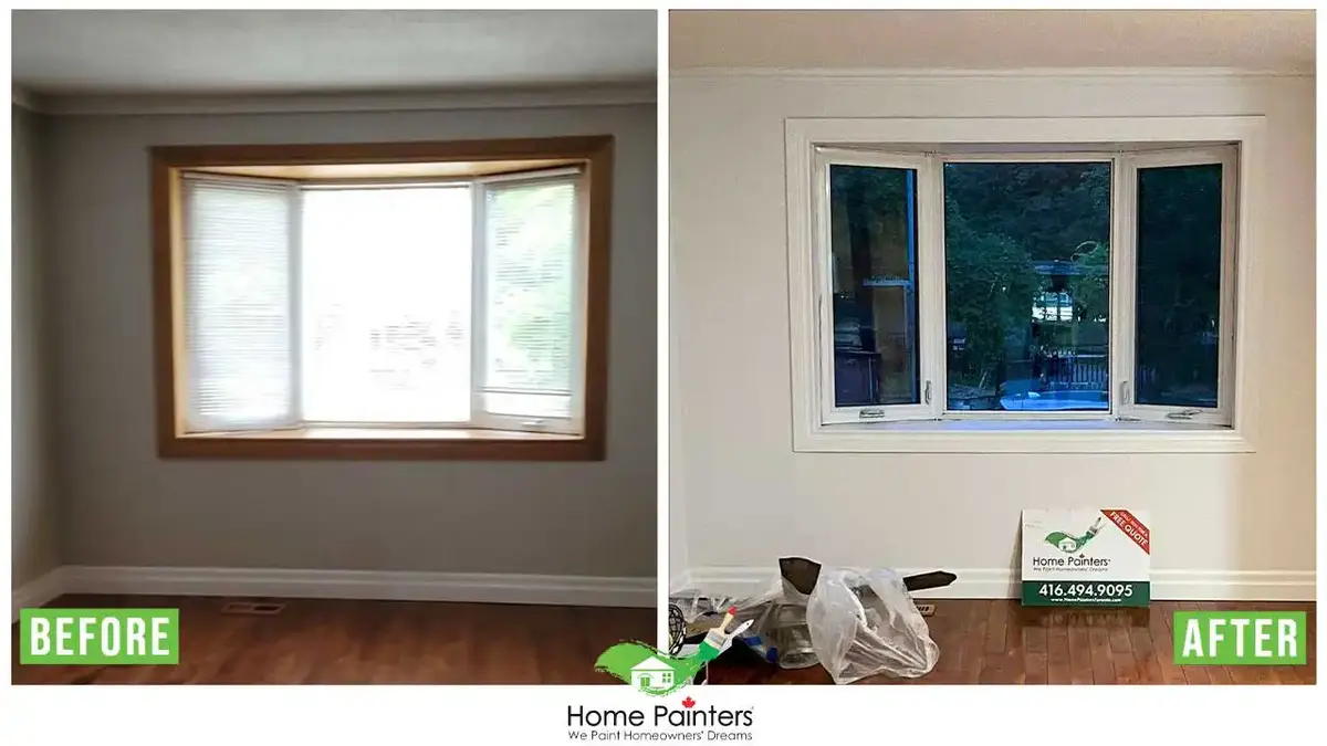
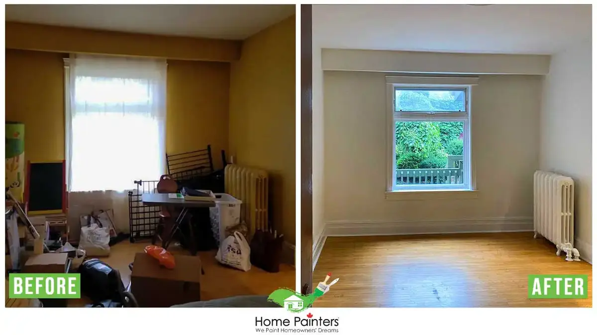
Need Some More Inspiration? View Our Colour Palettes Gallery!

More Interesting Blogs Related to
“Pantone Colour Of The Year 2025”
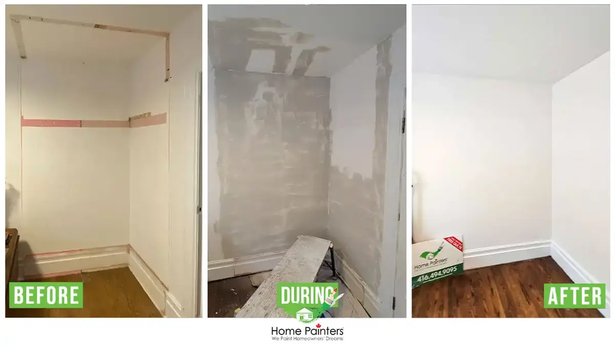
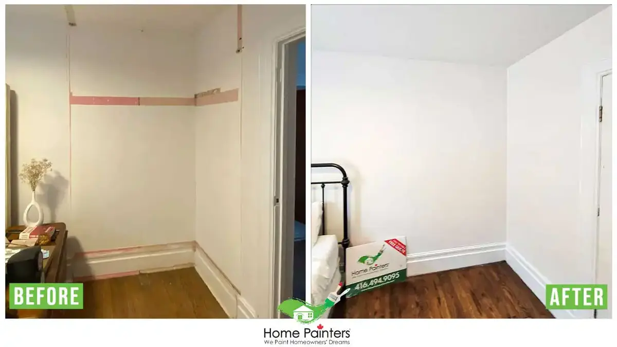
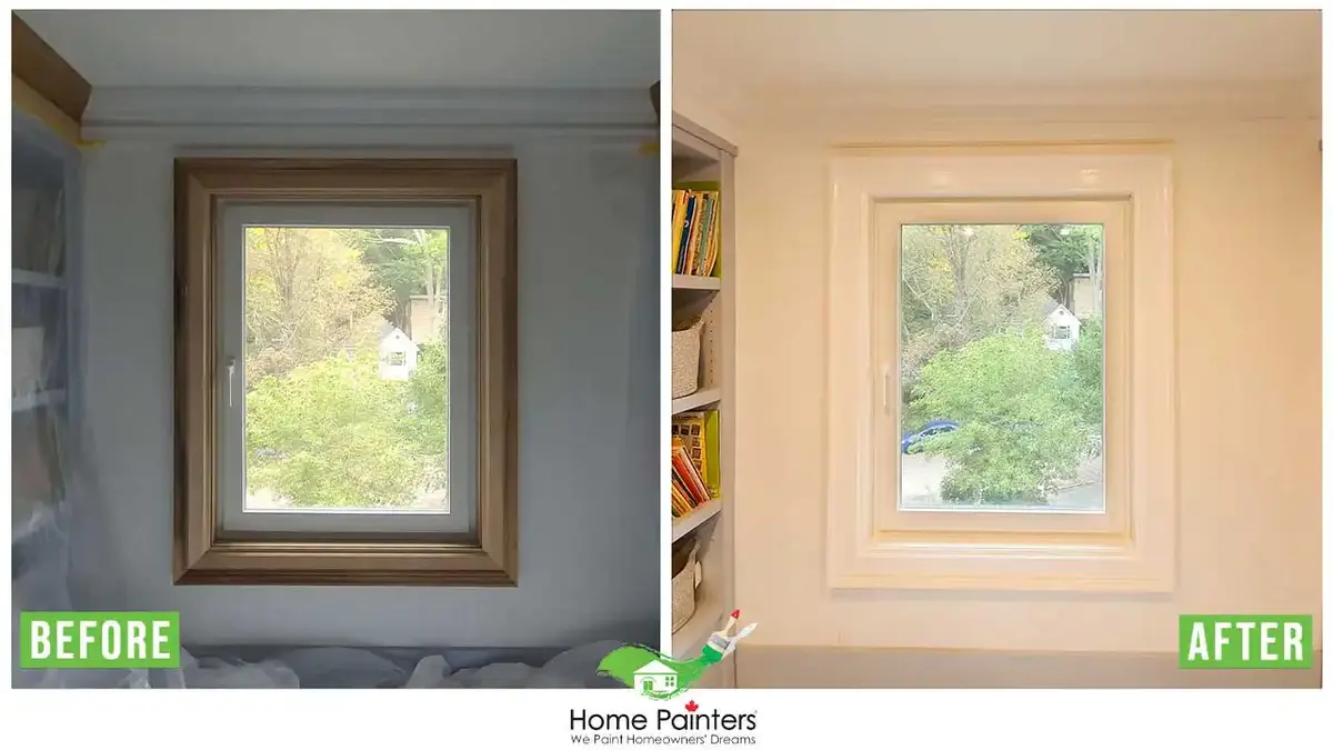
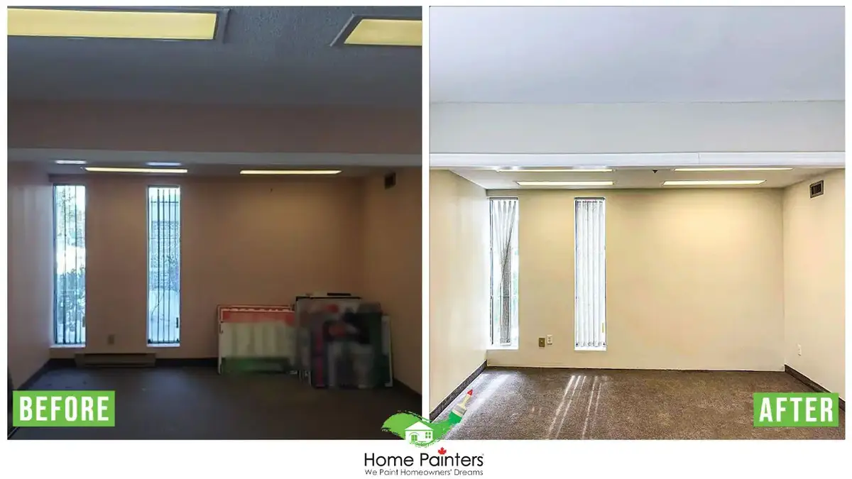
If you reside in Toronto and the GTA and need some help picking out interior painting colours don’t hesitate to call us! We will help you pick the colours you want and show you the latest painting and home renovation trends. Our expert pro painters have been around now for over 37 years. Call 416.494.9095 or email [email protected] for a FREE quote for your home painting needs! And don’t forget to visit us on our social media channels below.