The colours of the rooms in your home make an immediate impression on yourself and those around you. While a large portion of us may not invest a great deal of energy contemplating room colours, they influence us a lot. Room colours can impact our moods as well as our thoughts. Colours influence us from multiple points of view, all based on age, our own personal preferences, our emotions and even where we live.
Certain colours (or combinations of colours) can usually receive the same response from a large group of people because they’re universally satisfying. This is the reason it’s so critical to choose your paint colours wisely in regards to decorating. Trends will fluctuate over time, but often it helps to go with how you feel. Paint colour has the ability to change the shape and size of the room itself. Choosing paint colours doesn’t have to be stressful, either. You just have to equip yourself with the right information. Let’s discover more about room colours and how they impact your mood!
Decoding Room Colour Psychology
Colour psychology is a field of study that examines how colour influences human behaviour and mood. While individual experiences with colour can vary due to personal history and cultural differences, certain general trends have been widely acknowledged. For instance, warm colours such as red, orange, and yellow are typically associated with emotions ranging from comfort and warmth to anger and hostility. On the other hand, cool colours like blue, green, and purple often evoke feelings of calmness, sadness, or introspection.
Room Colour Ideas
When embarking on the journey of selecting room colours, practicality should blend seamlessly with creativity. It is not solely about painting walls; it’s about curating experiences and atmospheres. Herein, we will explore a spectrum of room colour ideas, illustrating how to achieve a balance between visual harmony and functional design.
Living Rooms: Where Comfort Meets Style
In the living room, aim for a colour that unites the energy of the home’s social hub with the tranquillity needed for downtime. A soft dove gray can provide a sophisticated backdrop, playing well with vibrant accents and allowing artwork to pop. Alternatively, consider an earthy sage green to promote a restful environment with an organic vibe. The key is to select a hue that complements natural lighting and the room’s orientation.
Bedrooms: Personal Retreats
The bedroom is your personal sanctuary, requiring a colour that resonates with tranquillity and personal taste. A classic choice is a muted blue, known for its calming properties, which can be complemented with layers of texture in the bedding and curtains to add richness. For those seeking warmth and coziness, subtle terracotta tones can create a snug and intimate atmosphere, ideal for restful slumber.
Kitchens: Whetting the Appetite
High-energy zones like kitchens flourish with stimulating colours. Crisp whites paired with a bold backsplash can create a clean and fresh look, while a touch of sunny yellow can invigorate the space without overwhelming it. For a modern edge, consider charcoal or deep blue cabinetry against lighter walls to craft a space that’s both chic and functional.
Bathrooms: Serenity Now
The bathroom calls for hues that evoke cleanliness and renewal. Cool blues or greens reflect the soothing qualities of water, making them perennial favourites. For a more daring approach, rich jewel tones like amethyst or sapphire can turn a functional bathroom into a luxurious spa-like retreat, especially when balanced with light fixtures and hardware with a matte or brushed finish.
Home Offices: Productivity in Colour
A home office demands a colour that stimulates the mind without creating distraction. Muted blues can again play a role here, encouraging concentration and calmness. For those desiring a more energizing environment, a muted green can provide a sense of balance, acting as a catalyst for creativity and equanimity in the workflow.
Nurseries: Gentle Hues for Gentle Dreams
For nurseries, gentle pastels remain a traditional choice, offering a soothing backdrop as baby grows. Pale pinks, soft blues, and creamy yellows nurture a peaceful yet cheerful atmosphere. To future-proof the room, opt for a neutral base with colourful accents that can easily evolve with the child’s age and changing preferences.
Choose Colour Combination Wisely
Remember that each colour can make you feel something different. Consider how certain colours cause you to feel different emotions. They can impact your day and make you feel everything from happiness to loneliness. To feel harmony and congruity in your home, pick your colours carefully. Just a few colours may have the opposite impact on you and your family. What mindset do you want to feel when walking into a room? Which colours will help you achieve that mood?
If you need assistance in thinking about these things, flip through some magazines. Or even check out books, online journals and other websites for thoughts. Likewise, let your materials be your guide. Texture, covering, furniture and tile are accessible in a more constrained scope of colours than paint, so pick them first and then settle on your paint colour. Once you discover something you like, limit the number of colours in a space to close to three or four. An excessive number of colours can make a room look too occupied or jumbled. Paint is an inexpensive investment and changes a room more effectively than anything else.
Room Colours and Their Effect
Colours act in three essential manners: dynamic, latent and impartial. You can undoubtedly coordinate each room’s colours to your own wants, as you would prefer and to the room’s motivation. Light colours are broad and vaporous, causing rooms to appear to be bigger and more splendid. Dull colours are complex and warm. They give huge rooms a more private appearance. How about we investigate some popular room colours and see what they can do for a space?
White
Painting your trim or cornice white or grayish is an extraordinary method to help make your home feel more roomy and open. It’s a completely unbiased choice that will fit in anywhere. White gives a fair compromise that leaves you feeling clean and completely refreshed.
White rooms also give a feeling of neatness and virtue. The colour white itself represents assurance, honesty and goodness.
Painting your ceilings white or cream is a simple choice that goes with pretty much every colour and gives the figment that the ceiling is higher than it actually is. It can really open up a space.
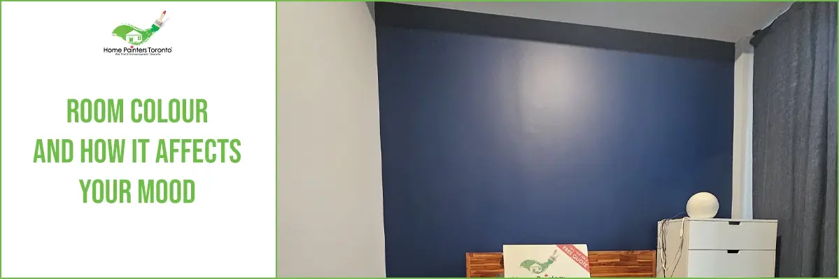
Blue
Blue is a colour that can allow you to feel focused and peaceful. It’s actually known to lower blood pressure, help to clear the mind and help to make one feel more relaxed.
While blue rooms are nice to rest in, note that pastel blues can seem a little cold or even juvenile. Light warm blues are extraordinary and are effectively offset with warm shades and other room colour outfittings.
Don’t forget to check out our Pinterest page for all sorts of interior painting inspiration!
Final Thoughts
In conclusion, the strategic application of room colour can transform a space from merely functional to emotionally resonant. By understanding the psychological effects of colours and carefully considering the specific needs and dynamics of a space, designers and homeowners can create environments that positively influence mood and well-being. Balancing aesthetic appeal with functionality and emotional impact requires thoughtful consideration, but the result is invariably a space that truly feels like home.
More Interesting Blogs Related to
“Room Colour And How It Affects Your Mood”


If you’re having trouble picking out the right colour for your home space or are just unsure of what direction to go in, call 416.494.9095 or email [email protected] for a FREE quote or visit our website. And don’t forget to follow us on all our social channels below!